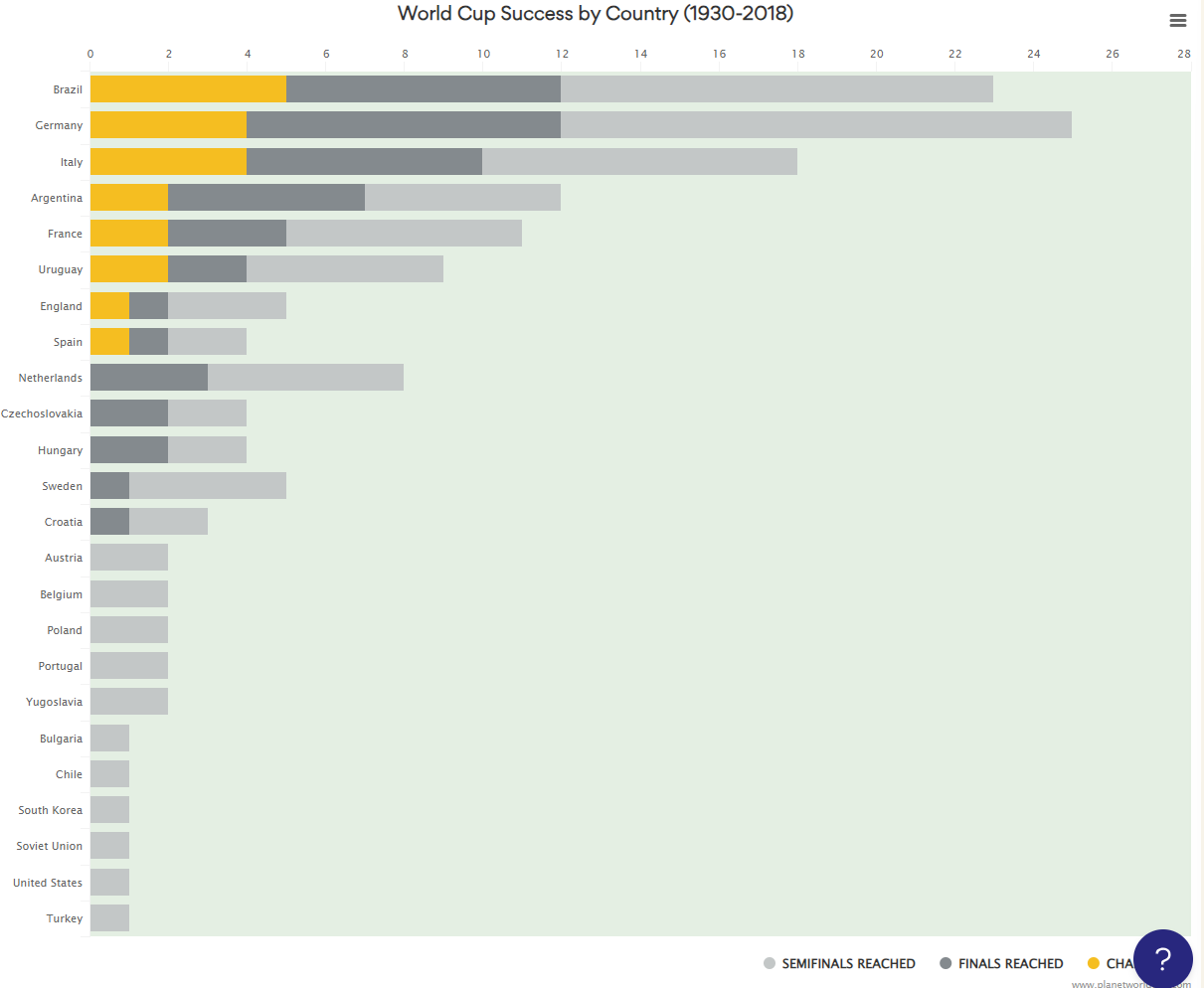
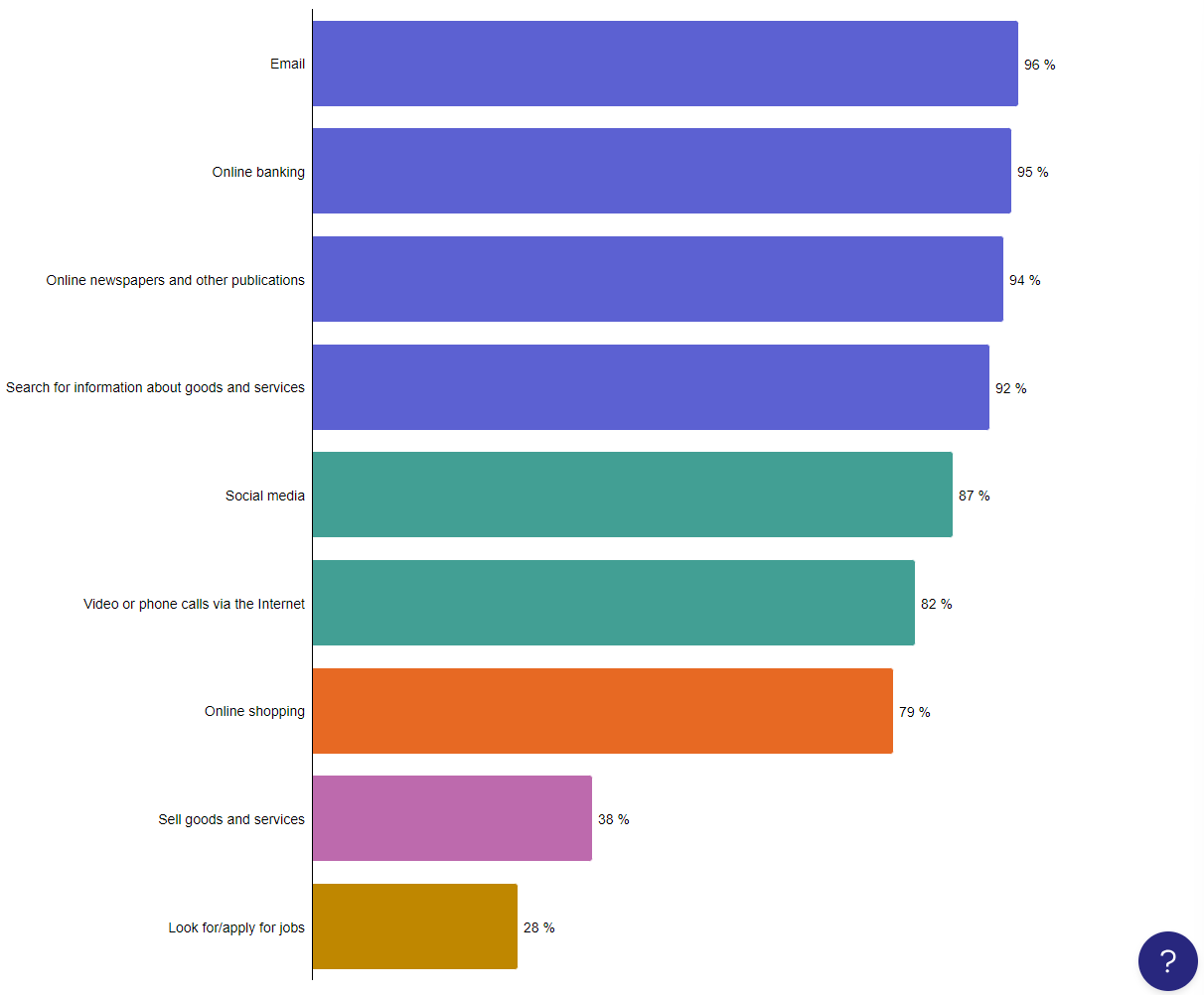
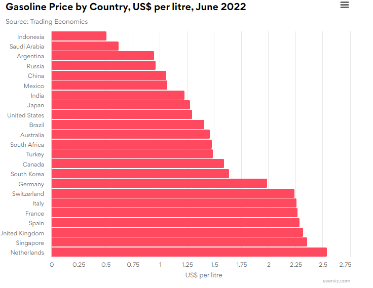
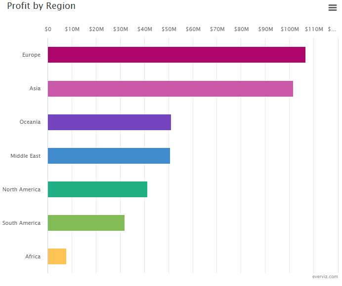
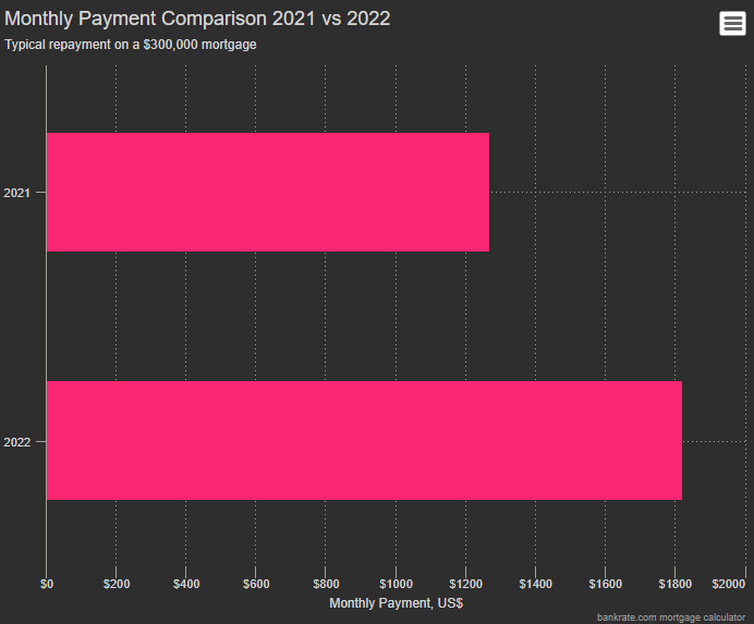
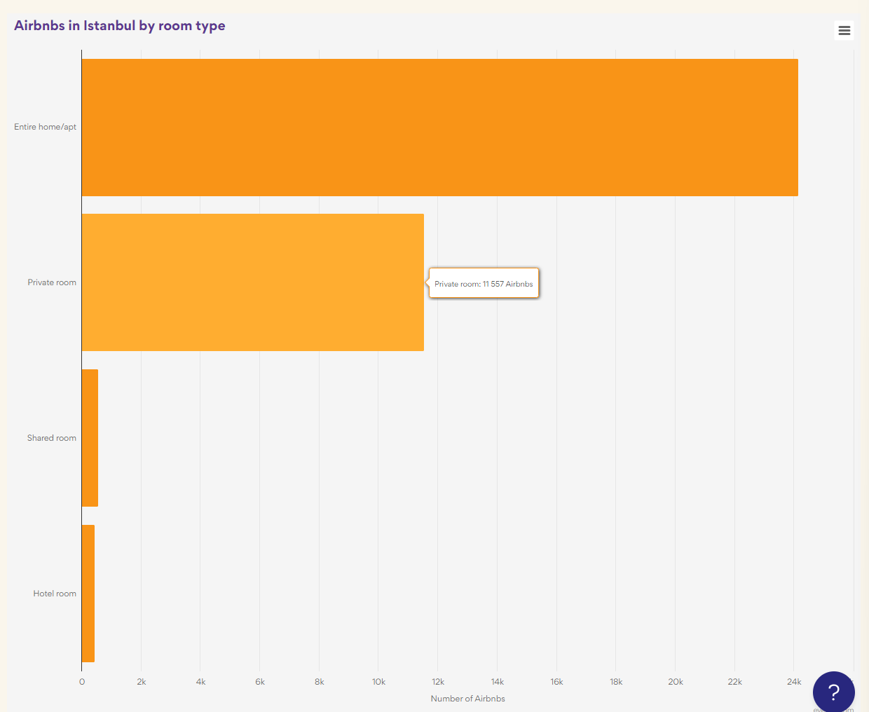
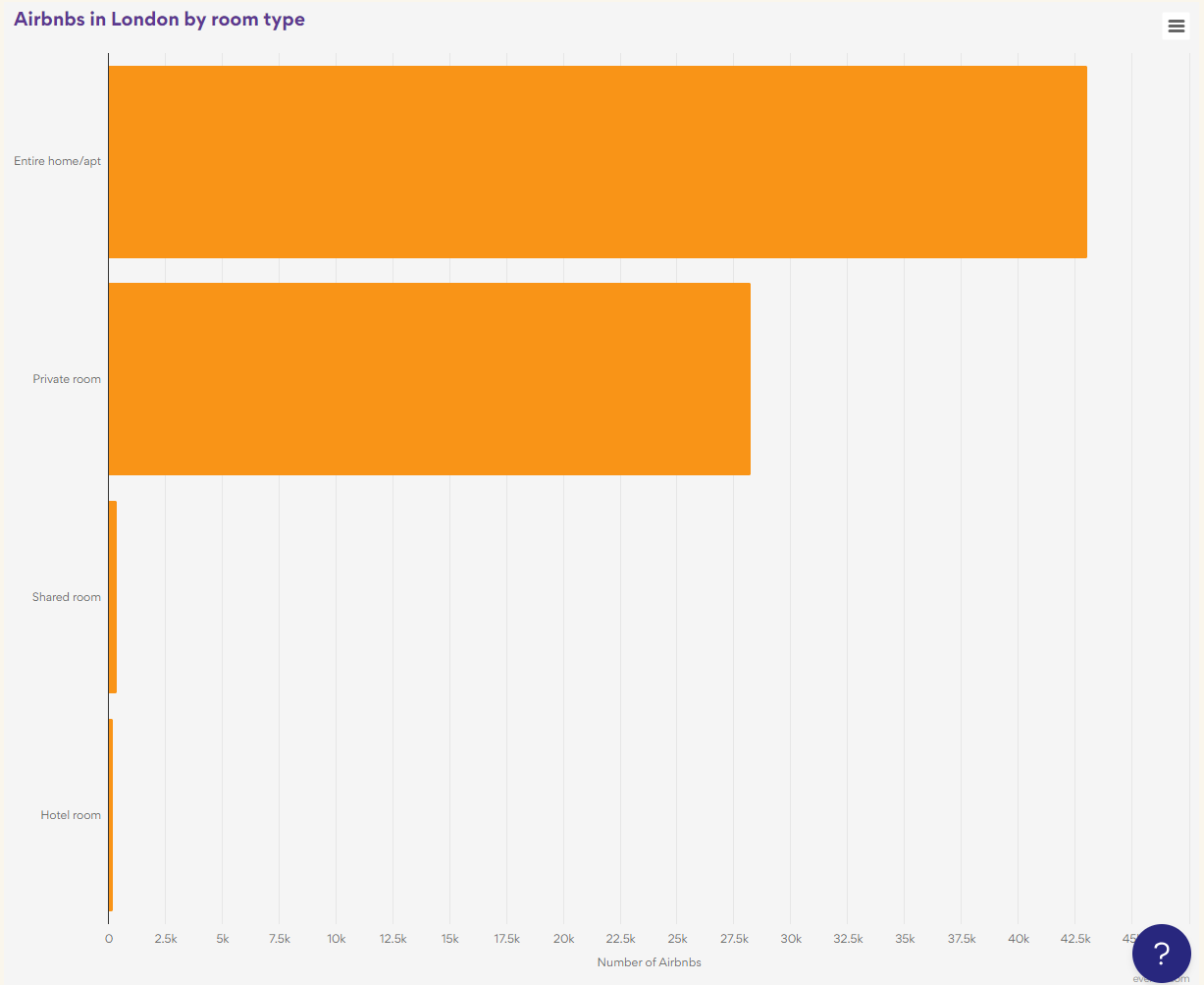
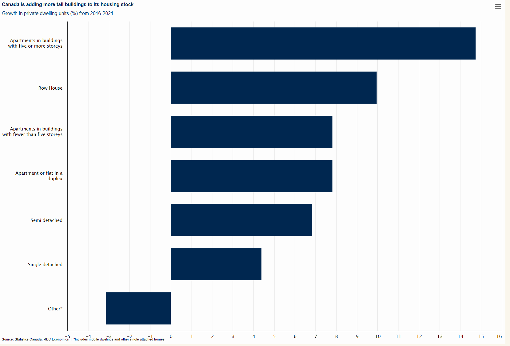
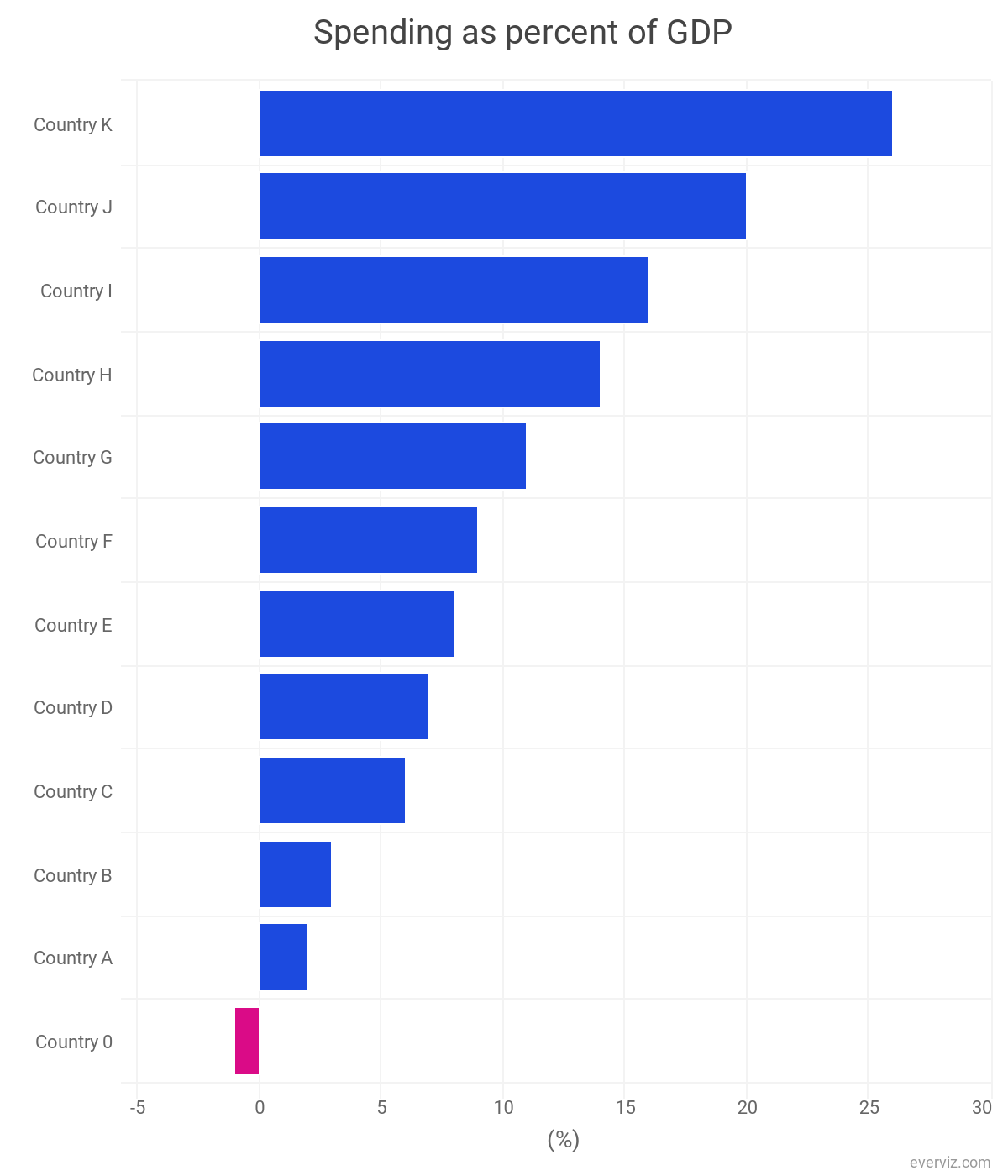
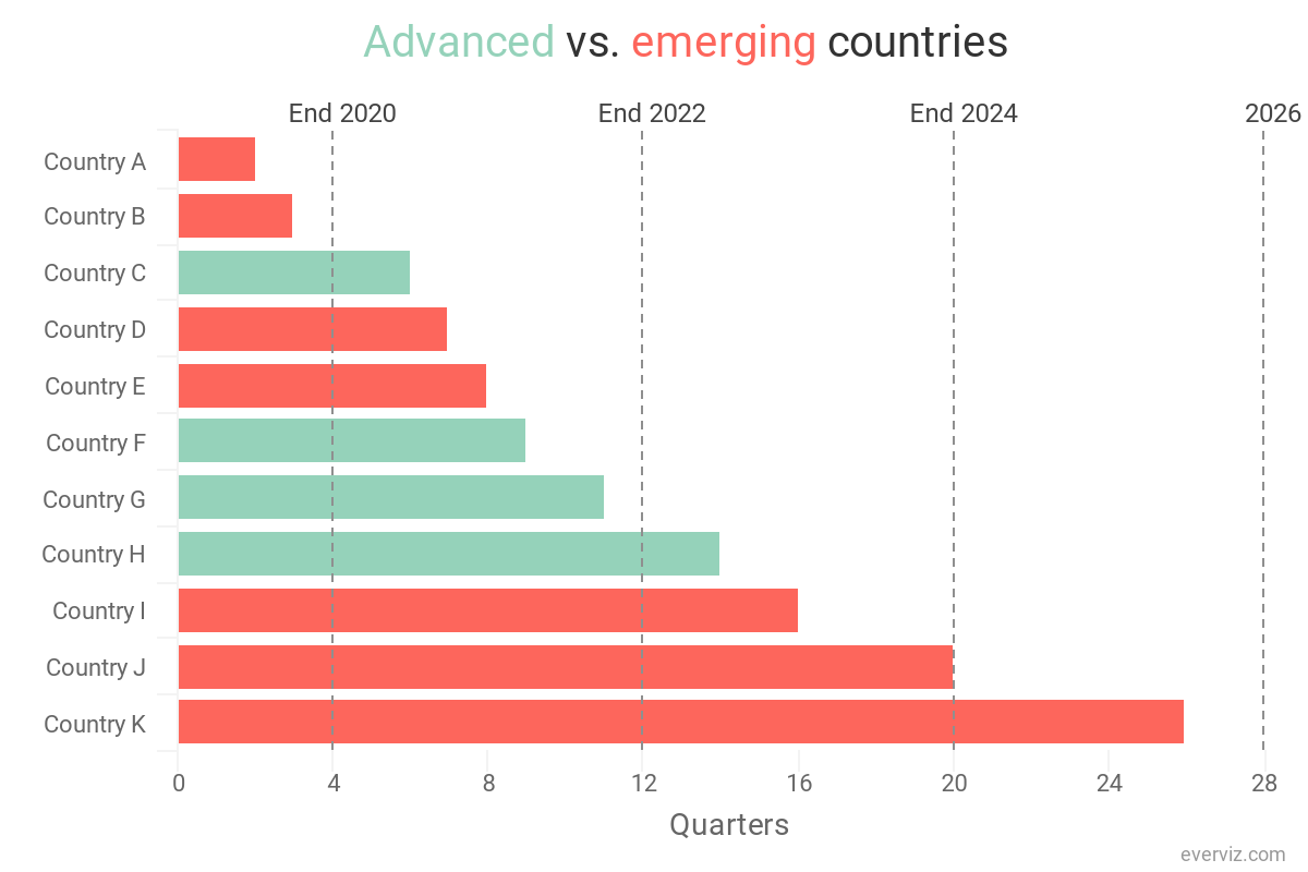
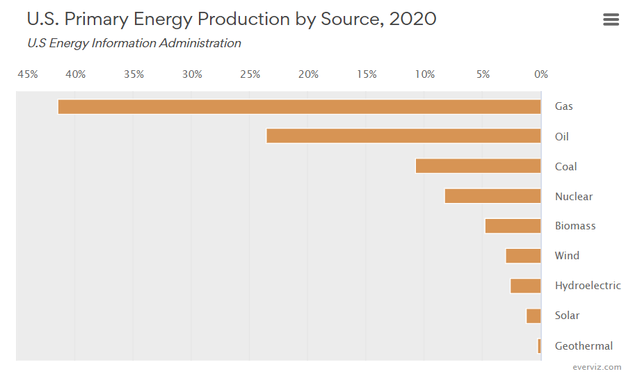
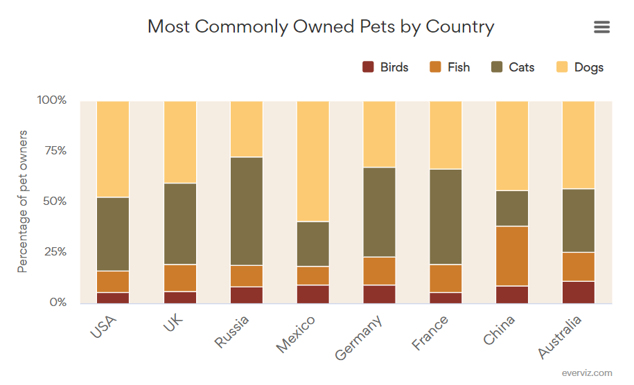
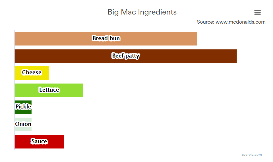
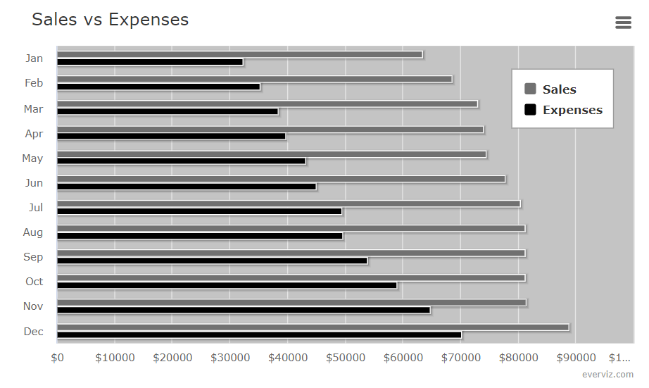
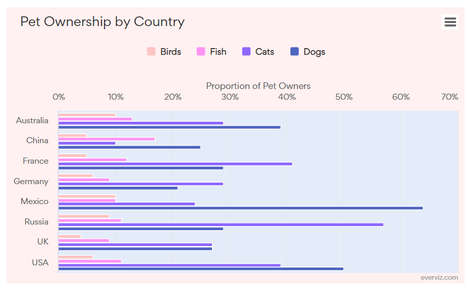
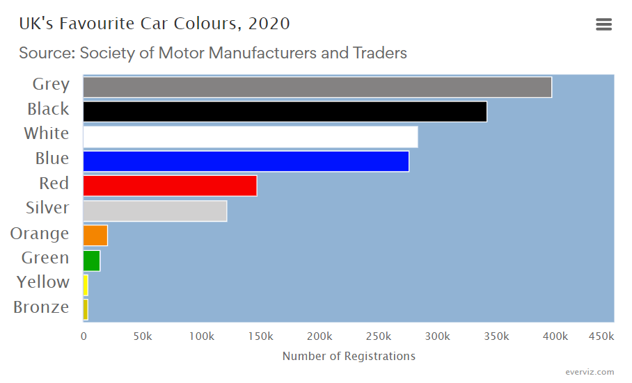
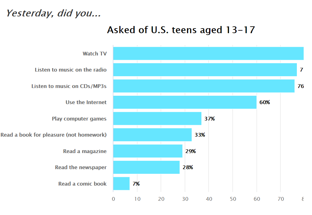
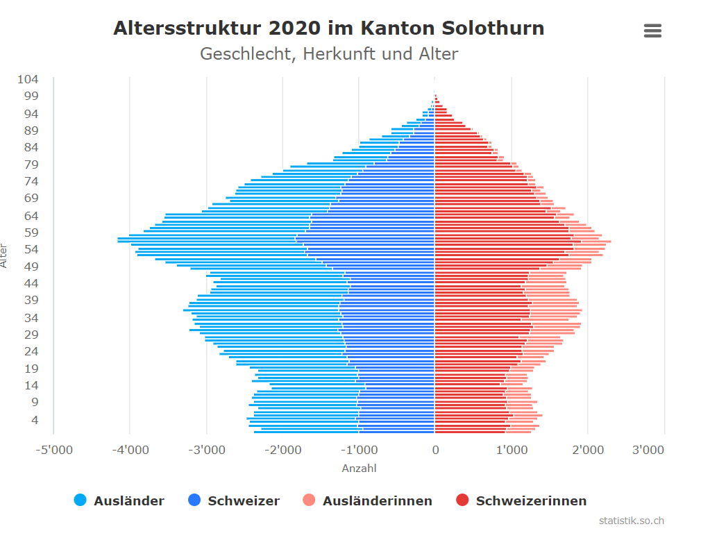
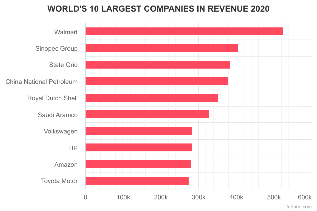
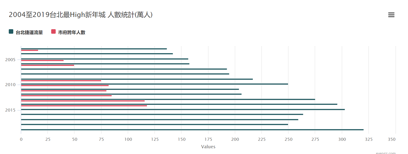
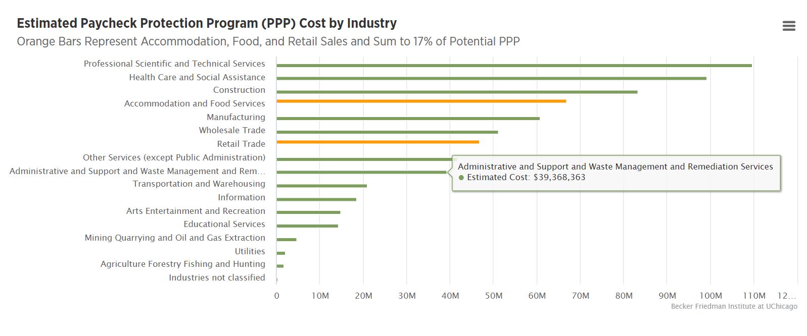
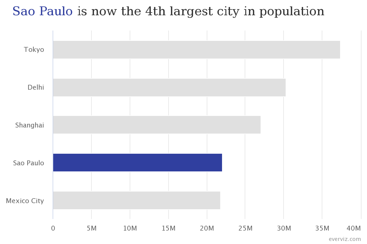
Both bar and column charts typically display categorical data and answer the question of “how many/much” for each group. In a bar chart, the data is displayed as horizontal bars (lines or rectangles), each with a length that is proportional to the value it represents. The category is displayed on the y-axis and the value is plotted against the x-axis.
Bar charts are often used to compare values across different categories. For example, they might be used to show the comparative population size of different cities.
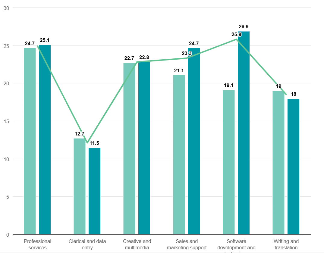
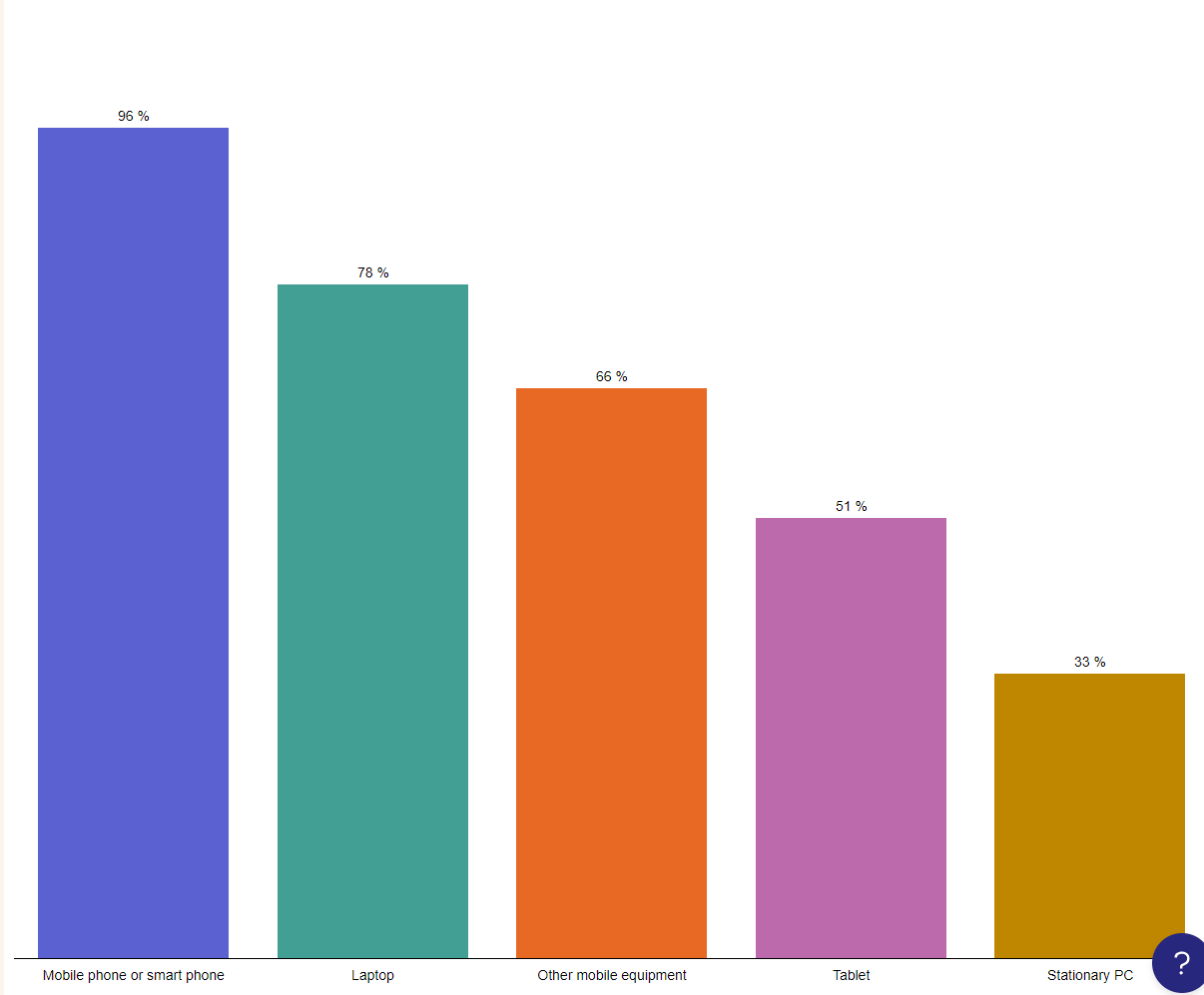
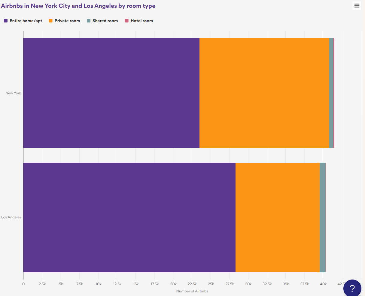
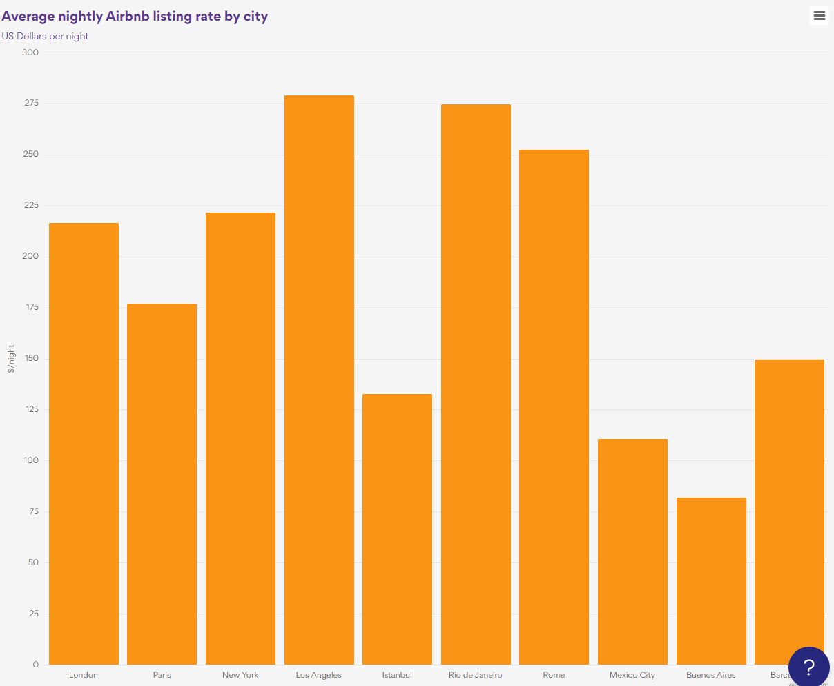
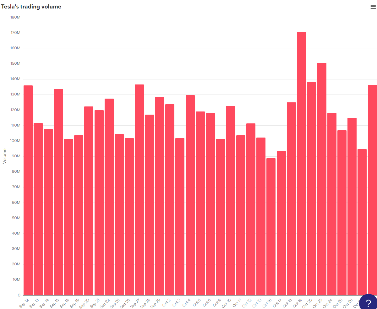
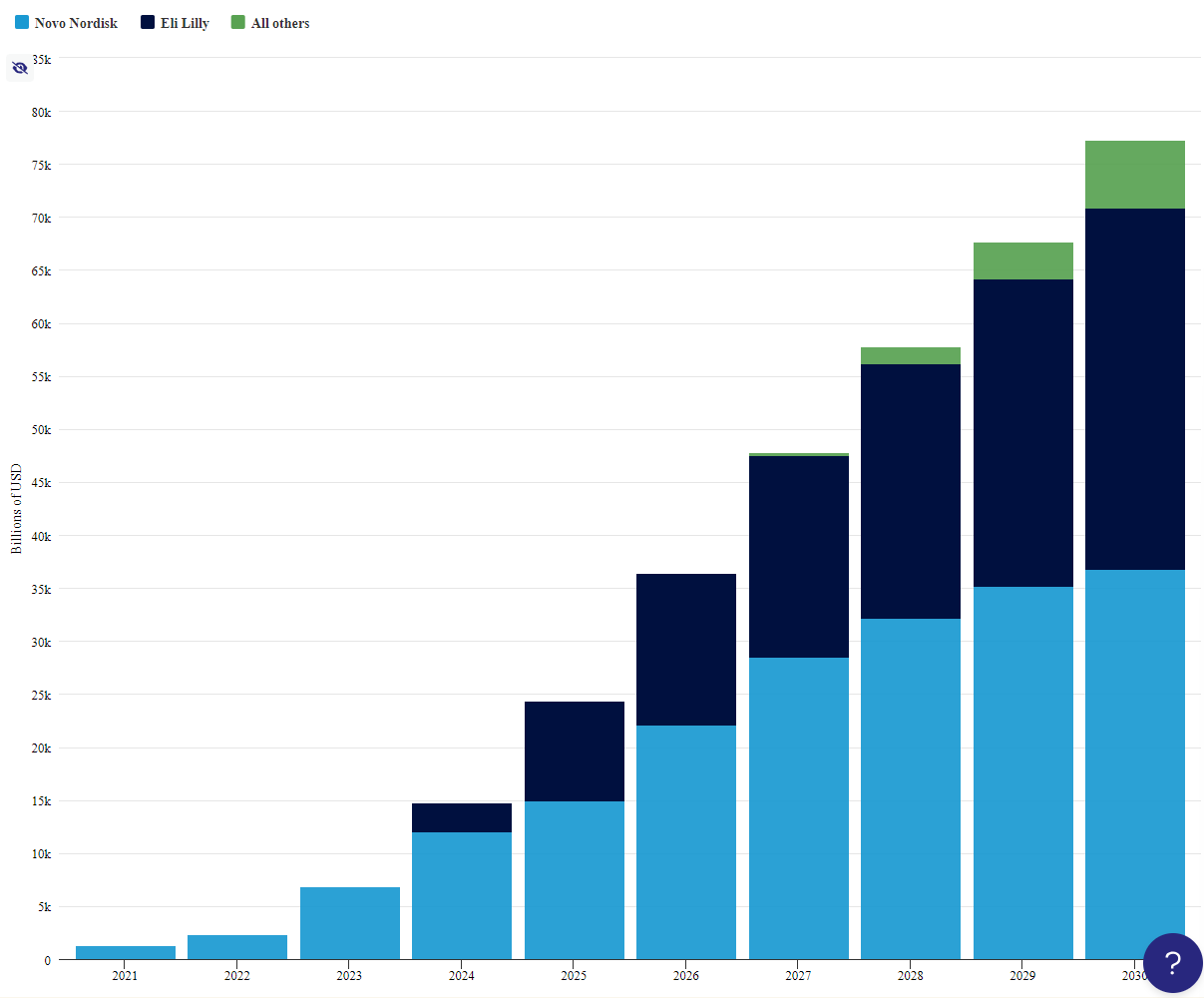
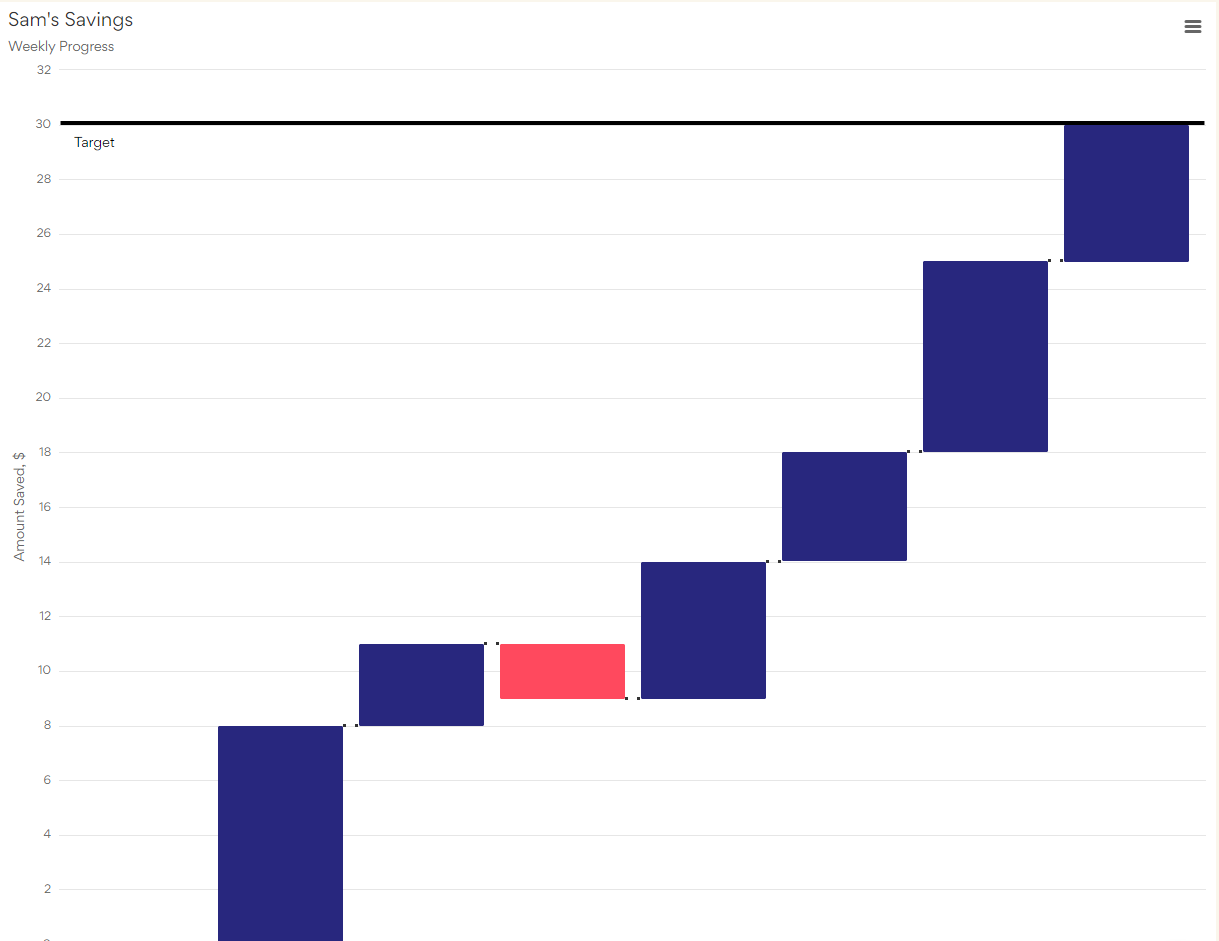
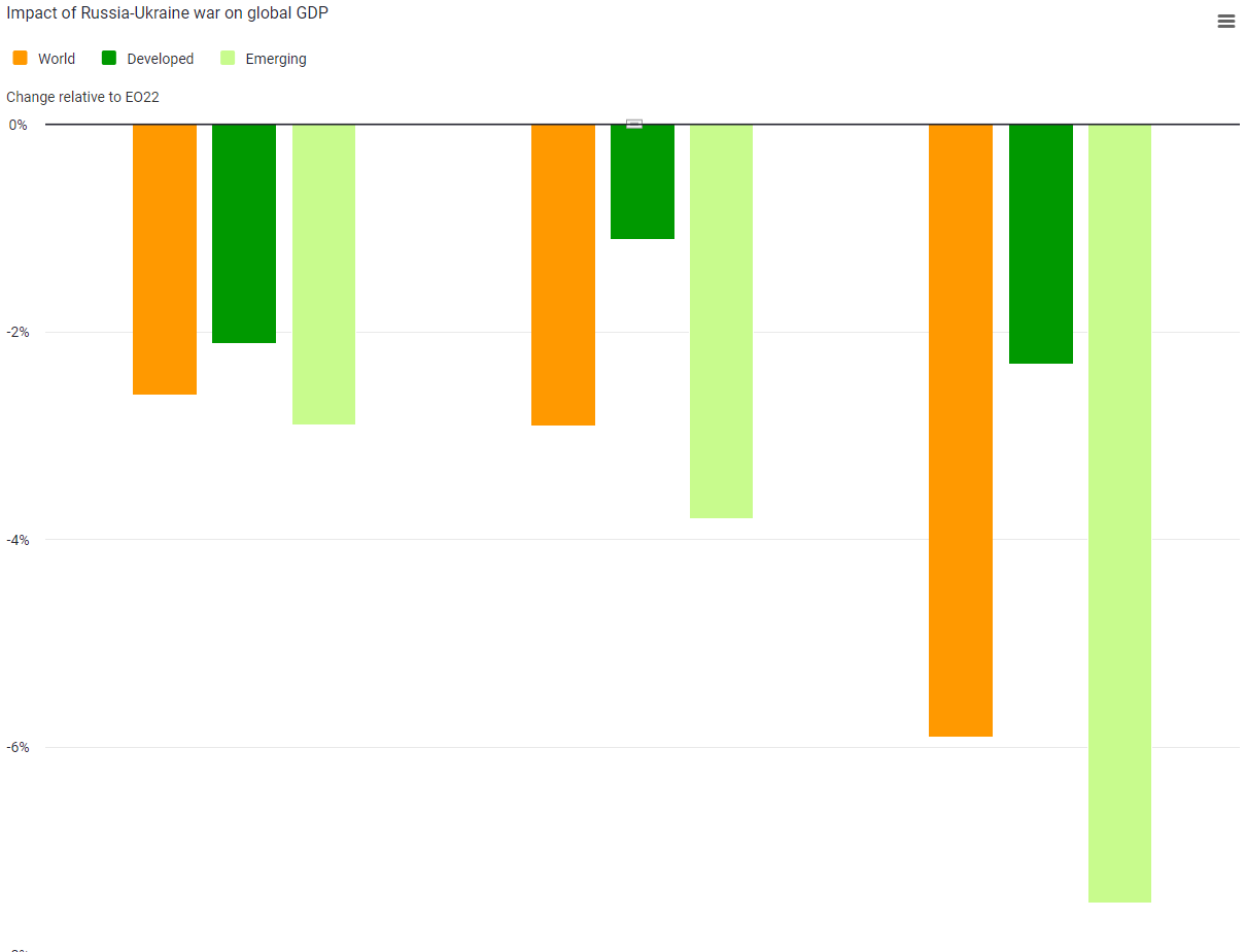
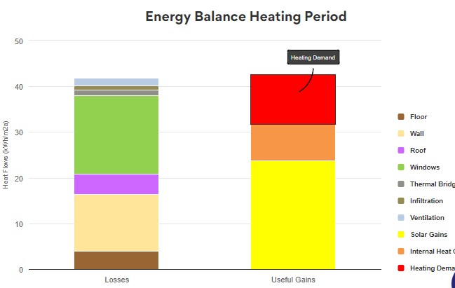
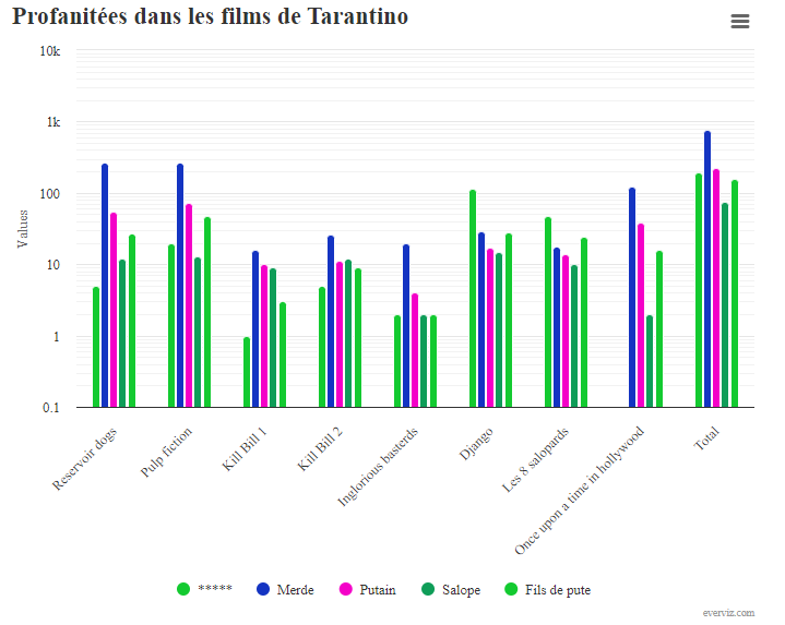
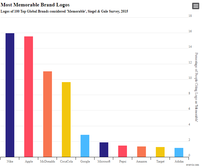
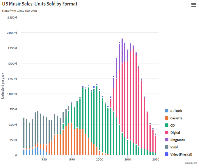
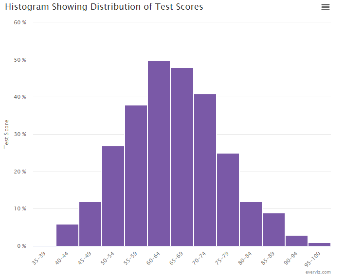
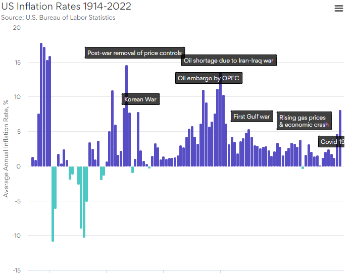
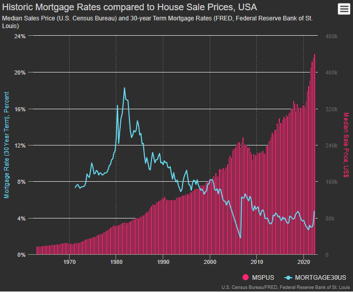
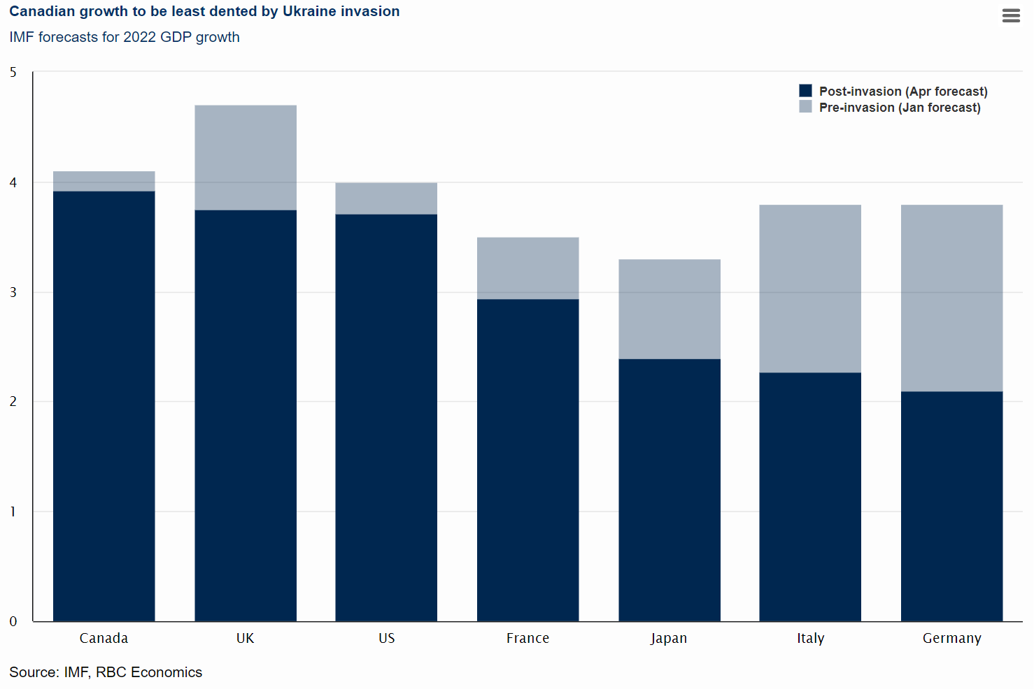
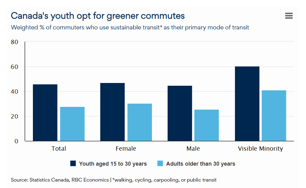
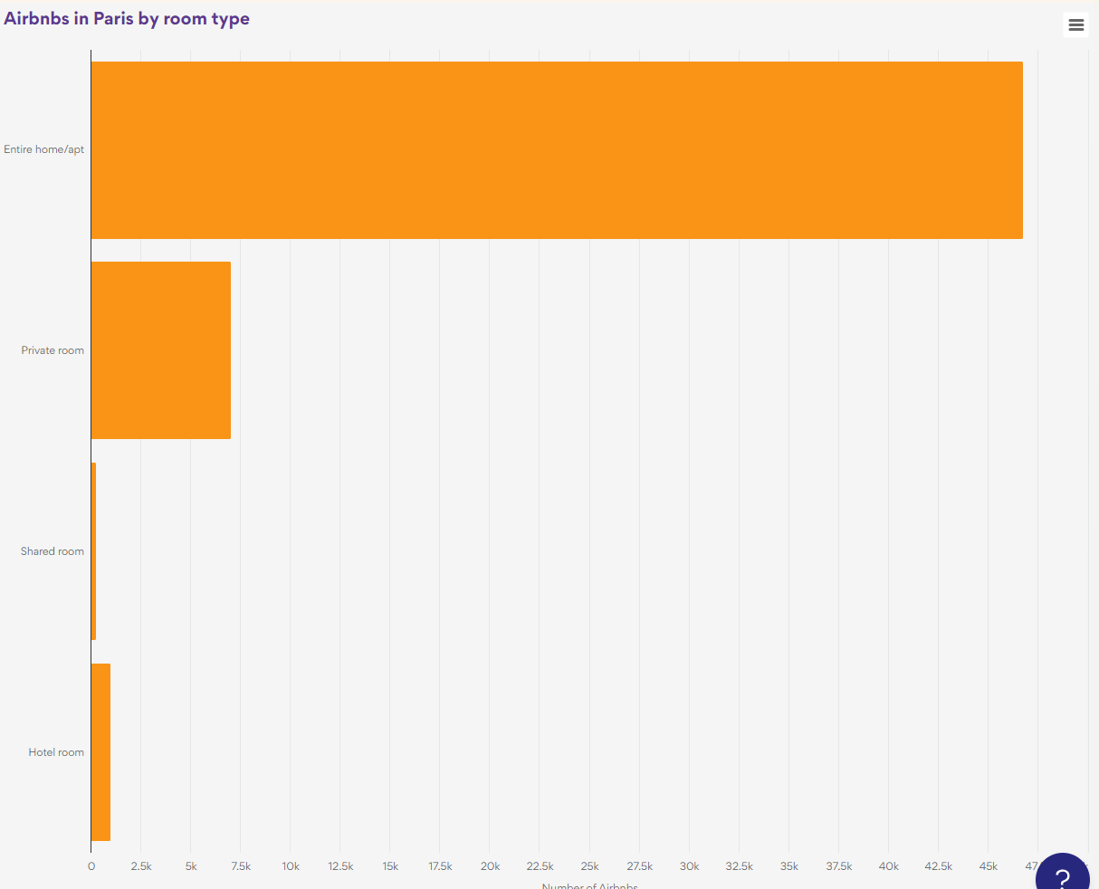
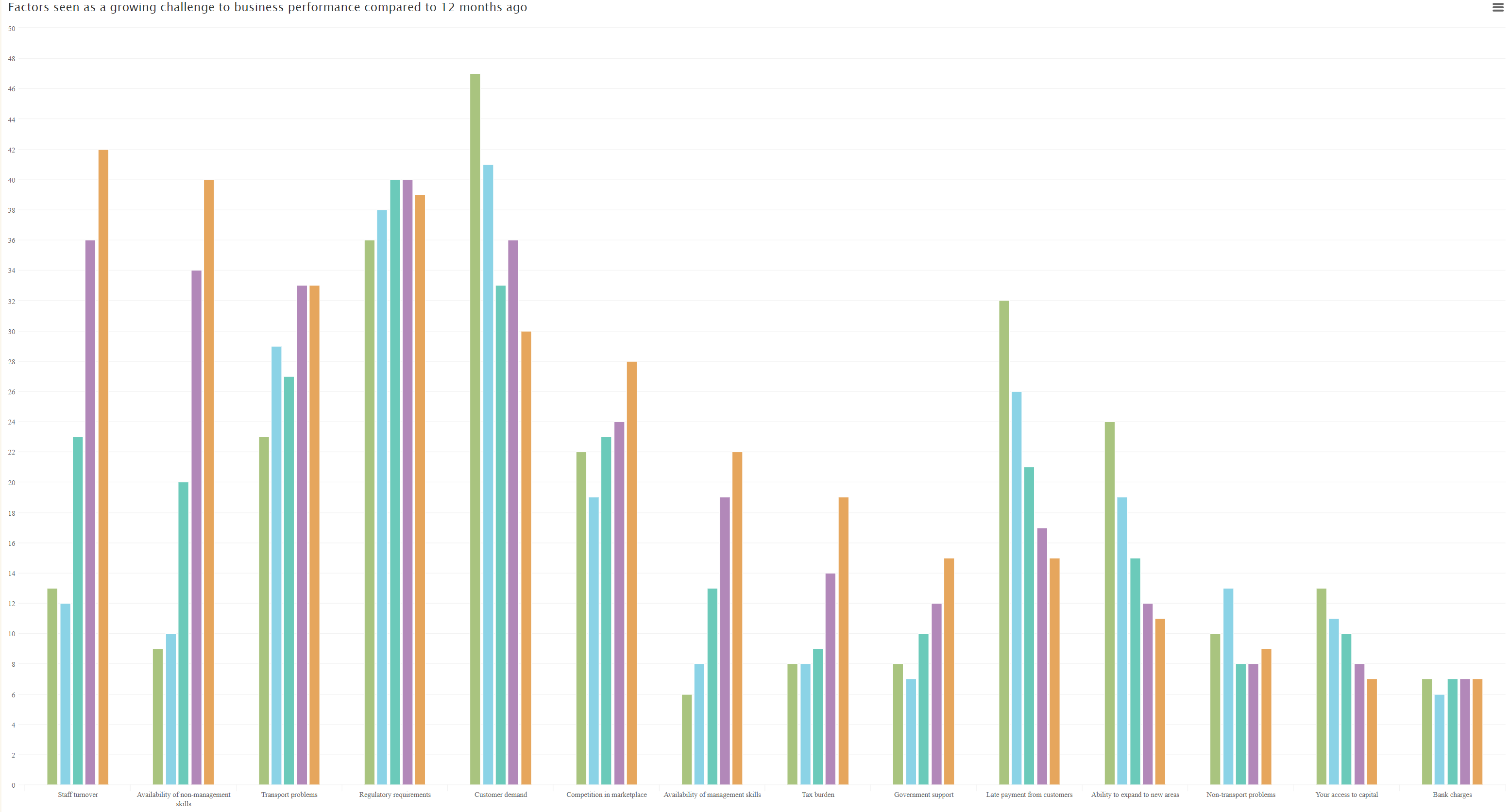
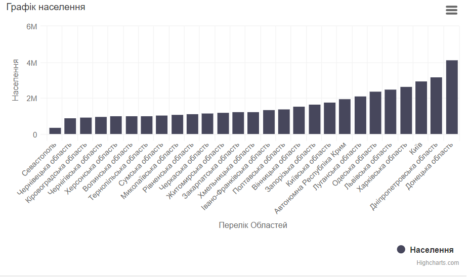
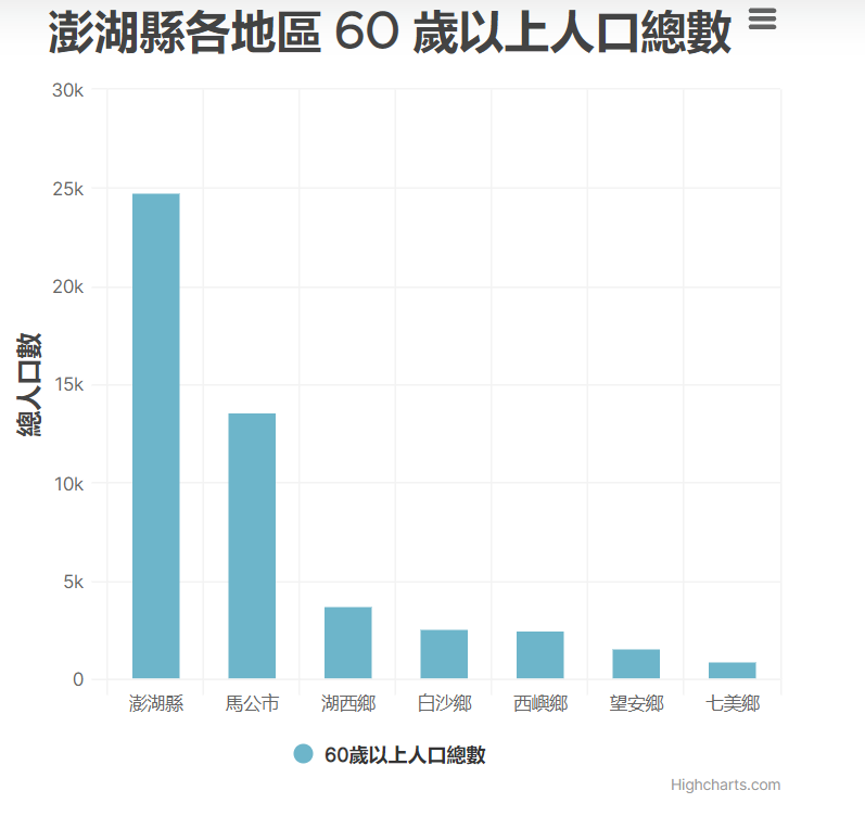
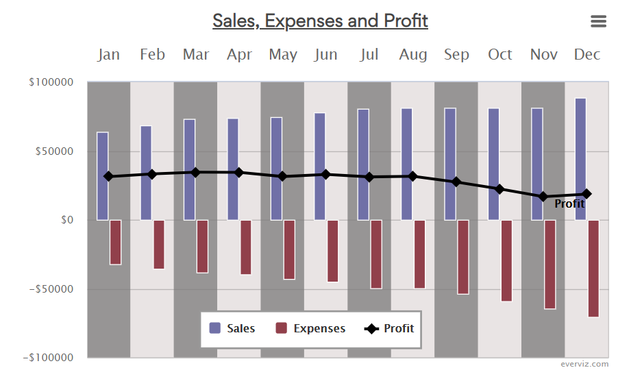
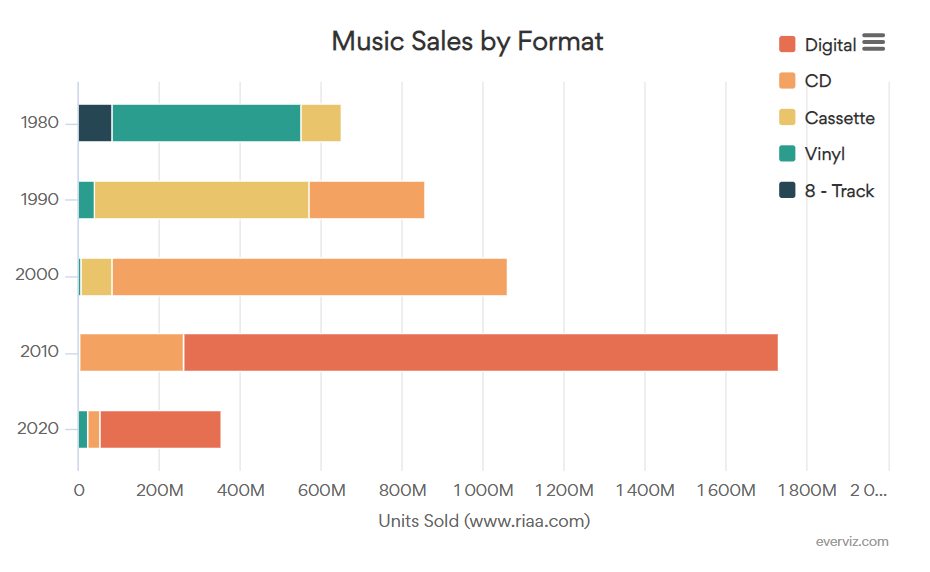
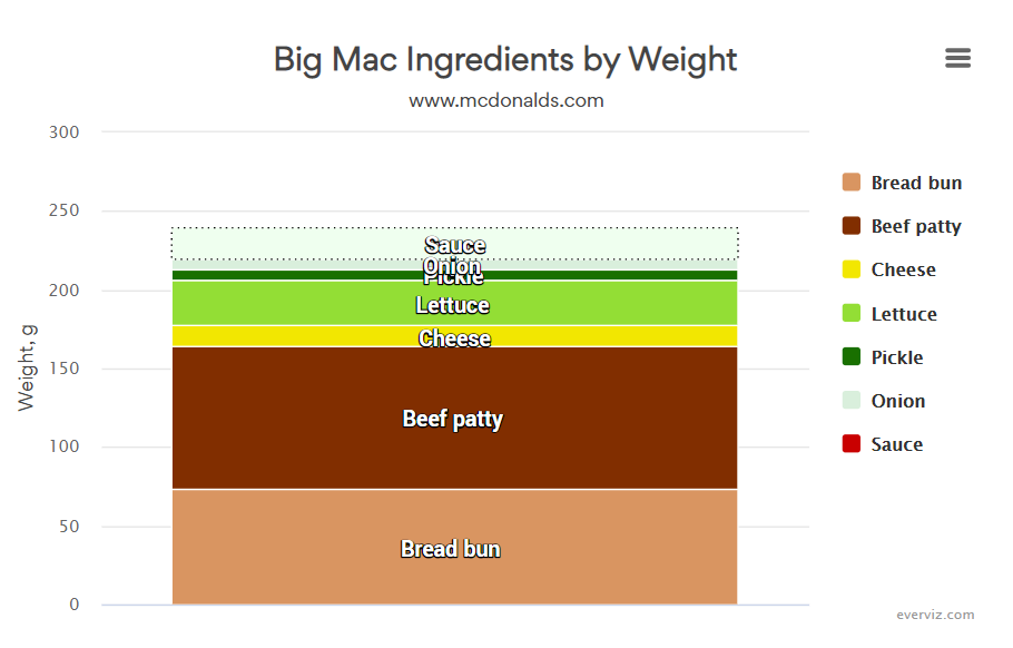
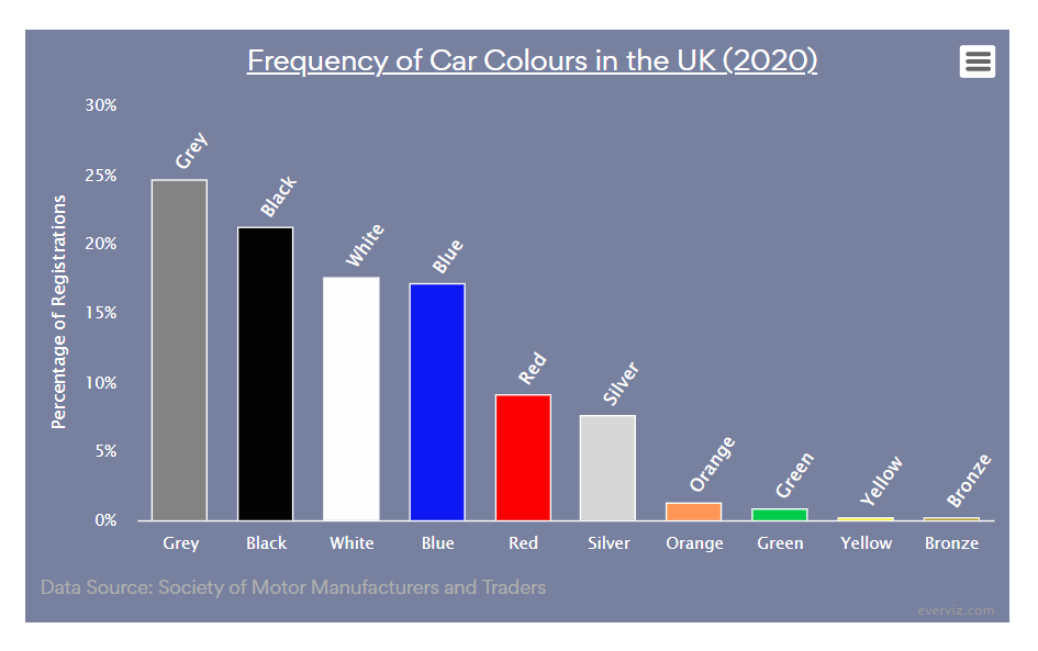
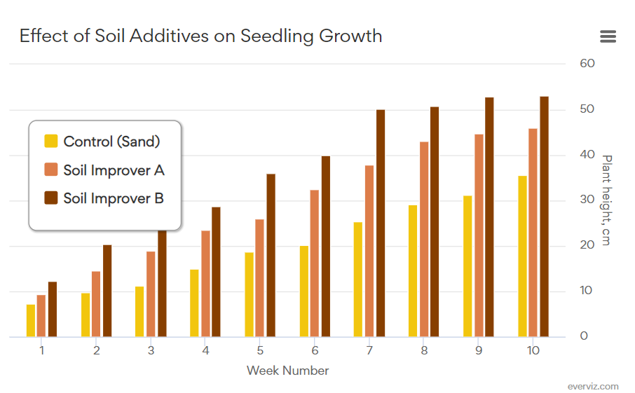
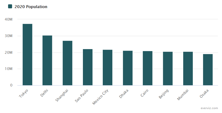
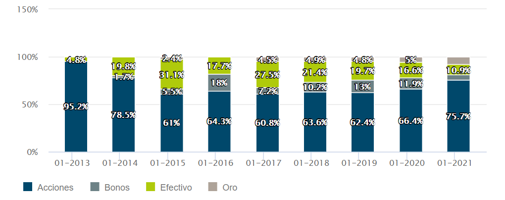
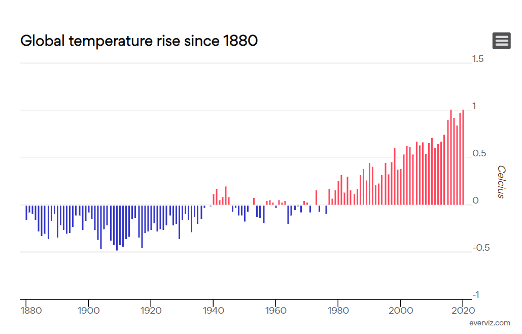
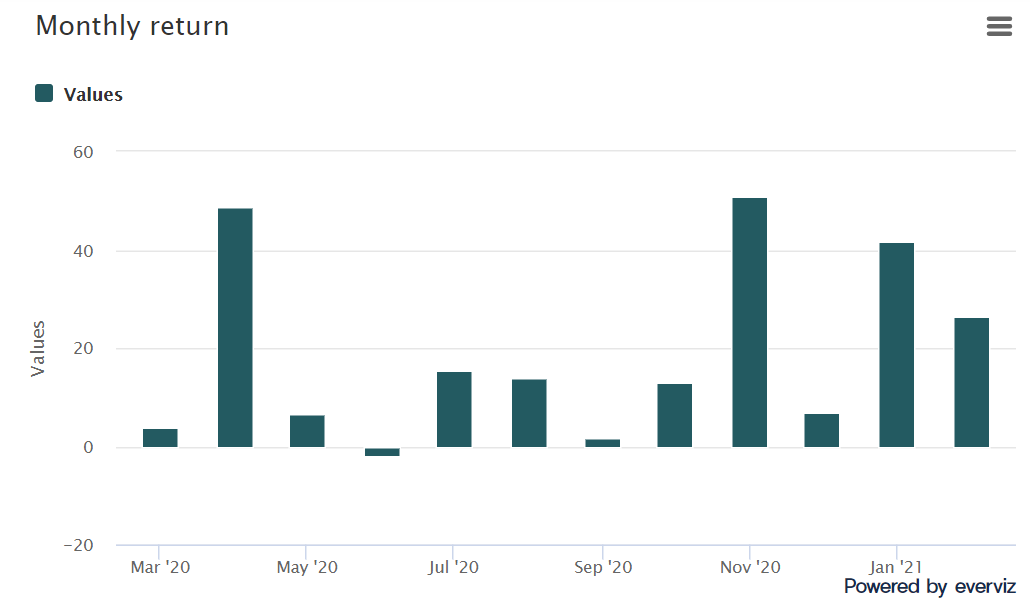
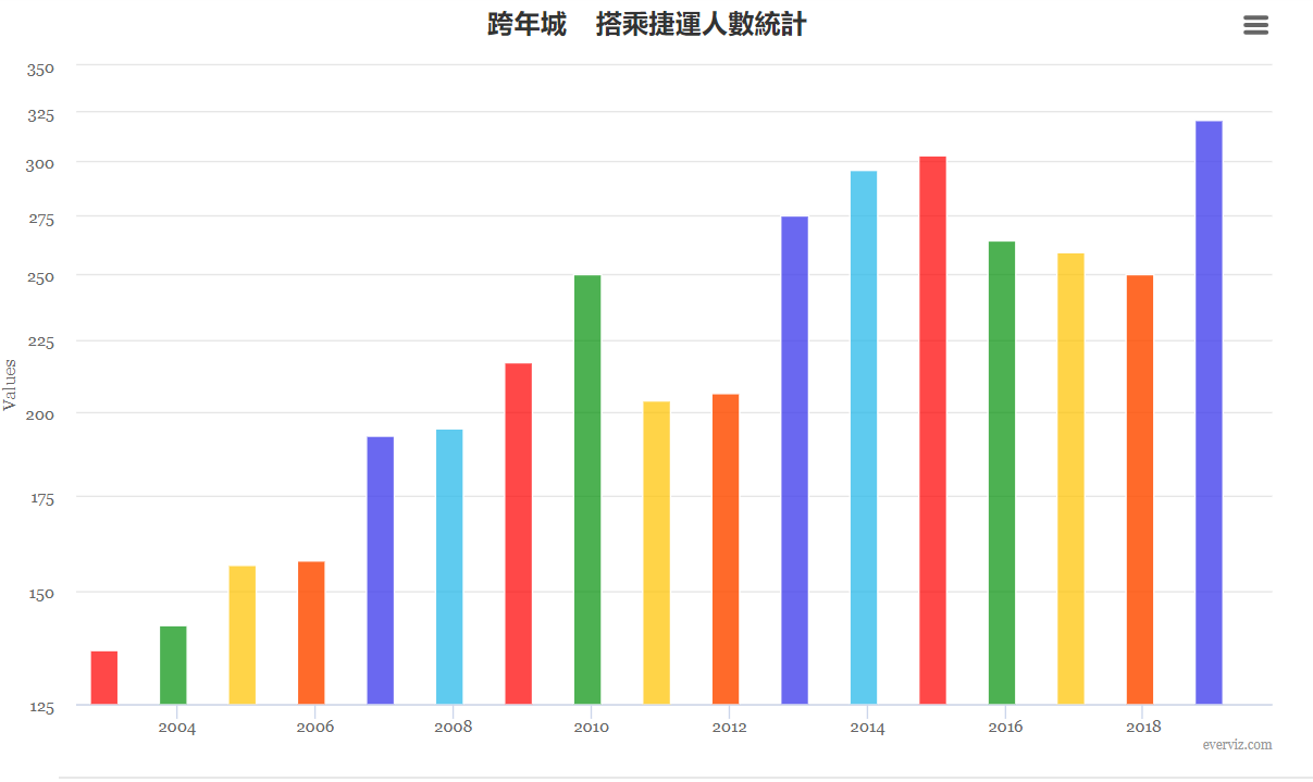
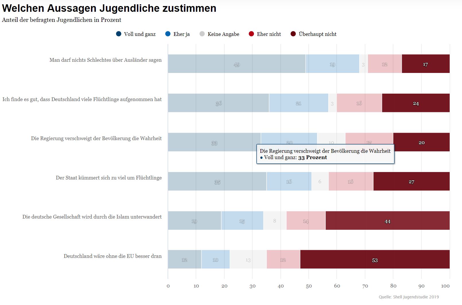
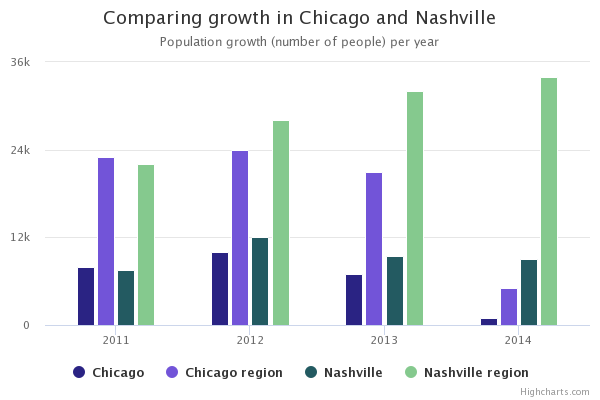
Column charts are similar to bar charts in that they display categorical data and answer the question of “how many/much” for each group. In a column chart, the data is displayed as vertical columns (lines or rectangles), each with a length that is proportional to the value it represents. The category is displayed on the x-axis and the value is plotted on the y-axis.
Column charts are often used to compare values across different categories. For example, they might be used to show the comparative population size of different cities.
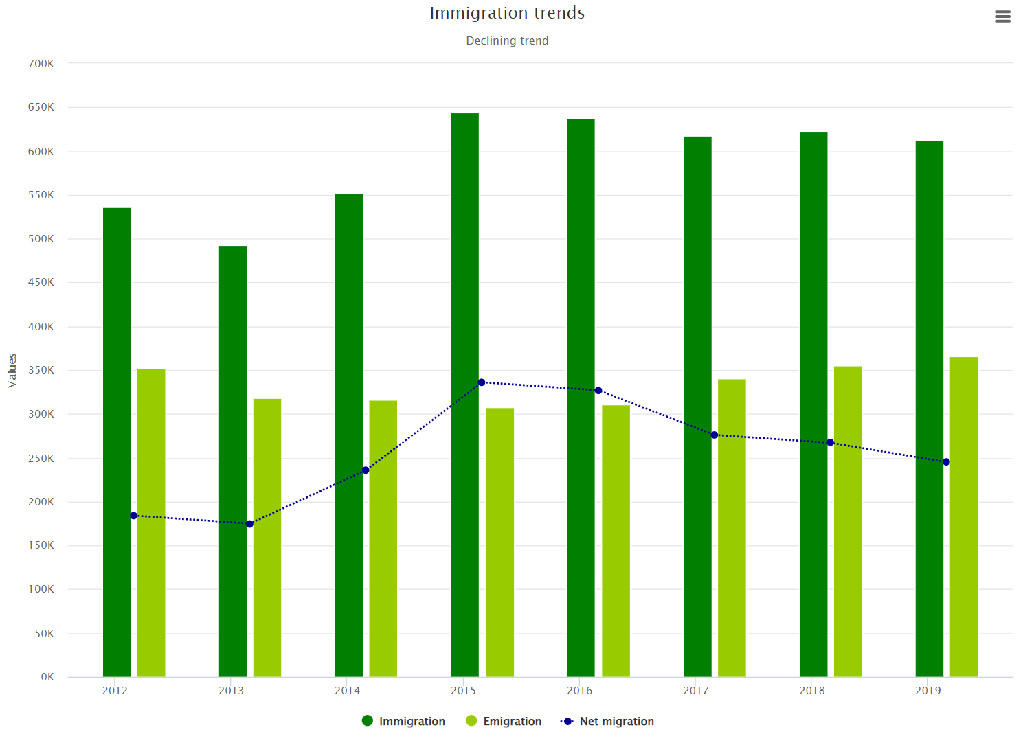
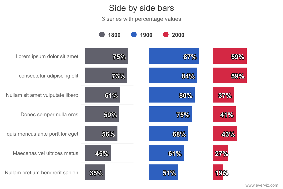
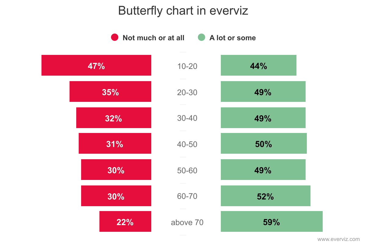
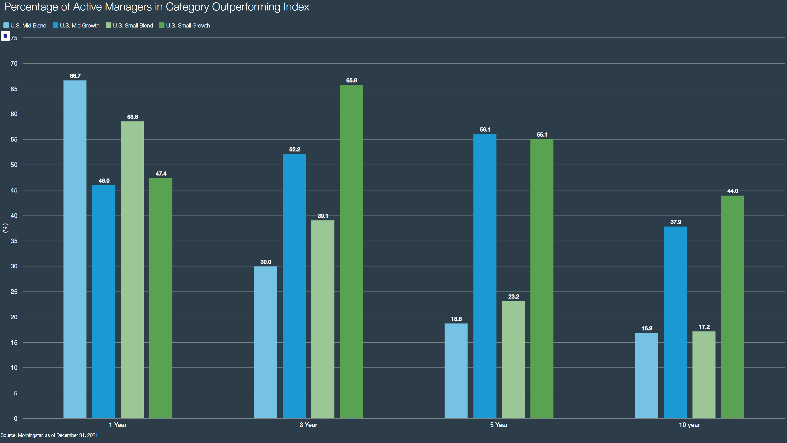
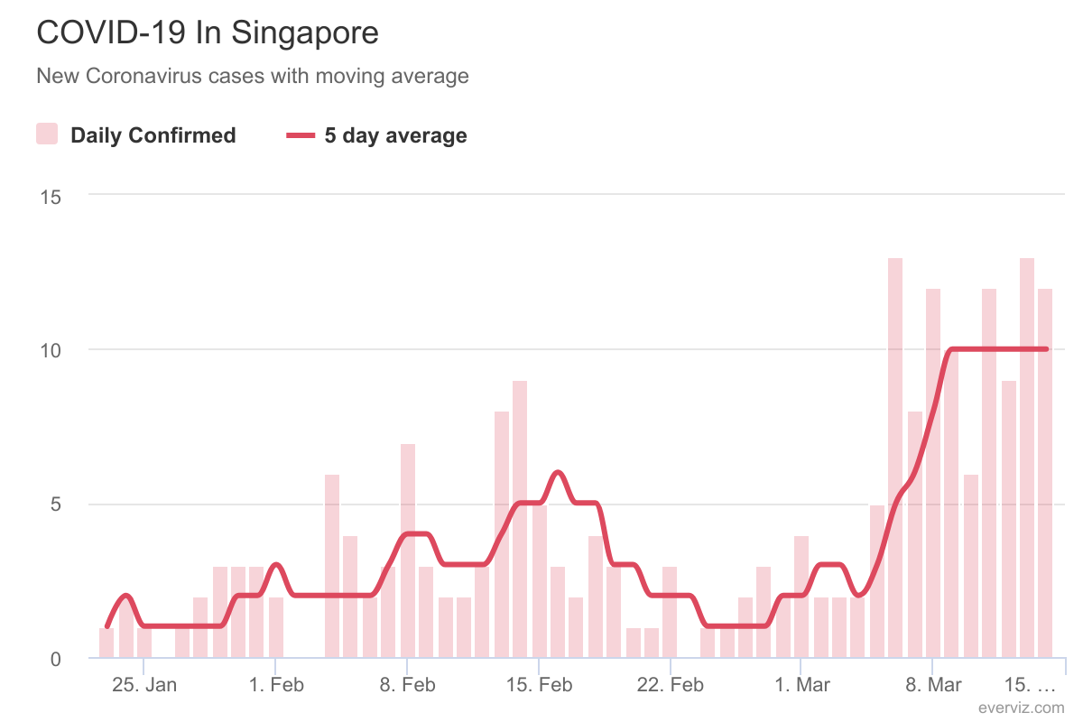
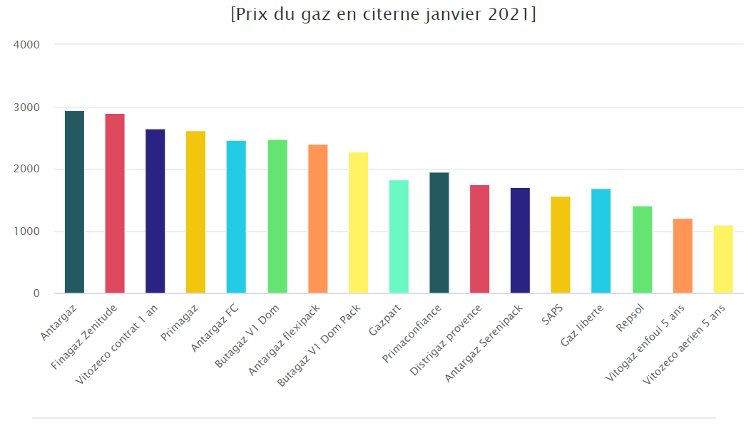
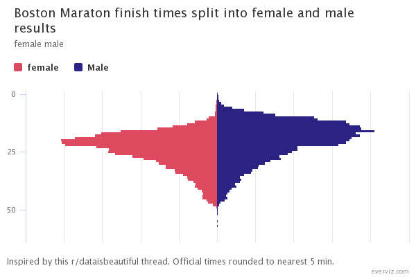
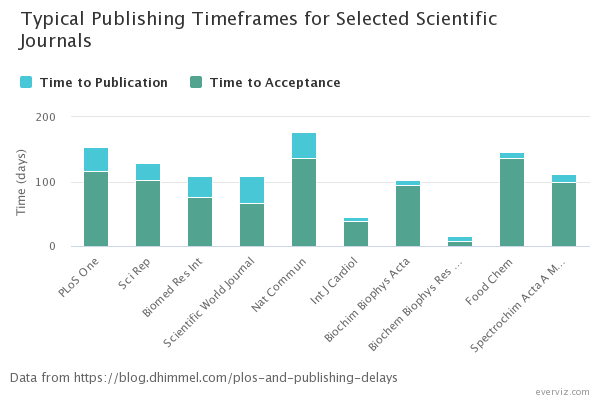
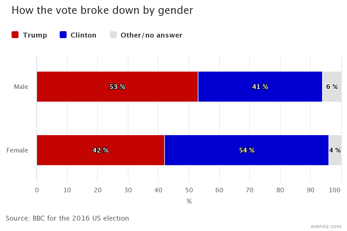
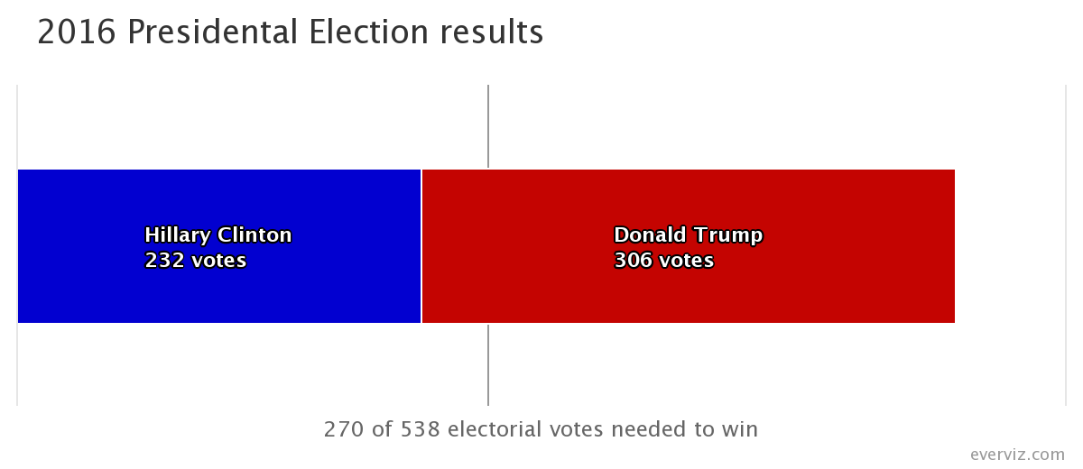
Below are example of column and bar charts created in everviz.