
2023 in review
2023 was a turbulent year on the international stage. Conflicts in Europe and the Middle east dominated the news, as did reports of tension between
2023 was a turbulent year on the international stage. Conflicts in Europe and the Middle east dominated the news, as did reports of tension between

Sunnmørsposten newspaper (SMP) is located in Ålesund, a city of 67,000 nestled in the beautiful fjord landscape of Western Norway. The newspaper has 2.5 million

In recent years, Airbnb has grown to become one of the most popular websites for holiday homes and other short-term rentals. It allows property owners to gain income from their accommodation, and it provides travellers with a wide range of rental choices.
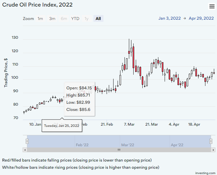
A candlestick chart is a type of graph used to display financial information such as trading patterns. The column of the candlestick is known as the ‘real bar’ and is used to show the prices at the opening and closing of the day’s trading.

Data expert Diana Guerrero offers tips and tricks on how to mine data sets for insights and outliers.
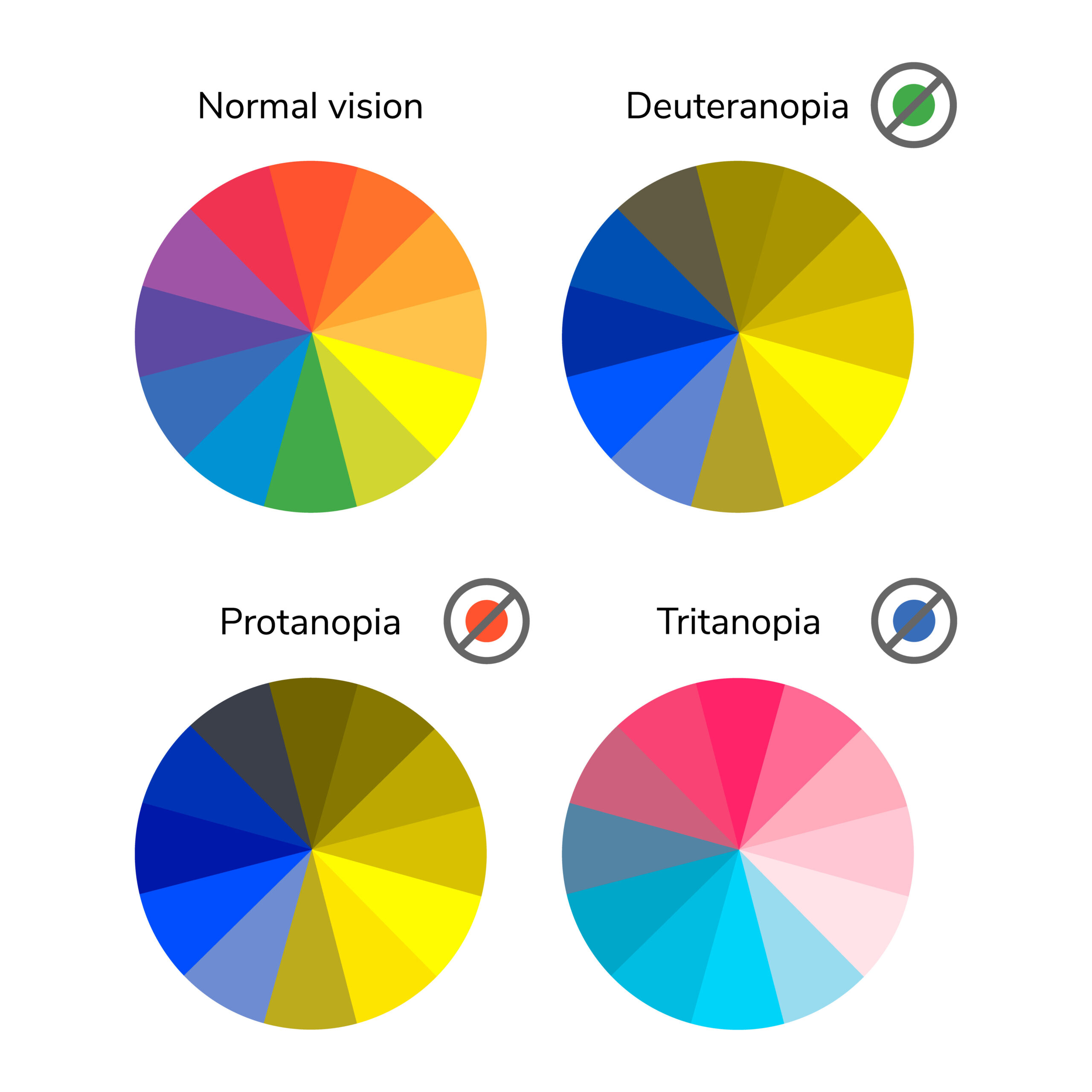
In this post we’ll take a closer look at low vision and how it relates to visualizations with everviz.
“Low vision” refers to visual impairments other than blindness. Other terms, like “partially sighted” and “sight impaired,” have different meanings depending on the context.
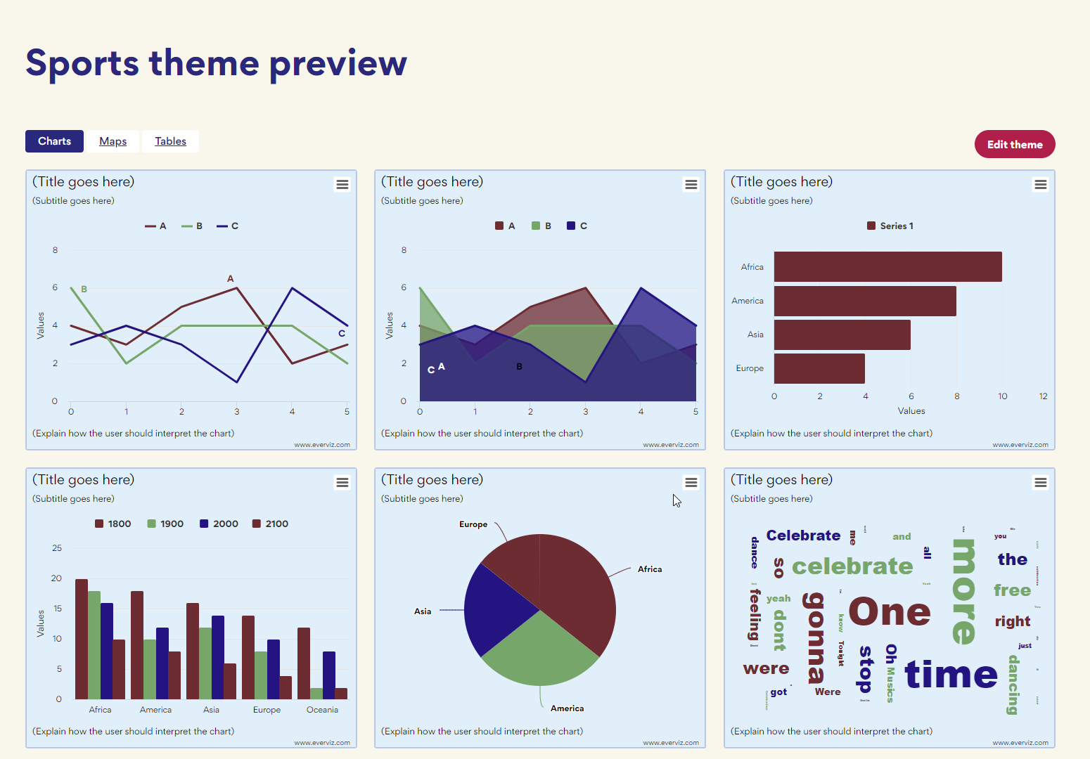
Themes is an easy way to ensure all your charts load with your organisation’s branding.

This article will focus on all the benefits you will be rewarded with a solid accessibility strategy for your website. Without going too deep into the technical aspects, we are going to discuss how you can make an impact for the people that are most important to your business: your customers and visitors. On top of that you’re contributing positively to society.

The FIFA World Cup Cup is one of the greatest sporting events in existence. That’s why we decided to to put together some world cup
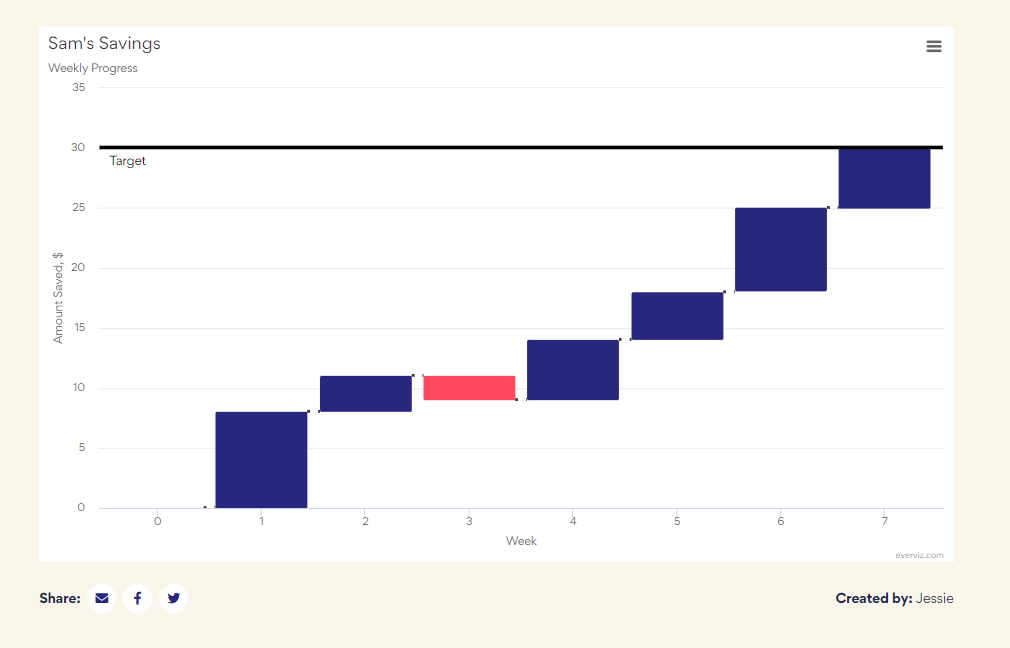
Waterfall charts are used to visualize cumulative values, where each data point contributes to a running total. The data points are displayed as floating columns, often connected by a line to illustrate the sequential relationship.
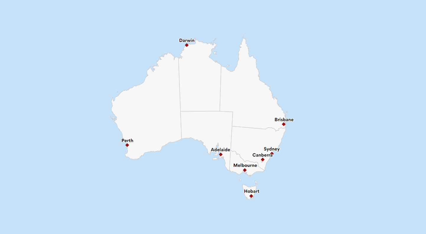
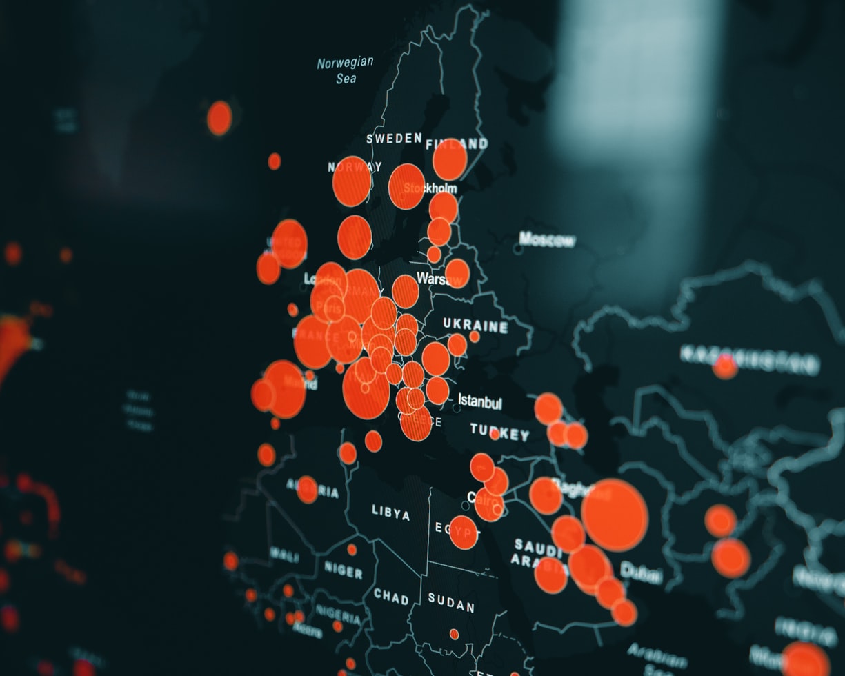
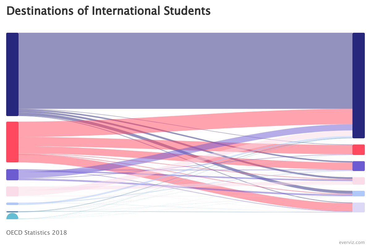
An interactive map allows users to explore and engage with data plotted on geographical coordinates. Many interactive maps will allow users to pan or zoom in on a location of interest. Some may allow users to see more detailed information by selecting features on the map. Maps can be used as visualization tools to display data associated with geographical locations in different ways.
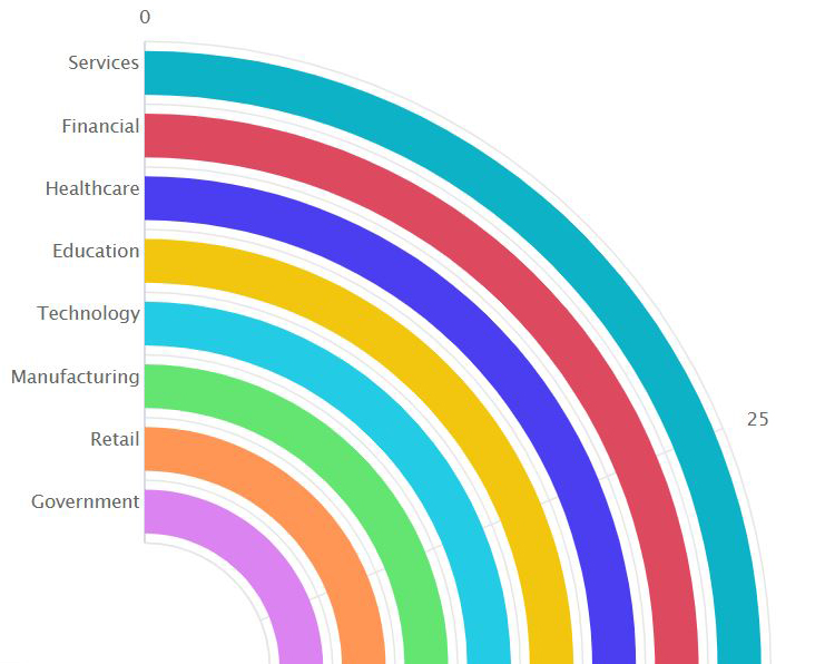
Let’s start with a few key statistics. Healthcare takes more than 10% of the GDP of most developed countries. In fact, in 2020, 21% of the US GDP was spent on healthcare. That is more than any other US program. Healthcare amounted to 12.8% of the GDP in the UK and 11.3% of the GDP in Norway.
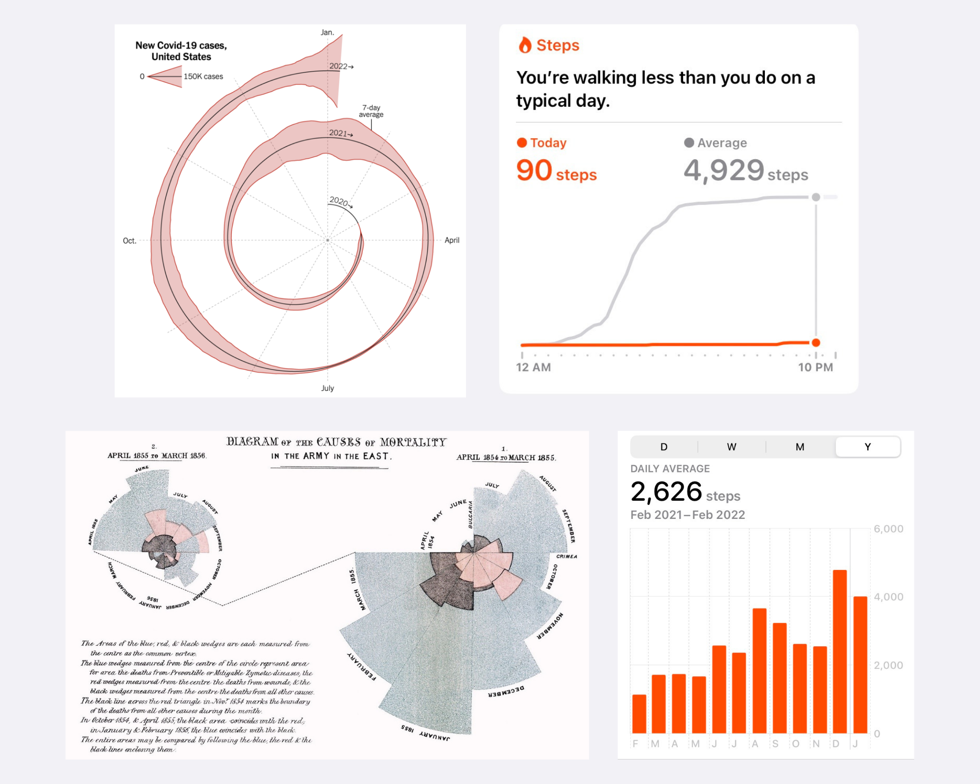
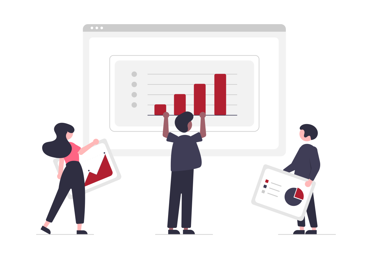
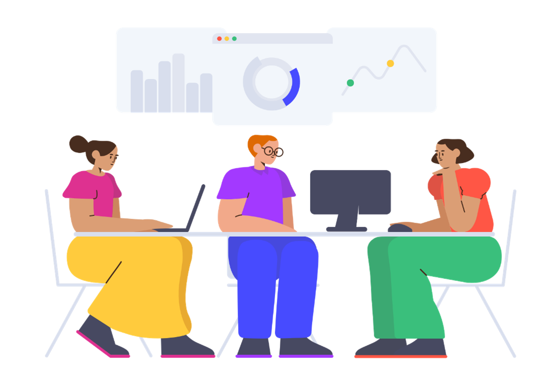
Graphs can be a wonderful tool to make data clear, engaging, and accessible to your audience. However, picking the right data visualization to communicate your story can be hard.
Climate change and global warming is a hot topic and on everyone’s mind these days. Still, communicating the crisis that is upon us is not
This is a guest blog post by Rebeca Pop, founder of Vizlogue, a Data Visualization and Storytelling Lab that offers workshops and consulting services. You
The COVID-19 pandemic triggered a funding crisis for non-government organizations (NGOs) and advocacies worldwide — right when they are needed the most. The World Economic
We’re excited to share with you a new feature in beta: Download project as video Our mission is to make it easy for anyone to
Imagine this scenario. Alex is an analyst working for a biotech company. He joined the organization two weeks ago. His manager calls him into her office and asks him to prepare a presentation for a few executives.
While I am not arguing that you should forget altogether about pie charts, bar charts, and line charts, there are situations in which a more innovative chart type could work better.
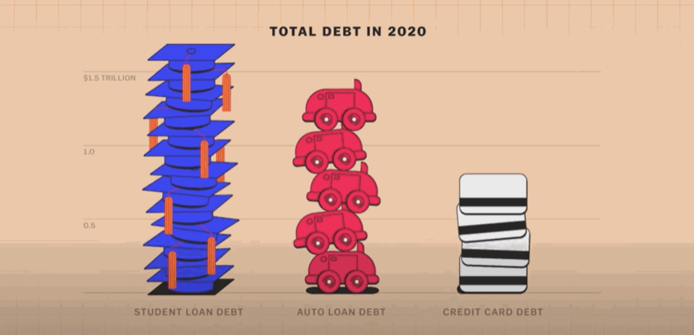
It can be difficult to communicate financial information to different audiences, but a well-designed graph or chart can help you to get your message across.

Pick the right color, make thoughtful chart choices, consider color-blindness, avoid clutter – you dive deep into each of these topics, master them, and, done! You are ready to start creating informative and effective data visualizations.
If you are a researcher or academic, the growth of the internet has brought many opportunities for sharing your achievements with the world! However, journal
This post was originally published on the Highcharts blog, and was transferred as part of the rebrand from Highcharts Cloud to everviz. More than 3,000
