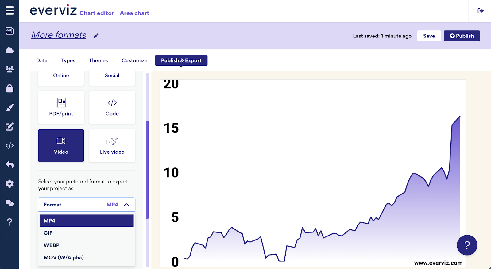
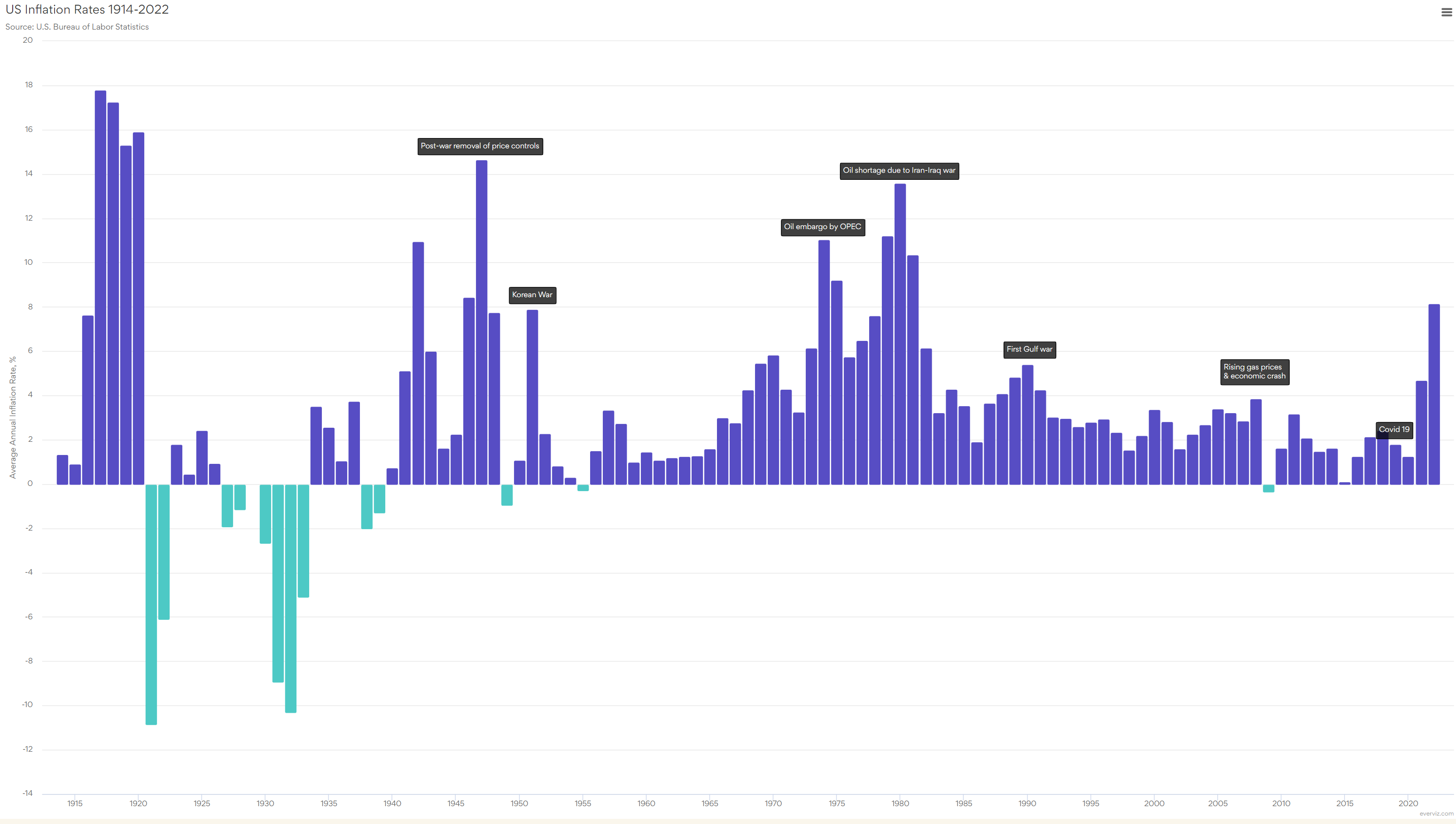
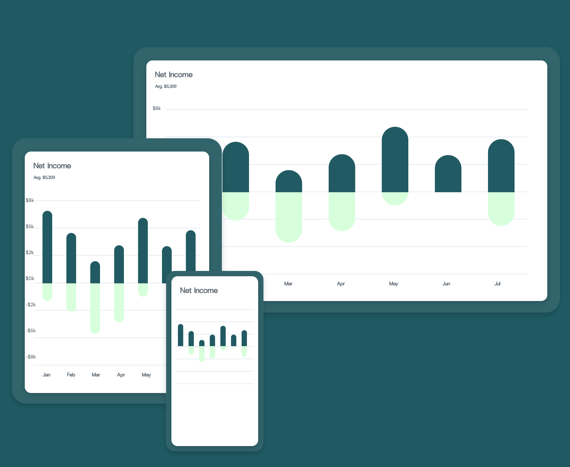
Tag: interactive

2023 in review

2023 in review

2023 was a turbulent year on the international stage. Conflicts in Europe and the Middle east dominated the news, as did reports of tension between

Building a Data Viz Style Guide

This is a featured blog post by Amy Cesal, Product Evangelist at everviz. A three-time winner of the Information is Beautiful awards, Amy is an

The 10 cities with the most Airbnbs

The 10 cities with the most Airbnbs

In recent years, Airbnb has grown to become one of the most popular websites for holiday homes and other short-term rentals. It allows property owners to gain income from their accommodation, and it provides travellers with a wide range of rental choices. 

How to create a candlestick chart

How to create a candlestick chart

A candlestick chart is a type of graph used to display financial information such as trading patterns. The column of the candlestick is known as the ‘real bar’ and is used to show the prices at the opening and closing of the day’s trading.

Low vision and visualizations with everviz

Low vision and visualizations with everviz

In this post we’ll take a closer look at low vision and how it relates to visualizations with everviz.
“Low vision” refers to visual impairments other than blindness. Other terms, like “partially sighted” and “sight impaired,” have different meanings depending on the context.

Top 5 benefits of accessible websites

Top 5 benefits of accessible websites

This article will focus on all the benefits you will be rewarded with a solid accessibility strategy for your website. Without going too deep into the technical aspects, we are going to discuss how you can make an impact for the people that are most important to your business: your customers and visitors. On top of that you’re contributing positively to society.

How to Create A Waterfall Chart

How to create a waterfall chart

Waterfall charts are used to visualize cumulative values, where each data point contributes to a running total. The data points are displayed as floating columns, often connected by a line to illustrate the sequential relationship.

Universal design gives universal access

Universal design gives universal access

Accessibility is crucial to our visualization platform, as it enables our customers to reach out with content, news and insights to the largest possible audience.

How to create a map

How to create a map

An interactive map allows users to explore and engage with data plotted on geographical coordinates. Many interactive maps will allow users to pan or zoom in on a location of interest. Some may allow users to see more detailed information by selecting features on the map. Maps can be used as visualization tools to display data associated with geographical locations in different ways.

How to design an interactive table

How to design an interactive table

Data tables can be a great way of summarizing information and sharing it with your audience.  Tables can break up sections of text and encourage

Interactive Corona charts and maps

Visualizations play an important part in making data digestible and turned into actionable insights. We are working day and night to enhance our service to

From spreadsheet to interactive chart

For visualization, spreadsheet tools such as Excel, Google Sheets, LibreOffice, etc. are often used to enter, organize and sort data. Then, one may look for ways to visualize the data using built-in charts’ functionality or his/her favorite 3rd party tool. In this guide, I will show you how to use any spreadsheet tool together with everviz to create a chart that communicates your data most effectively.