
The hook, the meat and the package: data viz inspiration
This is a featured blog post by Amy Cesal, Product Evangelist at everviz. A three-time winner of the Information is Beautiful awards, Amy is an
This is a featured blog post by Amy Cesal, Product Evangelist at everviz. A three-time winner of the Information is Beautiful awards, Amy is an
This is a featured blog post by Amy Cesal, Product Evangelist at everviz. A three-time winner of the Information is Beautiful awards, Amy is an
This is a featured blog post by Amy Cesal, Product Evangelist at everviz. A three-time winner of the Information is Beautiful awards, Amy is an

In recent years, Airbnb has grown to become one of the most popular websites for holiday homes and other short-term rentals. It allows property owners to gain income from their accommodation, and it provides travellers with a wide range of rental choices.
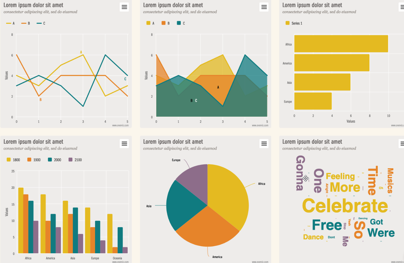
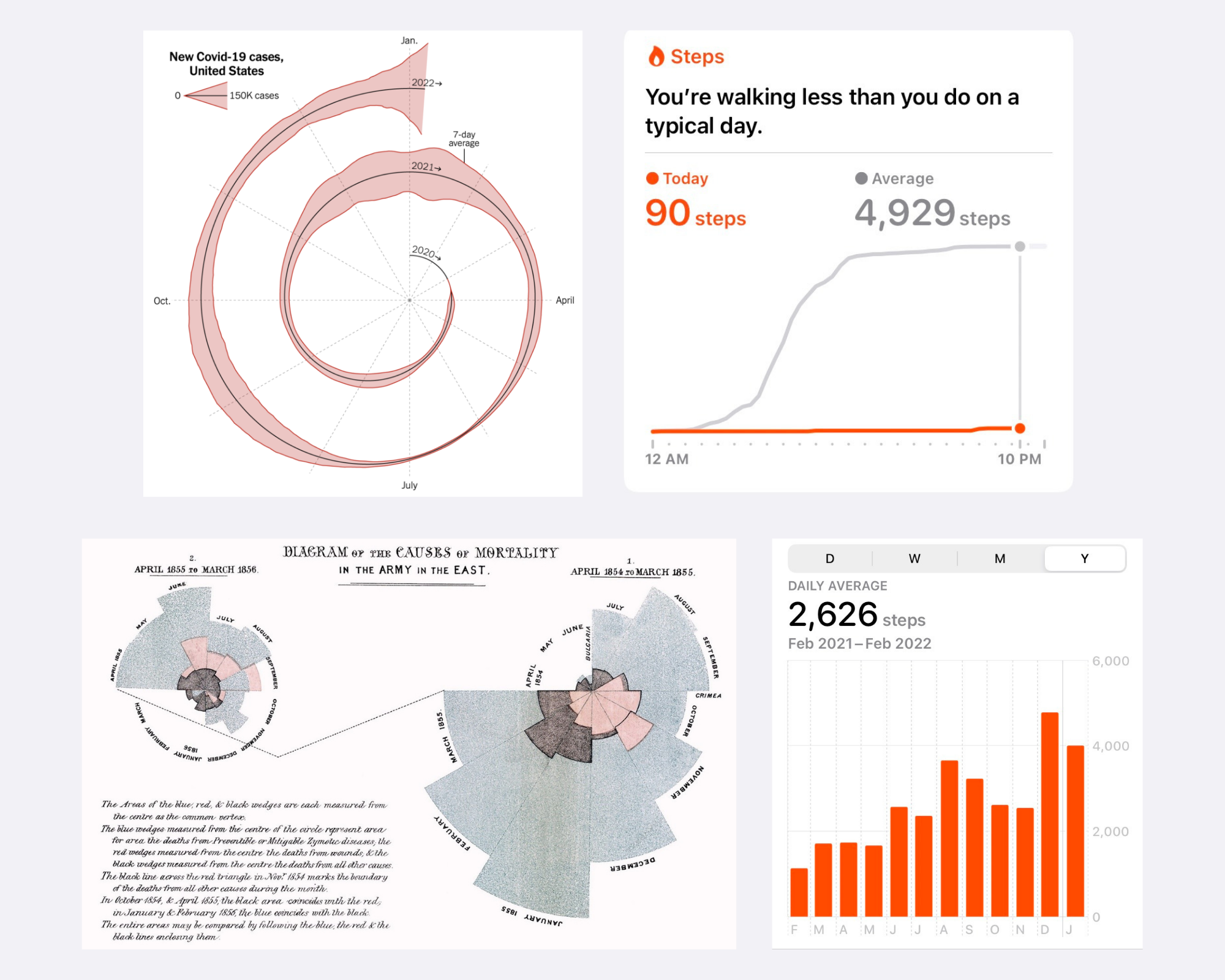
Sometimes the right chart type isn’t one that you’ve used in the past, but rather a chart type that you’ve come across online.

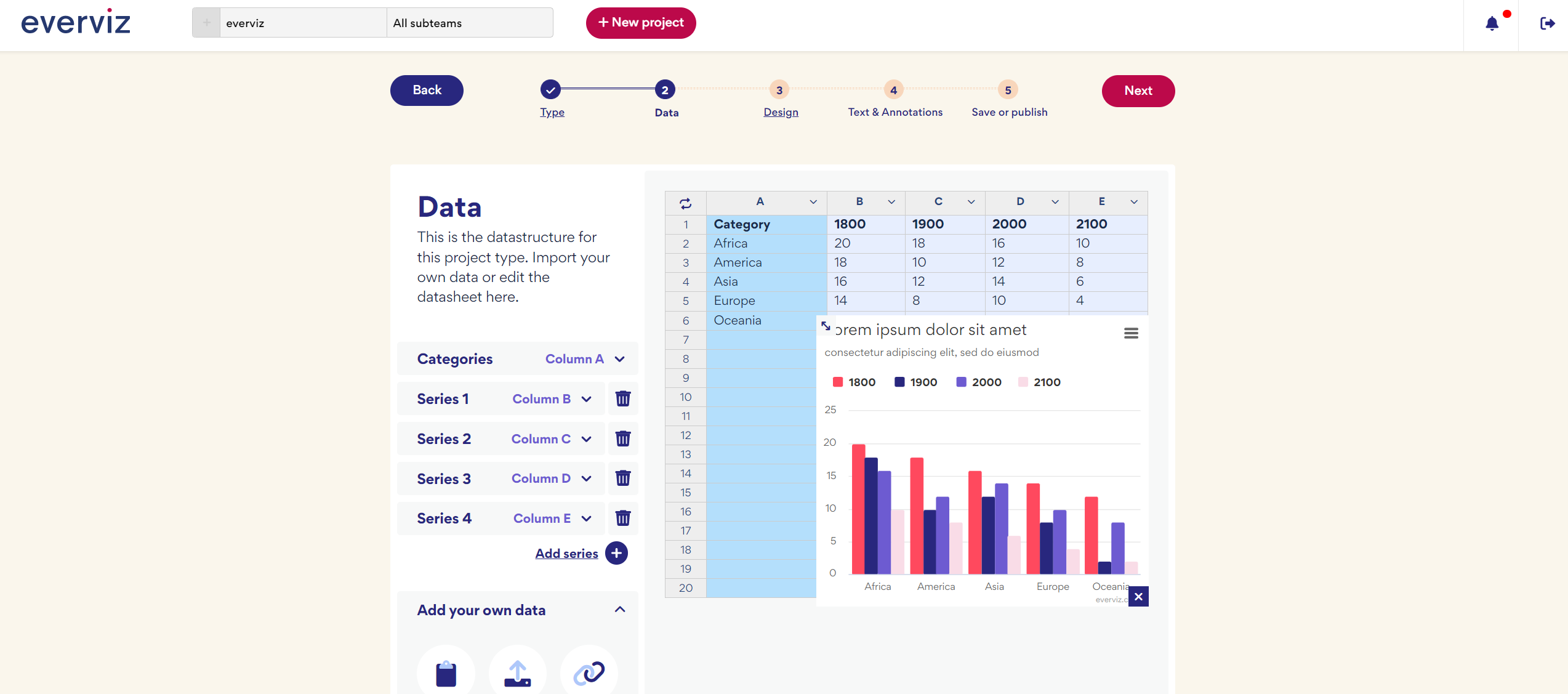
At everviz, we think a lot about interactivity. We write about it. We build it into the program. Our latest chart type, the packed bubble
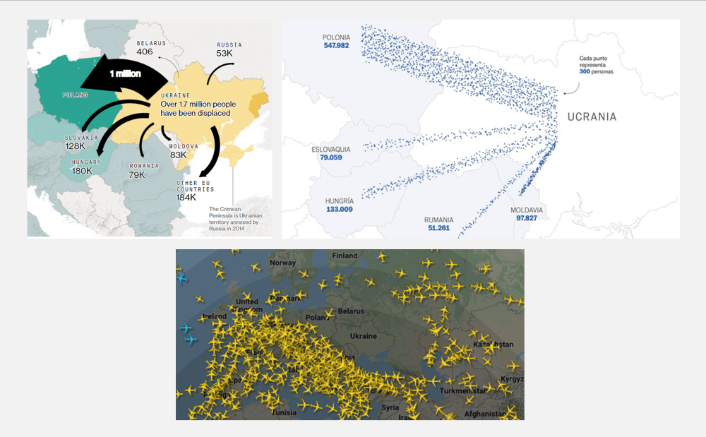
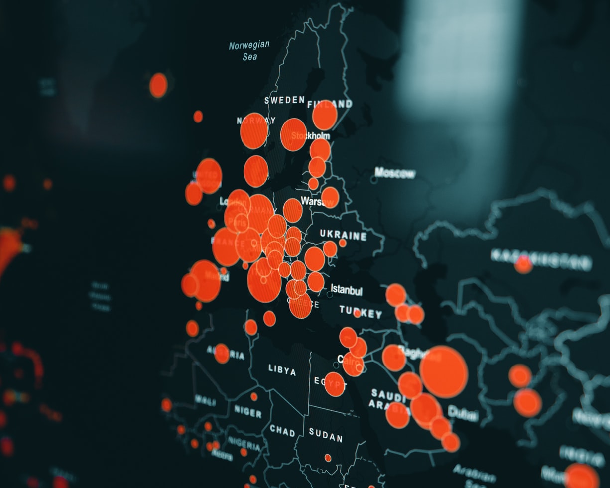
Shortly after Russia invaded Ukraine at the end of February, media publications started sharing maps of Ukraine and its neighbouring countries.
Let’s start with a few key statistics. Healthcare takes more than 10% of the GDP of most developed countries. In fact, in 2020, 21% of the US GDP was spent on healthcare. That is more than any other US program. Healthcare amounted to 12.8% of the GDP in the UK and 11.3% of the GDP in Norway.
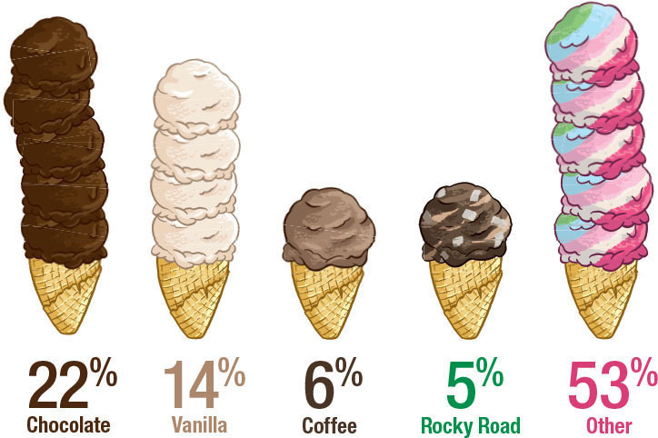
Graphs can be a wonderful tool to make data clear, engaging, and accessible to your audience. However, picking the right data visualization to communicate your story can be hard.
Data visualizations are an excellent marketing tool with a wide range of potential uses. Visuals can be a powerful addition to a marketing campaign. They
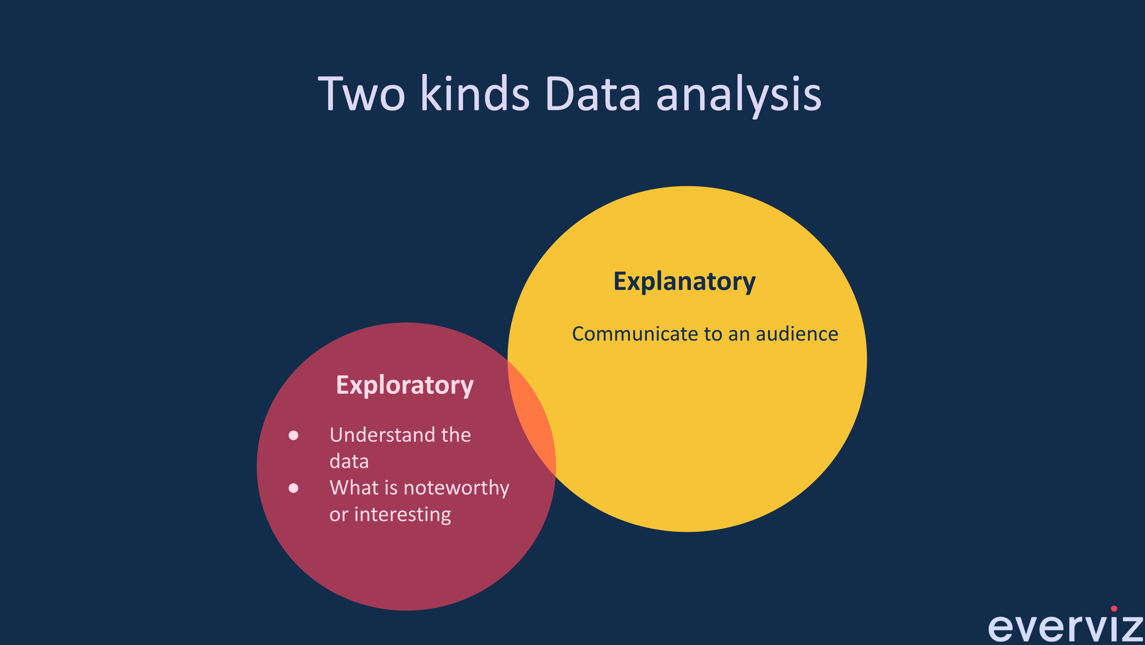
What is the difference between exploratory and explanatory data Visualization? Exploratory Data Visualizations are charts or graphs that are usually created during the data analysis
This is a guest blog post by Rebeca Pop, founder of Vizlogue, a Data Visualization and Storytelling Lab that offers workshops and consulting services. You
The COVID-19 pandemic triggered a funding crisis for non-government organizations (NGOs) and advocacies worldwide — right when they are needed the most. The World Economic

Imagine this scenario. Alex is an analyst working for a biotech company. He joined the organization two weeks ago. His manager calls him into her office and asks him to prepare a presentation for a few executives.

Let me ask you this: Do you recall the first time you created a graph? I still have a vivid memory of the first time that I designed one. I was in my first year of college and had to visualize data for my Statistics class.

Here at everviz our mission is to enable our customers to reach out with content, news and insights to the largest possible audience. This means

This post was originally published on the Highcharts blog, and was transferred as part of the rebrand from Highcharts Cloud to everviz. More than 3,000
At everviz, we want to help everyone easily visualize and communicate with data. That’s why we handpicked some of our favorite data visualization resources to
