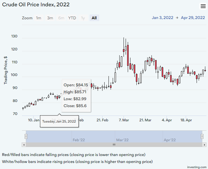
How to create a candlestick chart
A candlestick chart is a type of graph used to display financial information such as trading patterns. The column of the candlestick is known as the ‘real bar’ and is used to show the prices at the opening and closing of the day’s trading.