
The Telegraph’s inclusive approach to visualizing the news
Simplifying complex information in news stories is key to reader engagement at The Telegraph. Charts and maps from everviz help readers understand at a glance
Simplifying complex information in news stories is key to reader engagement at The Telegraph. Charts and maps from everviz help readers understand at a glance

Video as an increasingly popular medium for conveying information. Our customers want to know – how do we make engaging videos with beautiful and relevant

The US election this November promises to be one of the biggest stories of the year. A data-driven event, where visualization of vote tallies stands

This is a featured blog post by Amy Cesal, Product Evangelist at everviz. A three-time winner of the Information is Beautiful awards, Amy is an

2023 was a turbulent year on the international stage. Conflicts in Europe and the Middle east dominated the news, as did reports of tension between
This is a featured blog post by Amy Cesal, Product Evangelist at everviz. A three-time winner of the Information is Beautiful awards, Amy is an
The University of California, Berkeley places high standards on their data visualizations. Charts must update in real time, satisfy web accessibility requirements, feature university colors
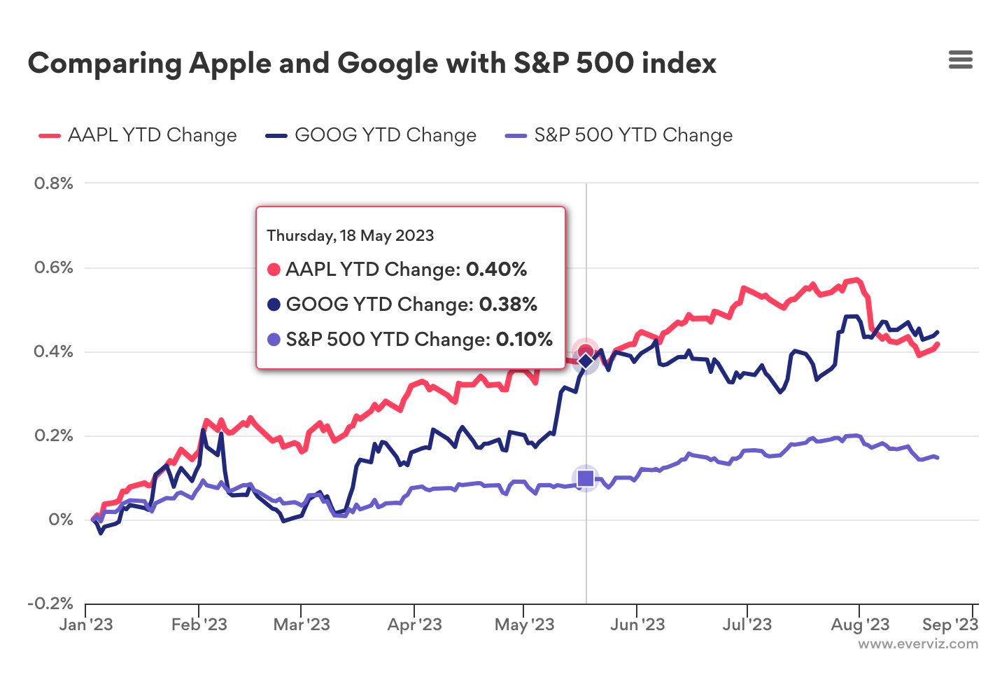
Introduction In this post, we’ll show you how to use the GOOGLEFINANCE function with everviz to create interactive charts and visualizations, and make the most
Charts are key to marketing efforts at Thornburg, a US-based Investment firm. Their thought leadership content is found on multiple platforms, including their website, social
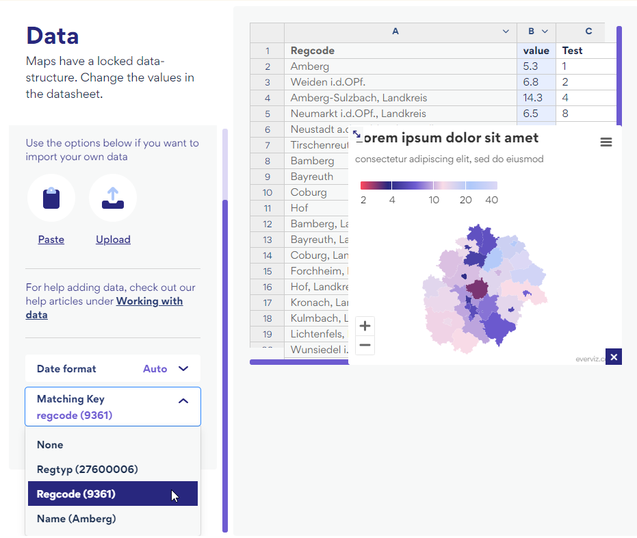
We have some exciting new updates to share. Working with maps and multiplatform publishing just got easier. With the introduction of dynamic fonts, chart text
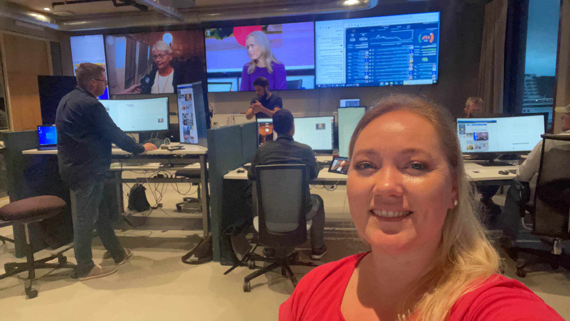
Something extraordinary marked this year’s election coverage at Sunnmørsposten (SMP) newspaper. For the very first time, data graphics enriched the live election night stream. Liv-Jorunn Håker,
This is a featured blog post by Amy Cesal, Product Evangelist at everviz. A three-time winner of the Information is Beautiful awards, Amy is an
Expanding upon our recent announcement of multi-platform visualizations, we’re thrilled to introduce even more versatile formats to enhance your content. Enhance your visual content with
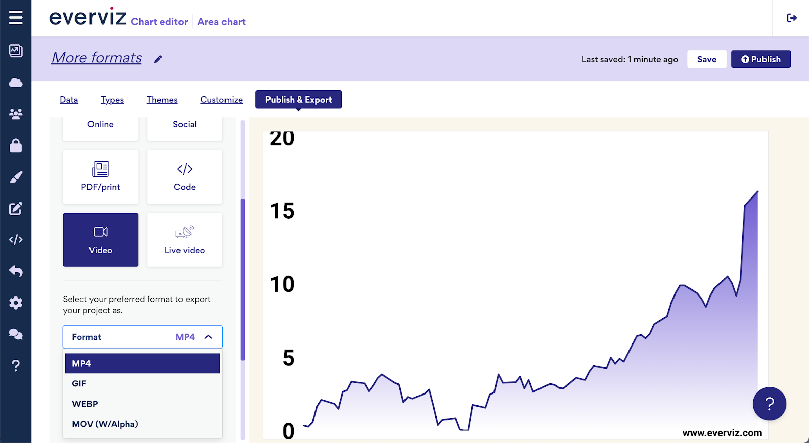
📺everviz charts can now be seamlessly inserted into live video – making multiplatform data visualizations possible. Until now, making charts for live video required specialist

Introduction Morning Consult analysts work with millions of data points that reflect public sentiment on various topics. Their reports are packed with data, posing the

Sunnmørsposten newspaper (SMP) is located in Ålesund, a city of 67,000 nestled in the beautiful fjord landscape of Western Norway. The newspaper has 2.5 million

We are pleased to welcome Amy Cesal to the team as our Product Evangelist. Amy will liaise with our chart designers to create charts and

The world’s most accessible data visualisations are likely created in Norway by the Authority for Universal Design of IT (the Authority). In Norway, all public

In recent years, Airbnb has grown to become one of the most popular websites for holiday homes and other short-term rentals. It allows property owners to gain income from their accommodation, and it provides travellers with a wide range of rental choices.
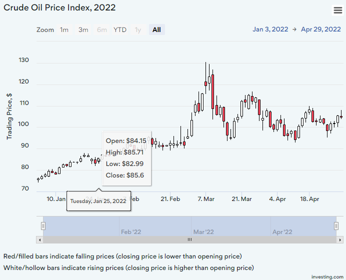
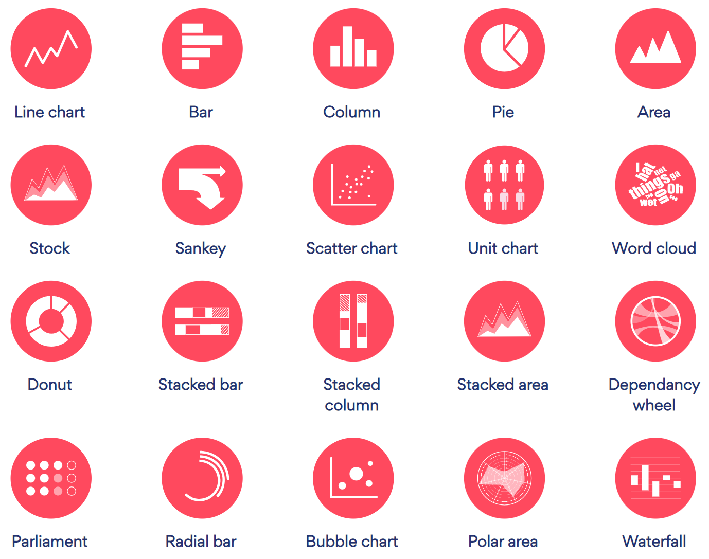
A candlestick chart is a type of graph used to display financial information such as trading patterns. The column of the candlestick is known as the ‘real bar’ and is used to show the prices at the opening and closing of the day’s trading.

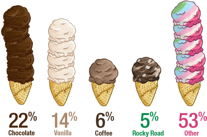
Data expert Diana Guerrero offers tips and tricks on how to mine data sets for insights and outliers.
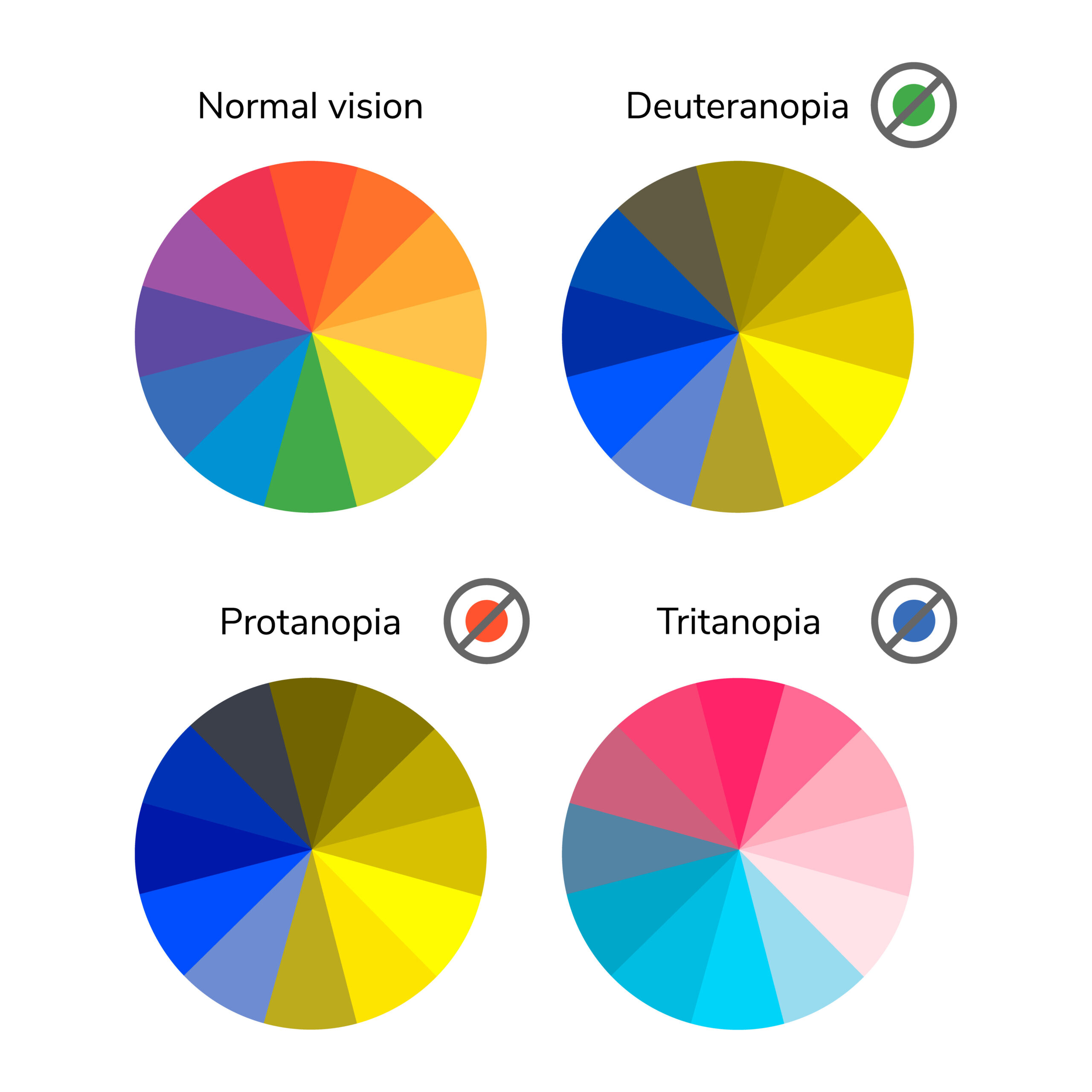
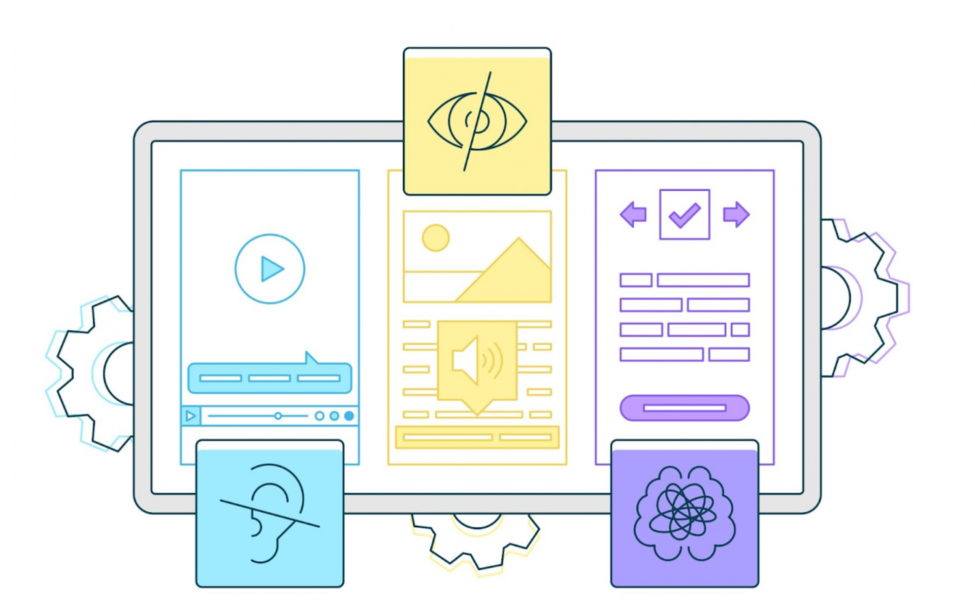
In this post we’ll take a closer look at low vision and how it relates to visualizations with everviz.
“Low vision” refers to visual impairments other than blindness. Other terms, like “partially sighted” and “sight impaired,” have different meanings depending on the context.
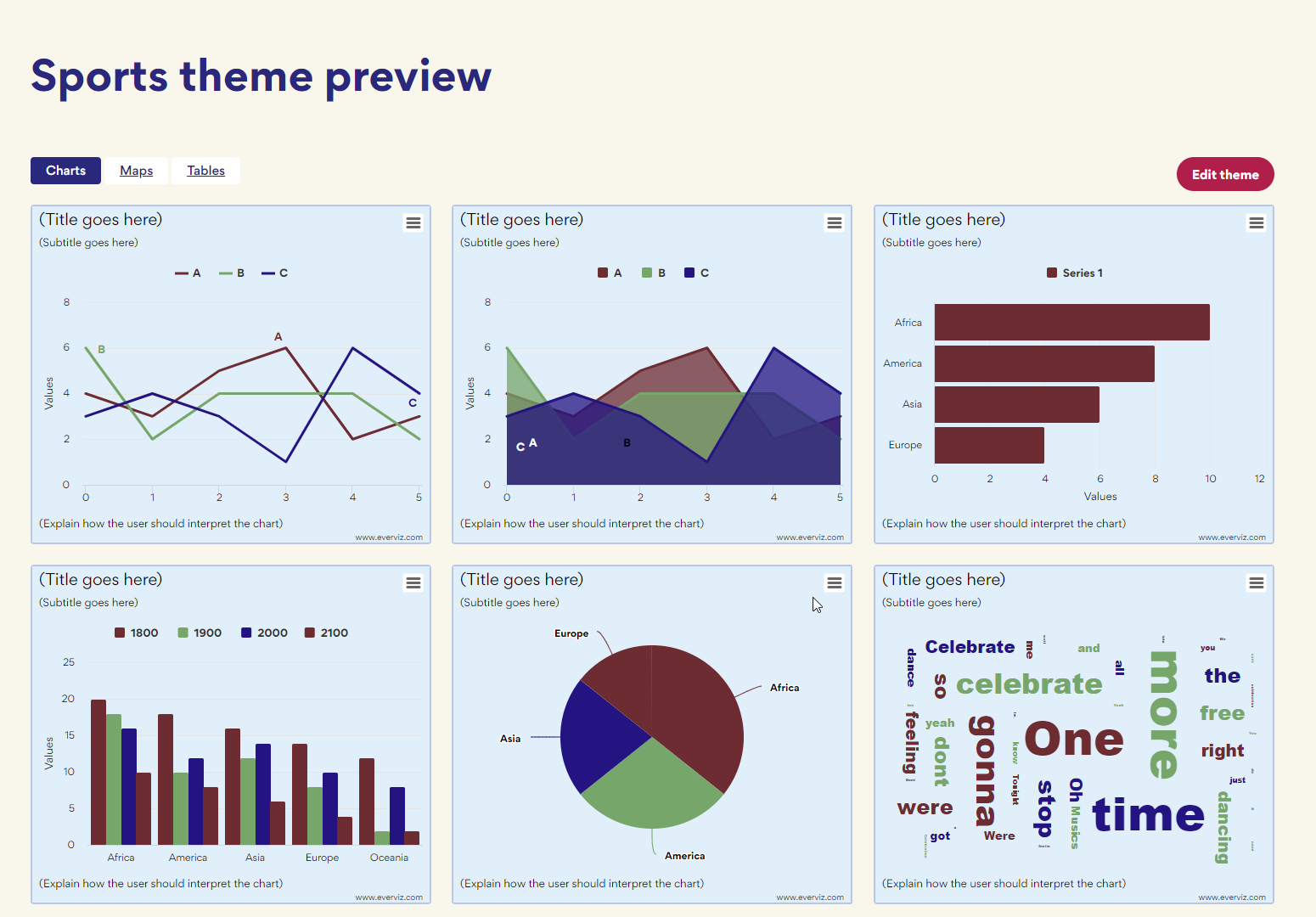
Themes is an easy way to ensure all your charts load with your organisation’s branding.

This article will focus on all the benefits you will be rewarded with a solid accessibility strategy for your website. Without going too deep into the technical aspects, we are going to discuss how you can make an impact for the people that are most important to your business: your customers and visitors. On top of that you’re contributing positively to society.

The FIFA World Cup Cup is one of the greatest sporting events in existence. That’s why we decided to to put together some world cup
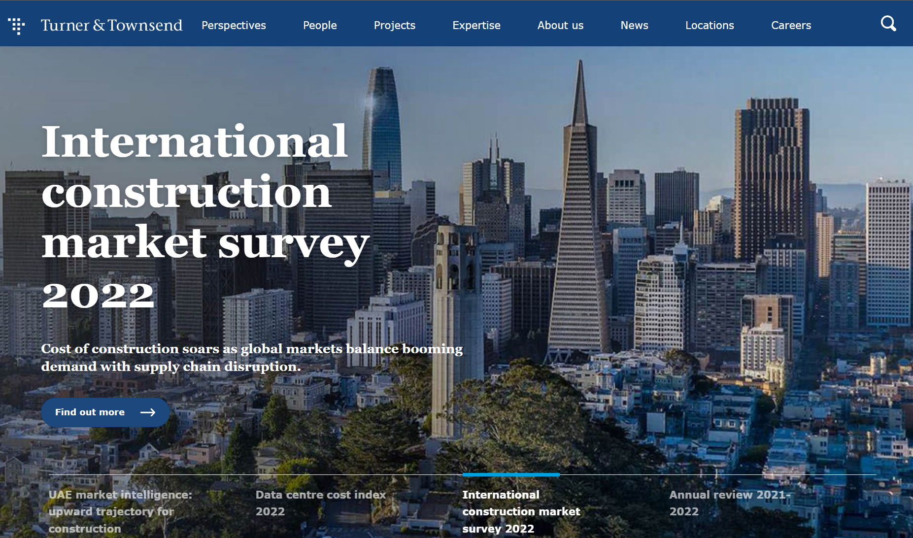
‘With a chart, clients instantly see the highs and the lows and the differences in the data’ Turner & Townsend is a global professional services
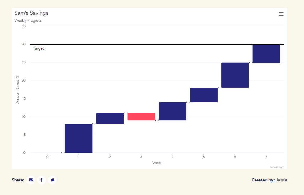
Waterfall charts are used to visualize cumulative values, where each data point contributes to a running total. The data points are displayed as floating columns, often connected by a line to illustrate the sequential relationship.

If you are thinking about buying a house, you may have developed a sudden interest in mortgage rates. This may be particularly true for mortgage
Over the last couple of months, we have made some massive improvements to the editing experience in everviz. This article dives a bit deeper into the improvements and explains how you can use them.
Accessibility is crucial to our visualization platform, as it enables our customers to reach out with content, news and insights to the largest possible audience.
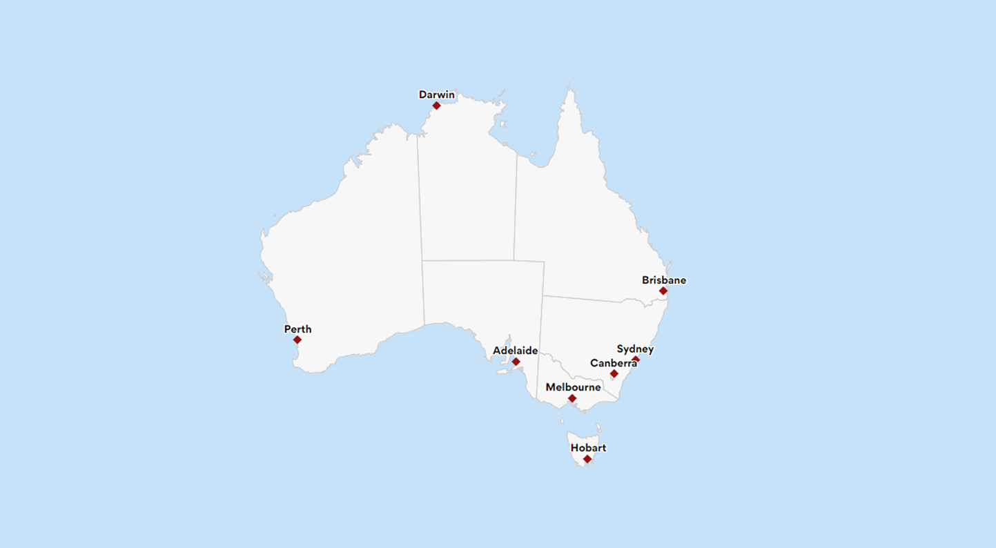
An interactive map allows users to explore and engage with data plotted on geographical coordinates. Many interactive maps will allow users to pan or zoom in on a location of interest. Some may allow users to see more detailed information by selecting features on the map. Maps can be used as visualization tools to display data associated with geographical locations in different ways.

If you’re new to this whole data visualization thing and get confused when people are talking about “logarithmic”, “CSV” or “legend” , then stick around,

Accessibility is crucial to our visualization platform, as it enables our customers to reach out with content, news and insights to the largest possible audience.
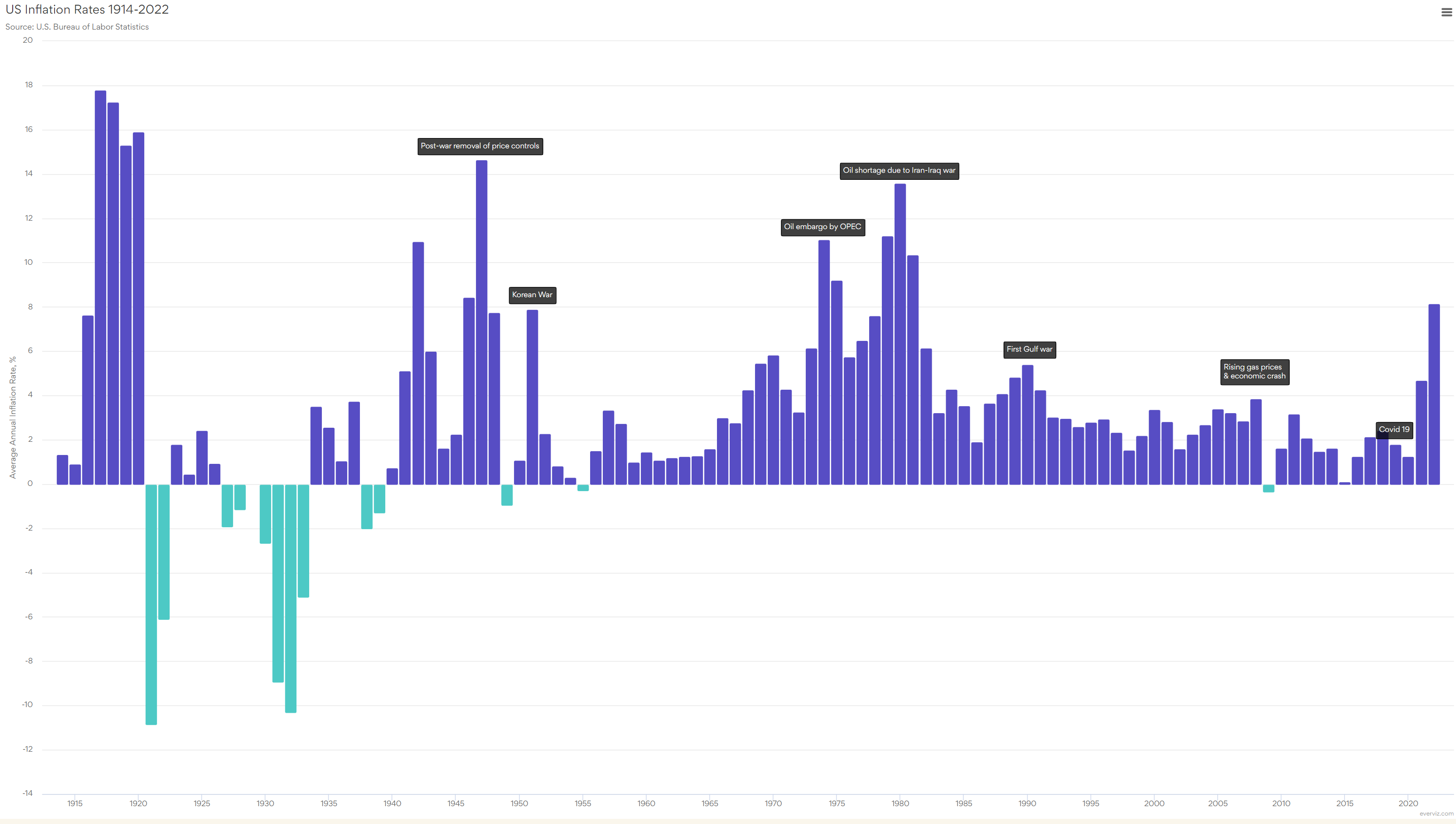
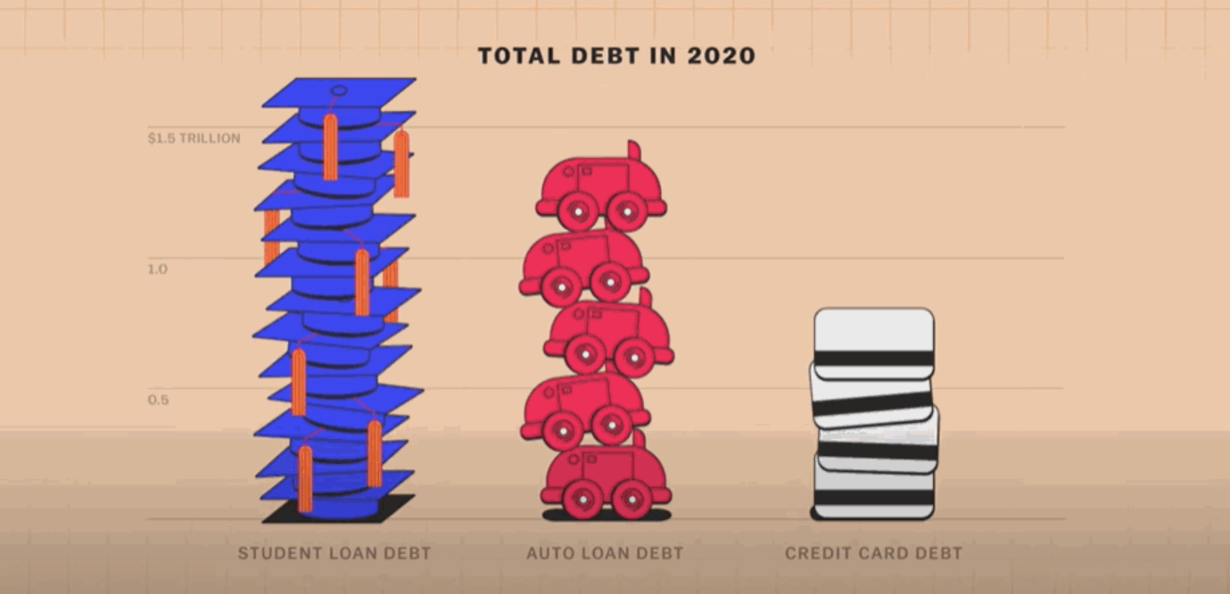
Like us, you might have noticed a few changes if you paid for anything in the previous six months. The cost of meat has increased.

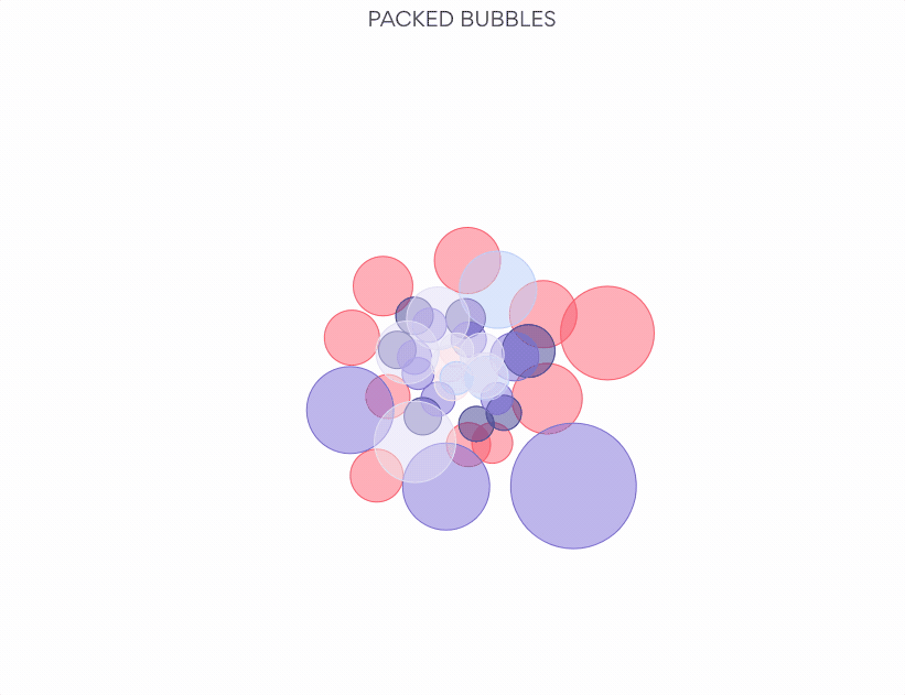
At everviz, we think a lot about interactivity. We write about it. We build it into the program. Our latest chart type, the packed bubble
With everviz, you will have a variety of different choices for visualizations. We’ve just added another simple yet detailed and insightful visualization to your toolbox:
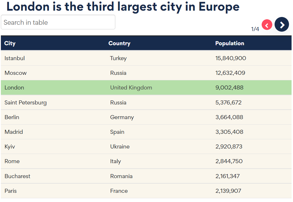
Data tables can be a great way of summarizing information and sharing it with your audience. Tables can break up sections of text and encourage
Let’s start with a few key statistics. Healthcare takes more than 10% of the GDP of most developed countries. In fact, in 2020, 21% of the US GDP was spent on healthcare. That is more than any other US program. Healthcare amounted to 12.8% of the GDP in the UK and 11.3% of the GDP in Norway.
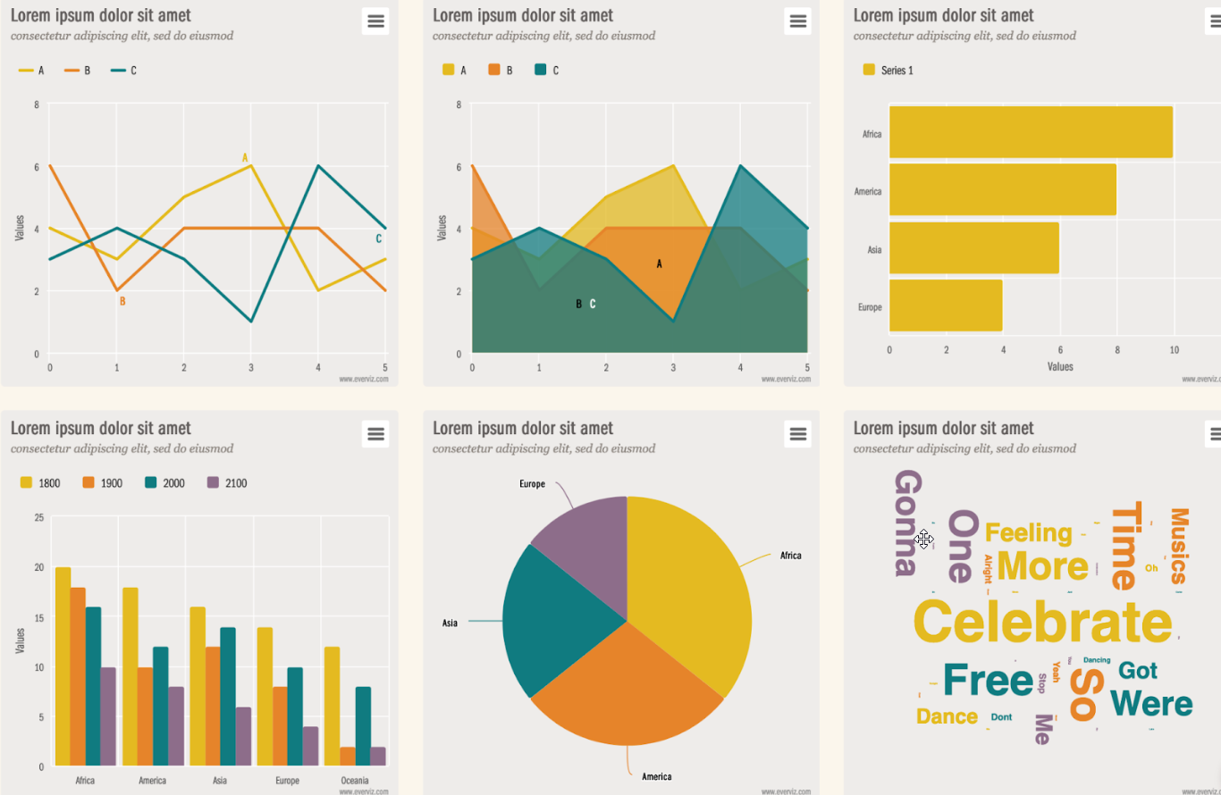
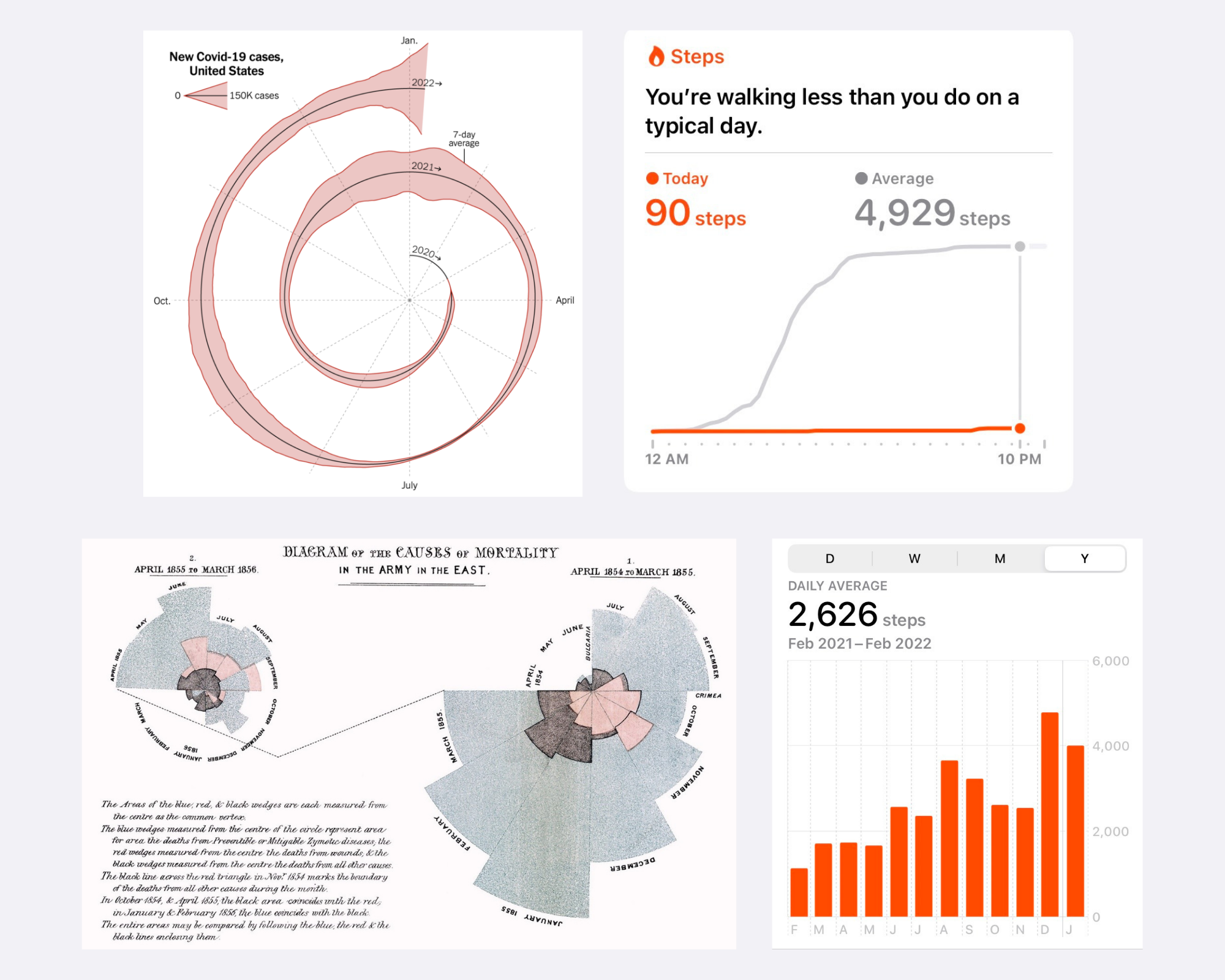
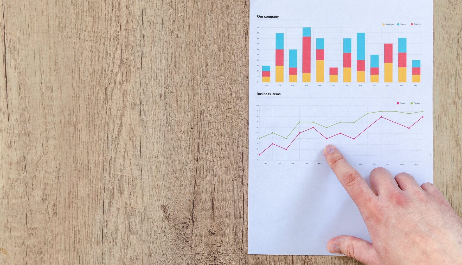
Graphs can be a wonderful tool to make data clear, engaging, and accessible to your audience. However, picking the right data visualization to communicate your story can be hard.
Data visualizations are an excellent marketing tool with a wide range of potential uses. Visuals can be a powerful addition to a marketing campaign. They
Data visualizations are a great way of communicating anything numerical with your audience. Perhaps you want to share the results of a survey or maybe you want to illustrate the differences between two products?
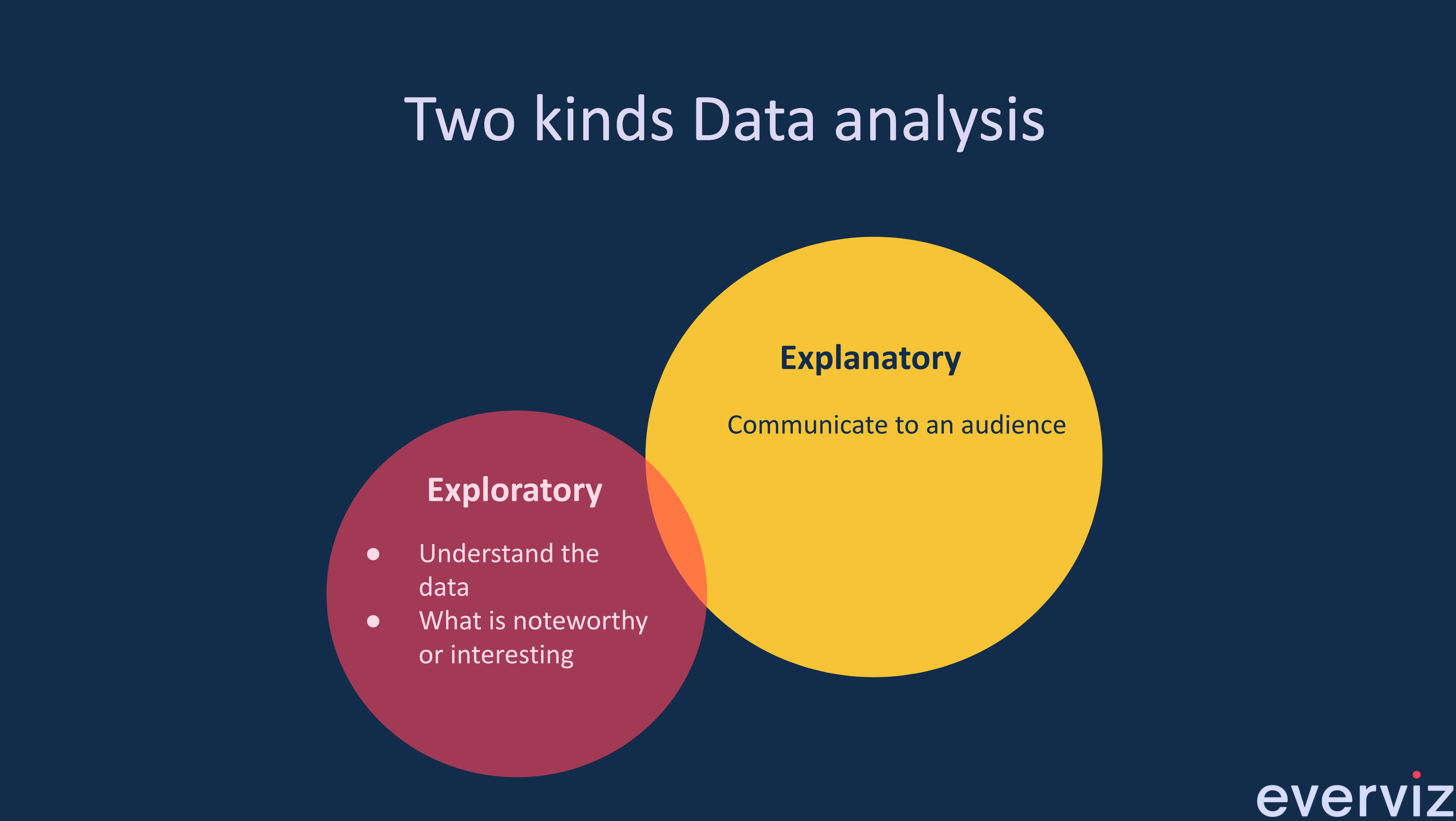
What is the difference between exploratory and explanatory data Visualization? Exploratory Data Visualizations are charts or graphs that are usually created during the data analysis
This is a guest blog post by Rebeca Pop, founder of Vizlogue, a Data Visualization and Storytelling Lab that offers workshops and consulting services. You
The COVID-19 pandemic triggered a funding crisis for non-government organizations (NGOs) and advocacies worldwide — right when they are needed the most. The World Economic
Imagine this scenario. Alex is an analyst working for a biotech company. He joined the organization two weeks ago. His manager calls him into her office and asks him to prepare a presentation for a few executives.

Let me ask you this: Do you recall the first time you created a graph? I still have a vivid memory of the first time that I designed one. I was in my first year of college and had to visualize data for my Statistics class.
At everviz, we want to help everyone easily visualize and communicate with data. That’s why we handpicked some of our favorite data visualization resources to
