
2023 in review
2023 was a turbulent year on the international stage. Conflicts in Europe and the Middle east dominated the news, as did reports of tension between
2023 was a turbulent year on the international stage. Conflicts in Europe and the Middle east dominated the news, as did reports of tension between
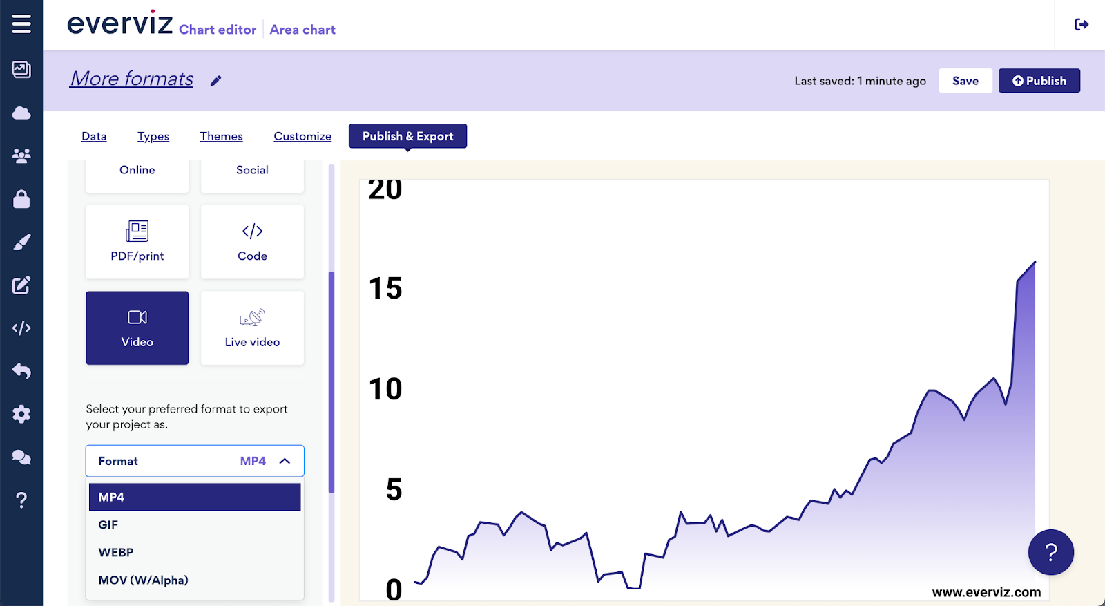
Expanding upon our recent announcement of multi-platform visualizations, we’re thrilled to introduce even more versatile formats to enhance your content. Enhance your visual content with

Introduction Morning Consult analysts work with millions of data points that reflect public sentiment on various topics. Their reports are packed with data, posing the
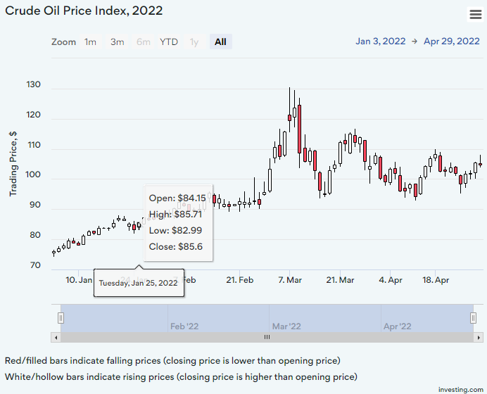
A candlestick chart is a type of graph used to display financial information such as trading patterns. The column of the candlestick is known as the ‘real bar’ and is used to show the prices at the opening and closing of the day’s trading.
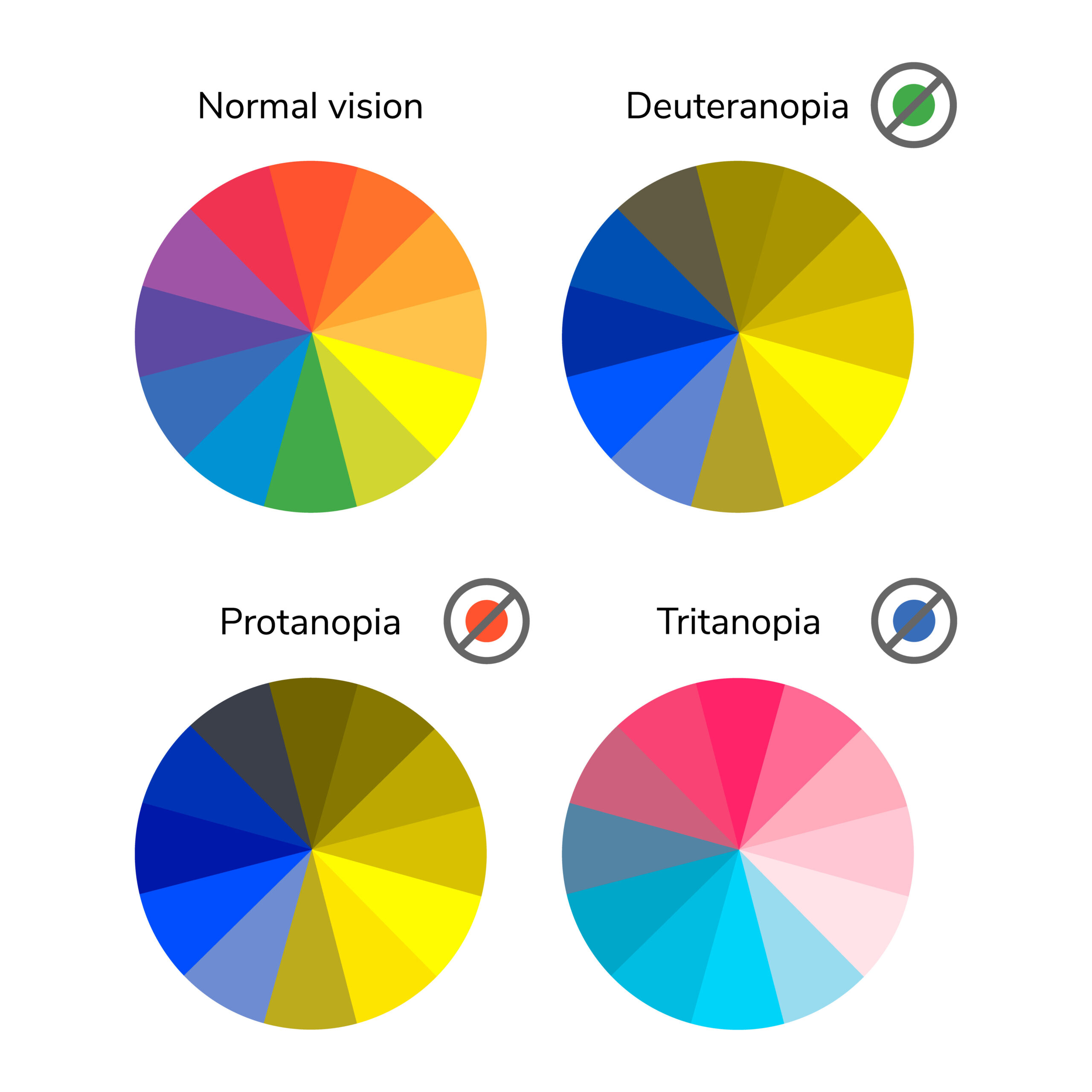
In this post we’ll take a closer look at low vision and how it relates to visualizations with everviz.
“Low vision” refers to visual impairments other than blindness. Other terms, like “partially sighted” and “sight impaired,” have different meanings depending on the context.
Themes is an easy way to ensure all your charts load with your organisation’s branding.

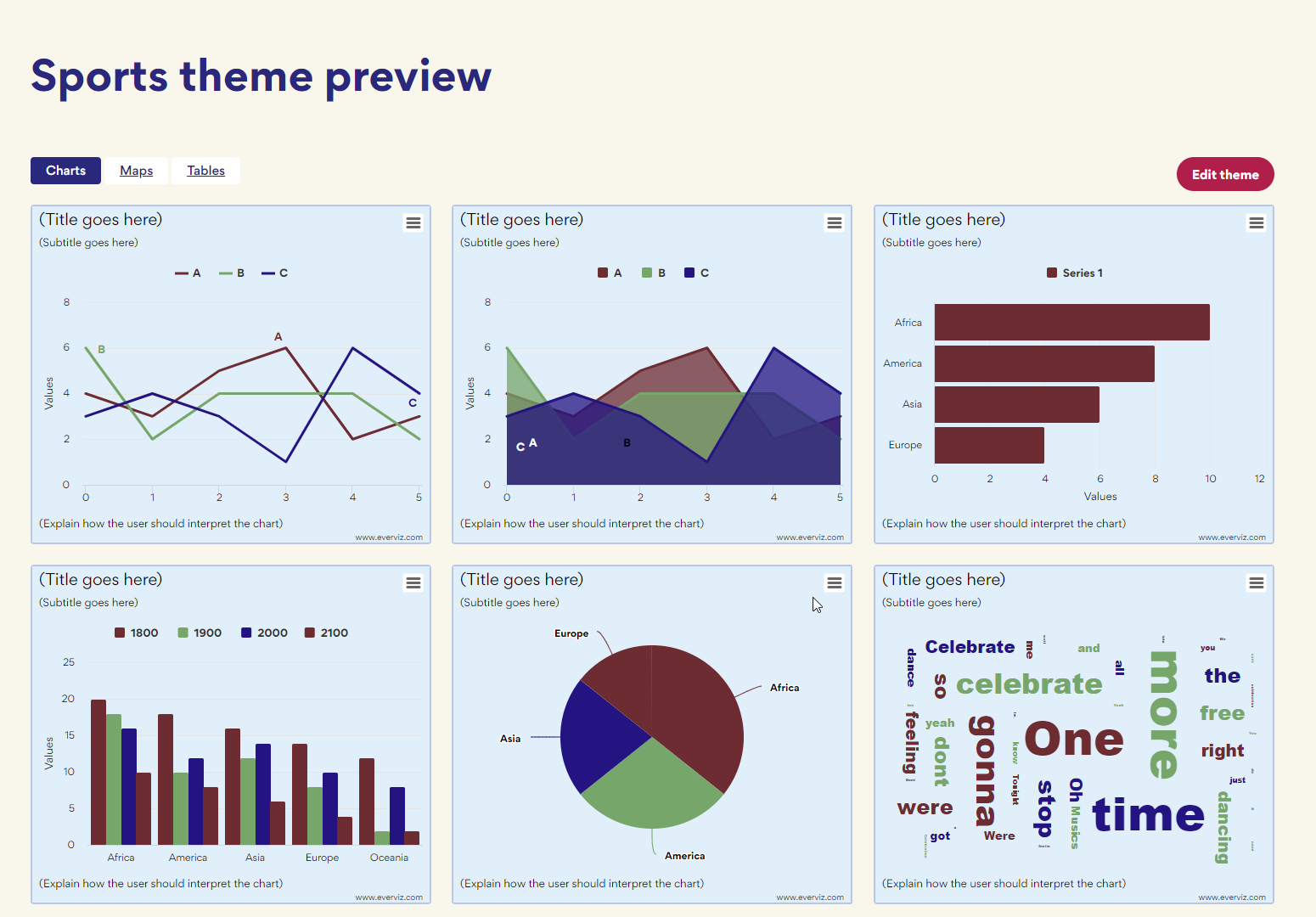
The FIFA World Cup Cup is one of the greatest sporting events in existence. That’s why we decided to to put together some world cup
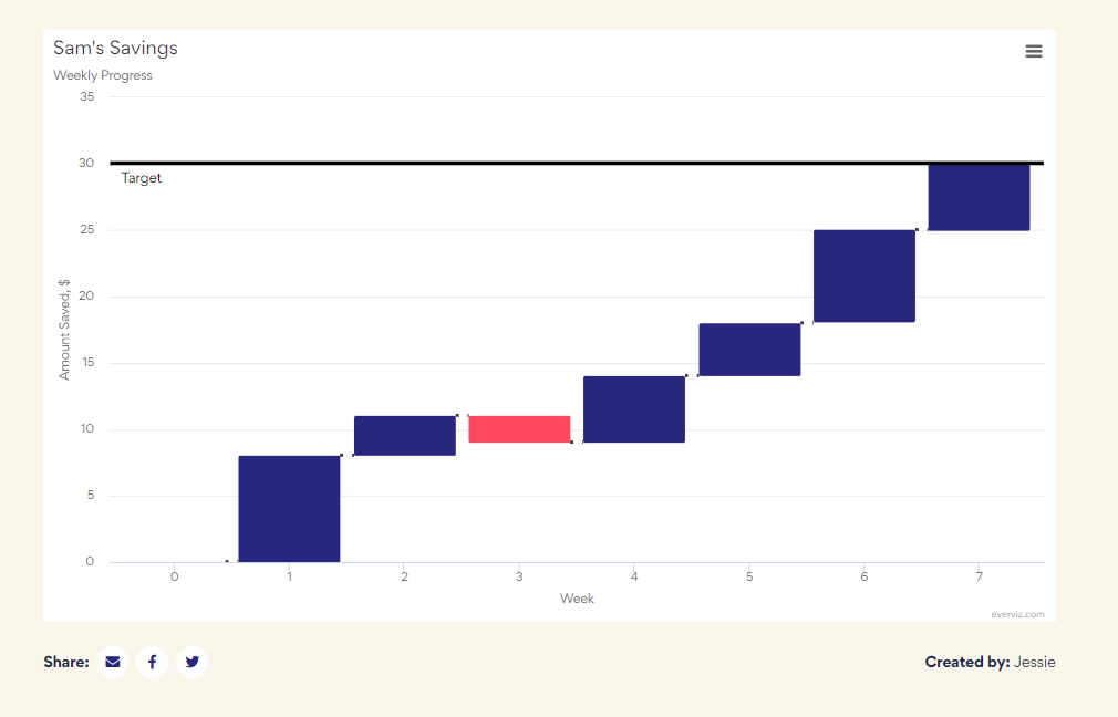
Waterfall charts are used to visualize cumulative values, where each data point contributes to a running total. The data points are displayed as floating columns, often connected by a line to illustrate the sequential relationship.
You may not be a web designer, but if your bread and butter is offering services to your audience through a website, “responsive” versus “static”
If you are a researcher or academic, the growth of the internet has brought many opportunities for sharing your achievements with the world! However, journal
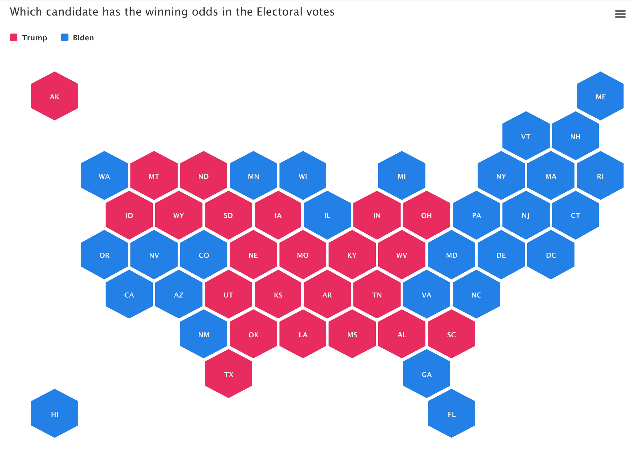
During election times, readers want more than just good writing, they want great graphics and interactive charts and maps. We believe the time is ripe

We strongly believe that telling stories with visuals makes the message easier to understand and act upon. Visuals created with everviz are Interactive, responsive and
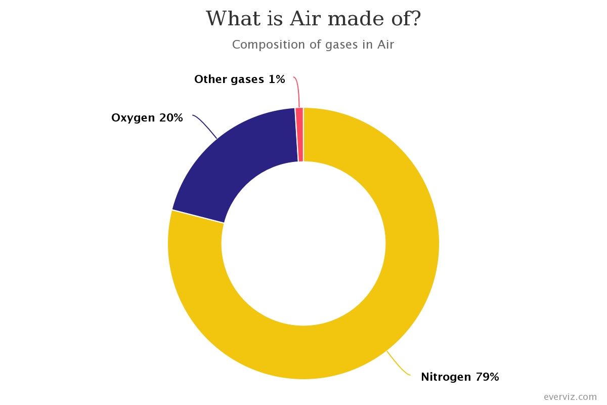
A donut chart is a variation of a Pie Chart with a round hole in the center which makes it look like a donut. This
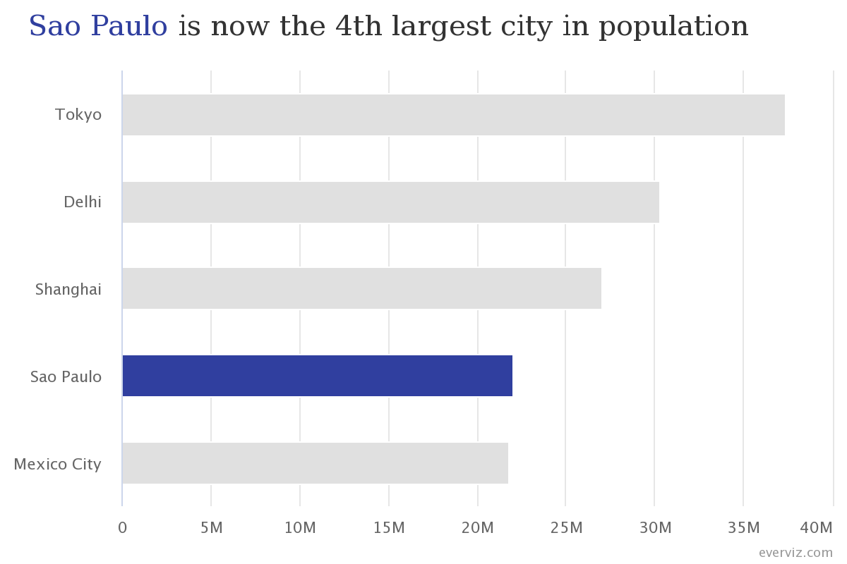
Bar charts are one of the most commonly used visualization types because they are simple to create and easy to understand.
In this article you will learn how to create a Bar chart in everviz and some good practices.
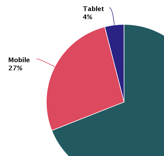
Pie charts have been under assault, probably as long as they have existed. Even though, they remain as a very commonly seen chart type. In
Virtually every website, app or news outlet use interactive charts to make data easier to understand. everviz is a service that makes it easy for
Visualizations play an important part in making data digestible and turned into actionable insights. We are working day and night to enhance our service to
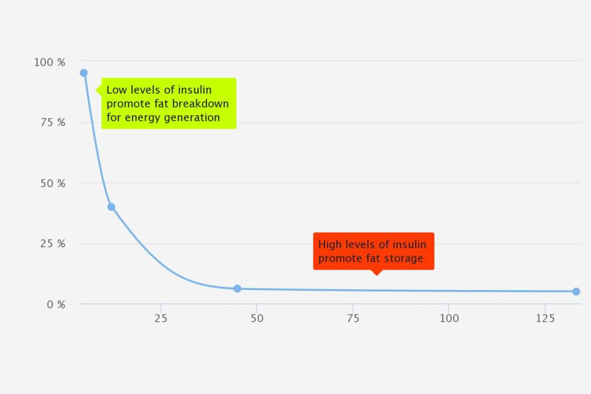
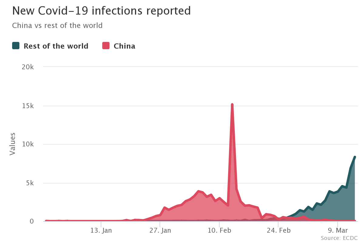
Sometimes a chart or map is not enough to clearly communicate the data on its own. Annotations can be helpful for showing when key events
If you want to attract new readers, keep your online audience engaged, your content needs to be dynamic and interactive. Being that so much content
This post was originally published on the Highcharts blog, and was transferred as part of the rebrand from Highcharts Cloud to everviz. More than 3,000
