Tag: best practice

Visualizing health data: Past, present, future

Let’s start with a few key statistics. Healthcare takes more than 10% of the GDP of most developed countries. In fact, in 2020, 21% of the US GDP was spent on healthcare. That is more than any other US program. Healthcare amounted to 12.8% of the GDP in the UK and 11.3% of the GDP in Norway.
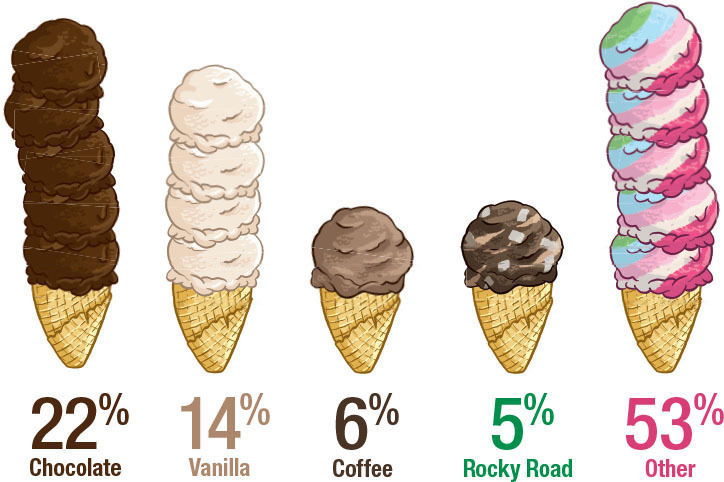
Favorite ice cream

Lies, damned lies, and visualizations

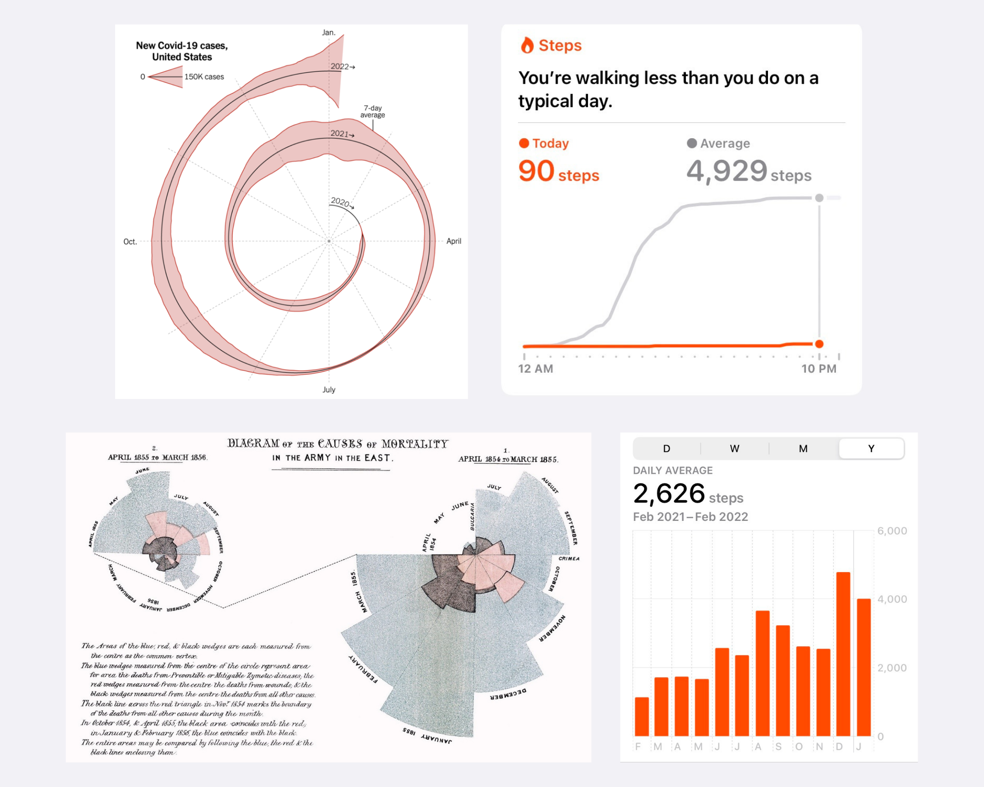
Graphs can be a wonderful tool to make data clear, engaging, and accessible to your audience. However, picking the right data visualization to communicate your story can be hard.

Are-Interactive-Graphs-Here-to-Stay

Are interactive graphs here to stay?

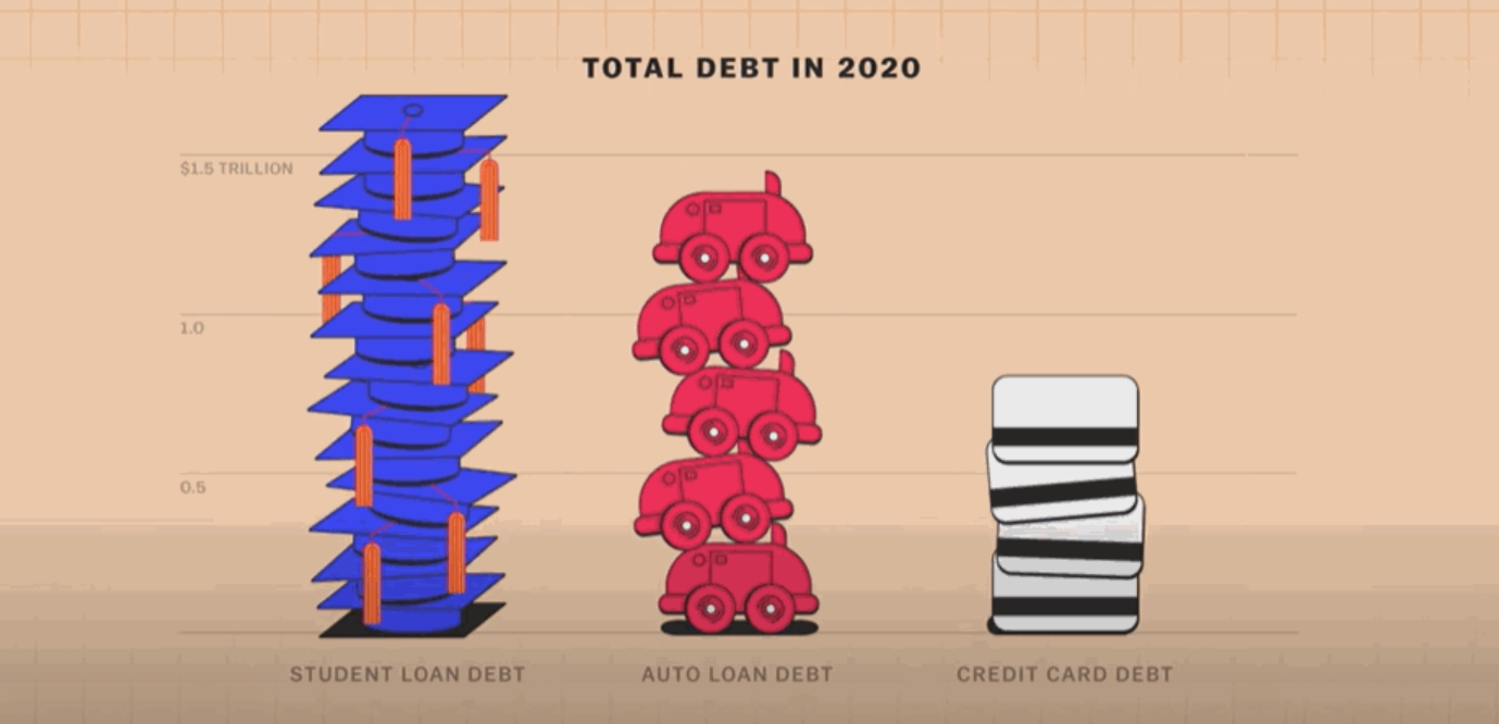
Explained is one of my favorite Netflix shows. It’s a docuseries created in partnership with Vox that brings attention to critical issues that impact people’s lives. The episodes are short, ranging from 15 to 20 minutes in length. To date, some of my favorite episodes have covered topics such as Money, The Mind, and The Racial Wealth Gap. You might be wondering what data visualization has to do with a Netflix show. Well, a lot…Each Explained episode includes simple, animated graphs that are key to explaining topics in an accessible manner. For example, the episode on Money starts with a unit chart showing how student loan debt compares to auto loan and credit card debt. By incorporating an animated and engaging graph, the producers truly drive the point home.

How effective is my data visualization? Well, It depends…

Pick the right color, make thoughtful chart choices, consider color-blindness, avoid clutter – you dive deep into each of these topics, master them, and, done! You are ready to start creating informative and effective data visualizations.