Image source: undraw.co.
This is a guest blog post by Rebeca Pop, founder of Vizlogue, a Data Visualization and Storytelling Lab that offers workshops and consulting services. You can find Rebeca on YouTube, where she posts data visualization videos. Rebeca has been providing insights and creating data visualizations for almost 10 years. She has worked as a digital analytics leader for top media and analytics companies, and is teaching Data Visualization and Storytelling at the University of Chicago and at Northwestern University. Read more about Rebeca in her bio below.
Let me ask you this: Do you recall the first time you created a graph? I still have a vivid memory of the first time that I designed one. I was in my first year of college and had to visualize data for my Statistics class. I did not venture into any fancy tools. I used my good old friend Excel and created a (terrible) line graph. Yes, you read that right. I have to admit that it was not a chart that I’m proud of. My line graph had 6 or 7 segments, the same number of rainbow-looking colors, and the Y-axis was adjusted to the point that the data trends were too magnified. How did this happen? The answer is simple: I was using my intuition and readily available templates, coupled with a lack of data visualization knowledge. This happened many years ago, and I’ve come a long way since, but the outcome is a lesson that I’ve taken with me throughout my career in data visualization: when it comes to graphs, use knowledge, as opposed to intuition, as much as possible.
In this blog post, I’ll discuss a specific source of knowledge: academic research. While there are topics in data visualization that researchers are still studying and questions that still don’t have definite answers, there are also plenty of questions that have quite solid answers, founded in research. Here are four questions that I’ll be exploring in this blog post:
1. Should you truncate the Y-axis?
2. How can you use color to evoke emotions?
3. Are word clouds an effective way to communicate information?
4. Should you still be using pie charts?
These four questions (and their research-based answers) are widely applicable to different chart types and data sets. Whether you work with large to small data sets, with qualitative or quantitative data, I believe that, sooner or later, these answers will turn out to be helpful.
1. Should you truncate the Y-axis?
When I ask my students or workshop participants what they think about truncating the Y-axis, I typically get one of these two responses: 1) we should never truncate the Y-axis or 2) we should never truncate a bar chart, but it’s alright to truncate the Y-axis of a line graph. Where do these perspectives come from? From experts in data visualization and information design who have been leveraging their experience to provide recommendations. The question is…are these perspectives backed up by research?
While there’s limited research published on the topic of truncating the Y-axis, I came across a paper presented at the 2020 CHI Conference on Human Factors in Computing Systems. In this study, Michael Correll, Enrico Bertini, and Steven Franconeri discussed the results of a series of crowd-sourced experiments that had two goals:
1. Test the impact of Y-axis truncation across bar charts and line charts.
2. Evaluate visual designs that might be helpful to reduce the exaggeration caused by truncation (such as broken axis or continuation of bars beyond the bounds of the chart).
The study results showed that truncating the Y-axis had a “consistent and significant impact on the perceived importance of effect sizes.” In other words, the effect size was perceived as magnified not just on bar charts but also when using line graphs. Moreover, if you truncate the Y-axis of a bar chart by using broken axes or by continuing bars beyond the bounds of the chart (such as in the image below), the differences are still perceived as magnified.
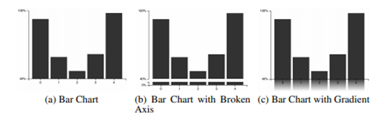
What does this mean to you? Be thoughtful and embrace the responsibility of considering effect sizes when you visualize data, whether you’re using bar charts and line graphs. You don’t need to start all your Y-axes at 0. But know that, by selecting a Y-axis starting point, you have “control over the subjective importance of the resulting differences.” And, with control, comes responsibility.
2. How can you use color to evoke emotions?
When creating graphs, we often want to evoke a mood or an emotion. Maybe you’re working on a deck for a fundraising event, and you want to use graphs not just to inform but to ensure that potential donors empathize with your cause. Or, maybe you’re giving a presentation about the gender pay gap, and you want your charts to evoke emotions so that your audience would be more determined to take action.
To date, researchers have published extensively on the link between color and emotions. For example, “warm” colors (such as red, yellow, and orange) are more arousing. They convey feelings of excitement, disturbance, or playfulness. “Cool” colors (such as green or blue) evoke calm. Blue is also associated with peacefulness, while green communicates freshness. See the readings listed at the end of this blog post for more resources.
One study that looked at color and emotions from a slightly different angle was presented at the 2017 CHI Conference on Human Factors in Computing Systems. In this paper, Lyn Bartram, Abhisekh Patra, and Maureen Stone looked at categorical data specifically and studied how different color properties (lightness, chroma, and hue) and different palette properties (combinations and distribution of colors) create engaging visual communication by conveying a feeling or an emotion.
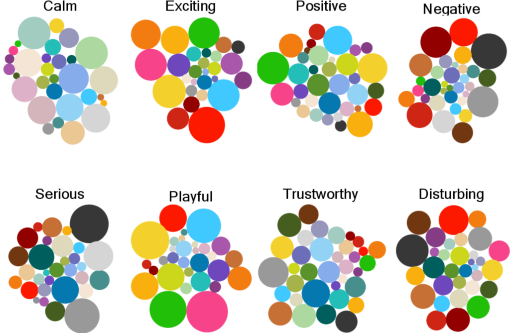
The authors ran a series of experiments, which confirmed that, even with categorical data, colors are powerful at evoking emotion. For example, if your goal is to convey a calming effect, the recommendation is to use light, cool colors. On the other hand, if you want to highlight a disturbing, exciting, or playful effect, saturated colors are more effective. The authors also found that the type of visualization used (e.g., bar chart or map) had no effect on how color is perceived and on the type of emotion that color communicates.
3. Are word clouds an effective way to communicate information?
If you work with qualitative data (such as interviews, focus groups, or text analysis), you are probably familiar with word clouds. Word clouds are one of the most commonly used chart types to visualize sets of keywords that summarize a given document or text content. Typically, we leverage font size and color to encode the frequency of words, but other metrics could be used as well.
Several studies have been published on the effectiveness of word clouds. Previous papers show that word clouds have evident shortcomings:
1. The order in which words are displayed is often arbitrary.
2. Font sizes cannot be accurately compared, which means we are roughly estimating differences in size.
3. Longer words stand out just because they have more letters, not because of their value.
See the readings listed at the end of this blog post for more resources.
A research paper published in 2018 by Cristian Felix, Steven Franconeri, and Enrico Bertini looked at both the word clouds layout and the font sizes of keywords. These two components affect how accurately and quickly we read word clouds. The layout, or the order and shape of the words, affects the sequence in which your audience reads the keywords. The font size affects the level of precision for making comparisons between words.
The study shows that the effectiveness of the word cloud visual depends largely on your goal. If your goal is to provide a big picture of the keywords, disregarding frequency, then a simple list is highly effective. If your goal is for your audience to understand the magnitude of different words, then using additional visual elements, such as bars or circles, helps. Font size and color intensity do a poor job at conveying magnitude. If the goal is for your audience to be able to find specific words in the word cloud, then using different font sizes and spatial or column layout is effective.
4. Should you still be using pie charts?
To say that pie charts are controversial would be an understatement. Many data visualization experts have been outspoken regarding their dislike for pie charts. For example, Stephen Few, a well-known voice in data visualization, published an article with the title Save the Pies for Dessert (PDF). Or, Cole Nussbaumer Knaflic, the author of Storytelling with Data, once wrote a blog post called death to pie charts. While Cole’s perspective on pie charts has since softened, many people I meet at workshops or conferences tell me that they’ve been influenced by these opinions and are now avoiding pie charts.
What does research tell us? Studies show contradicting results. For example, in one of the first studies published on this topic, in 1926, Walter Crosby Eells showed that “Pie charts can be read as fast as the bar charts, and more accurately than the bar charts.” Many years later, in 1994, William S. Cleveland, Professor at Purdue University, published The Elements of Graphing Data. In his book, Cleveland argues that angle judgements that we need to make to read pie charts tend to be inaccurate. See the readings listed at the end of this blog post for more resources.
Fast forward to modern times, two studies (here and here) published by Drew Skau and Robert Kosara show that the angle of the pie chart slices might not be the primary way of decoding information. Both papers concluded that that “angle is not likely the main, and certainly not the only, way we read pie charts.”
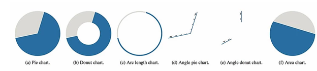
Another more recent study, Dissecting Pie Charts, published by Harri Siirtola, Kari-Jouko Räihä, Howell Istance, and Oleg Špakov provided evidence that “doughnut charts with a medium size hole have a slight edge over the other chart types (e.g. pie charts).”
So, what should you do? Should you still be using pie chart? Additional research is needed to more confidently determine how we read pie charts, whether that is based on the arc length, the angle, or the area. For the time being, my recommendation is to continue using both pie charts and donut charts, but to avoid having too many slices or too many colors.
What’s Next?
I invite you to go back to my original question (which was not a rhetorical one!): Do you recall the first time you created a graph? Pause for a few seconds and think back to the first time you created a chart. What tool did you use? What chart type was it? And, what knowledge did you apply? Spend a few minutes identifying what worked and what didn’t, and what lessons emerged from that first experience.
As a next step, I highly encourage you to look into research studies when you have a data visualization question. Here are a few websites to explore:
- Northwestern University’s Visual Thinking Lab
- UW Interactive Data Lab
- The Data Visualization Research Lab at the University of New Hampshire
- IEEE Transactions on Visualization and Computer Graphics (a peer-reviewed scientific journal)
Additional Readings
S. Bateman, C. Gutwin, and M. Nacenta. Seeing things in the clouds: The effect of visual features on tag cloud selections. In Proc. of the ACM Conference on Hypertext and Hypermedia (HT). ACM, 2008.
Joseph A Bellizzi and Robert E Hite. 1992. Environmental color, consumer feelings, and purchase likelihood. Psychology & Marketing. 9, 5 (1992), 347–363.
Andrew J Elliot and Markus A Maier. 2014. Color psychology: Effects of perceiving color on psychological functioning in humans. Annual Review of Psychology. 65 (2014), 95–120.
M. A. Hearst. What’s Up with Tag Clouds? Visual Business Intelligence Newsletter, 2008.
Lauren I Labrecque and George R Milne. 2012. Exciting red and competent blue: the importance of color in marketing. Journal of the Academy of Marketing Science. 40, 5 (2012), 711–727.
Thomas J Madden, Kelly Hewett, and Martin S Roth. 2000. Managing images in different cultures: A cross-national study of color meanings and preferences. Journal of International Marketing. 8, 4 (2000), 90–107.
A. W. Rivadeneira, D. M. Gruen, M. J. Muller, and D. R. Millen. Getting our head in the clouds: Toward evaluation studies of tag clouds. In Proc. of the SIGCHI Conference on Human Factors in Computing Systems (CHI). ACM, 2007.
J. Schrammel, S. Deutsch, and M. Tscheligi. Visual search strategies of tag clouds – results from an eye tracking study. In Proc. of the IFIP TC 13 International Conference on Human-Computer Interaction (INTERACT). Springer-Verlag, 2009.
About the author

Years ago, Rebeca fell in love with data visualization and storytelling. And there was no way back.
That was the point when she realized how underrepresented these skills are, despite being core to most business professionals.
Rebeca, Vizlogue’s founder, has been providing insights and creating data visualizations for almost 10 years. She has worked as a digital analytics leader for top media and analytics companies, across a diverse set of industries, such as Fast Food Restaurants, Consumer Packaged Goods (CPG) and Automotive.
For nearly 3 years, she has been teaching Data Visualization and Storytelling at the University of Chicago and at DePaul University in Chicago.
Rebeca holds a MA from the University of Oklahoma and a BA from the University of Bucharest, Romania. When she’s not reading, practicing or talking about data visualization and storytelling, Rebeca enjoys hiking and cycling.


