It can be difficult to communicate financial information to different audiences, but a well-designed graph or chart can help you to get your message across.
As more and more work moves online, the ability to produce web-ready graphs and charts is important in any sector, but particularly in finance where it is often necessary to explain numerical data to a wide range of different audiences. The ability to produce good data visualizations is a valuable tool, whether you are communicating company profits, market research, business plans, or any other financial data.
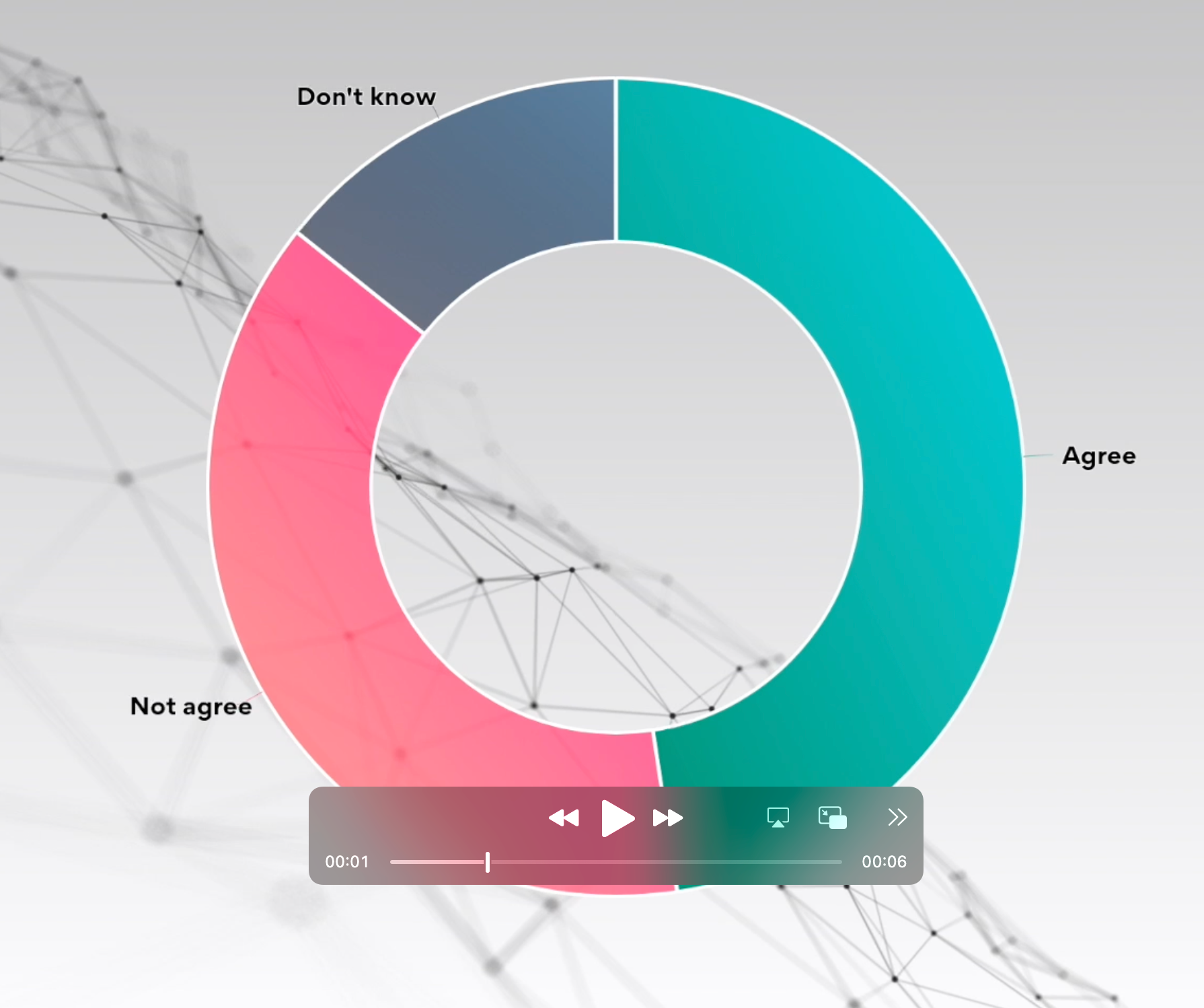
The following chart indicates that the majority of organizations across different sectors are moving to a digital approach.
This article will help you to plan and produce clear visualizations that deliver your message while avoiding some common pitfalls.
Consider the purpose of your data visualization
Before jumping in and creating graphs, first, take a moment to consider what you are aiming to achieve with this communication:
- WHO is your target audience? What is their background? What is their current understanding of the topic?
- WHAT does the audience need to know? What is their expectation? What message are you trying to get across?
- HOW will you present the information? What data do you have? What type of visualization is most suitable?
WHO: Tailor the visualization to the audience
It is important to consider the audience and their background knowledge. Imagine you are communicating figures on company profit/loss for the financial year. If you are presenting to the senior management and board, they may be looking for headline figures and broad trends. You might assume they already understand the company backdrop, but you shouldn’t always assume they have a numerical mindset.
On the other hand, an audience within the company accounts department is likely to have a very good understanding of the financial data, and they may be looking for a much more in-depth analysis of trends.
The below charts both show sales revenue for a company selling several different products. The first chart might be suitable for a top-level overview, as it clearly shows the total revenue fluctuations across the year. Note how the level of detail has been reduced to simplify the output and remove all unnecessary information. The second chart might be more useful to specific teams interested in how the different products are performing. In this case, gridlines and a legend have been included to aid the user in interpreting a more detailed graph.
If your target audience is outside of the company (e.g external funders or the general public) then you might need to include additional information to set the scene and ensure they understand the context of your presentation.
Consider the following tips and how they might apply to different audiences:
- Define the context – Make sure the audience has a common understanding of the scope and purpose of the visualization. Ensure any metrics are clearly defined. Check for possible misinterpretations or misunderstandings.
- Choose an appropriate format – What level of detail does your audience require? What metrics are they looking for and how might these best be conveyed? Are the requirements suited to a graphical visualization or might a table be a better choice?
- Consider the delivery method – If the information is to be delivered online, then consider whether an interactive format would be beneficial. Interactivity may also be a suitable choice for some presentation formats. For printed media, you will need to consider whether the charts will be printed in color and choose your palette accordingly.
WHAT: Telling the story with data
The key to conveying a strong message is understanding the story you are aiming to tell. A good visualization can help to share your findings and deliver a key takeaway for the audience.
- Provide the context – ensure any background information is provided that might be necessary to understand and interpret the visualization (with consideration to the knowledge of the audience)
- Identify the key message – focus on the data that is needed to tell the story and ensure that the key message stands out.
- Anticipate questions – think about what queries the audience might have and consider if the design should be adapted to eliminate ambiguities (but avoid overcomplicating things unnecessarily)
HOW: Presenting the data
It is important to choose the right method of displaying the data which suits the audience and conveys your message.
- Choose a suitable chart type – make sure you are using the right type of graph for the data you have (more tips on this below)
- Design for clarity – check that the message is clear and the graph can be easily understood at a glance. Remove all unnecessary information and focus on what is needed, not what looks good.
- Is a graph the best option? – Sometimes data can be conveyed more precisely in a table.
Chart type selection
Lots of different visualization options are available, but it is important to choose the right one for the purpose. Thinking about how people interpret visual information can help with the decision process.
People are much better at interpreting the difference in the length of two shapes than the area or volume. Generally, using a simple bar chart allows data differences to be easily visualized by comparing the length of the bars. Humans find it much more difficult to compare the area of shapes in this way.
The following two charts are displaying the same information. Note how the bar chart can be easily used to compare the profits in different regions, and direct comparisons are facilitated by placing the regions in profit order. Interpreting the same data presented in a pie chart is much more difficult – for example, it is hard to identify by eye whether Europe or Asia had the highest profits.
Volume comparisons are even more difficult, so it is usually best to avoid using 3-dimensional graphs. They may look impressive but they rarely convey a clear message!
Pie charts are often discouraged as they also rely on areas to indicate size, but they can be useful in some scenarios. They can be great for a quick and simple visualization of the difference between a small number of variables, such as a breakdown of expenses by category. But avoid using pie charts for complex data, and always check that the message can be easily interpreted from your image.
Line Graphs are commonly used in financial data visualizations, and these are a great choice for showing trends over time. They can also help with spotting outliers and identifying variance from forecasts or targets. Make sure that the x-axis is set up correctly using a time-based dimension, and stick to two dimensions for clarity.
In this example, a line chart has been used to show the profit margin fluctuation over time. Annotation has been used to draw attention to key features relevant to the message being delivered.
If you have location-based data, then you might want to choose a map. There are different options for displaying numerical data on a map.
This bubble map shows the company’s total revenue for each country. Both the bubble size and color vary with the value, allowing the highest revenue countries to be quickly identified.
The tooltip allows the user to explore the map: hovering over a point displays the country name and the associated revenue value.
A choropleth map is a map where different areas are shaded according to a variable representing the characteristics of the area. Data displayed on a choropleth should be normalized to present the data as a density rather than raw values, to ensure that the visual prominence is related to the data rather than the area of the region. Data can be normalized by dividing the value by area or population to give a comparable ratio for plotting.
In this example, the profit/loss data has been normalized by dividing the value by the number of stores in each region. The use of blue shades for profit and red for losses allows for quick interpretation of how different regions are performing.
Other types of chart can be useful in some cases, feel free to experiment but you should always keep in mind that clarity of the message should come first.
Finally, think about whether you even need a chart? Sometimes a simple table might be a more suitable way of conveying the data clearly and concisely. This usually works best for a small number of figures when the precision of the number is important.
But, if you are producing a visualization for online consumption, then you can use interactive features to preserve the numbers behind the graphic. Tooltips allow the user to hover over part of the graphic to see a popup box showing further information, such as the values behind the data. You can try this out with any of the charts in this article.
Visualisation details
Once you’ve chosen the perfect visualization format for your data, you need to ensure that it is designed and formatted correctly for maximum impact. Don’t just accept the default settings, consider whether these are most suited to your purpose.
Consistency is important to ensuring graphs are aesthetically pleasing and easy to interpret. If you are creating a series of graphs, you should ensure the fonts, sizes, and colors are consistent throughout. Color selection can be important to how the message is interpreted. For financial data, a red color is often used to represent debit and black may represent credit. But beware that colors may be interpreted differently in different cultures, and people with color blindness may struggle to differentiate certain shades.
Axes should be chosen to maintain data clarity. Take particular care if tempted to use a non-zero origin and avoid using logarithmic scales unless you are confident that your audience will be able to understand and interpret these with ease. Data integrity should come first, so ensure your chart is not misleading.
In the first chart below, the vertical axis does not start at zero.  This means the differences between the column heights are exaggerated, making it appear that there has been a dramatic decrease in sales during the year.  At a glance, it looks like the sales made in September were only a third of those in March.

In the second example, the axis has been extended to zero, which allows the decrease in sales to be viewed in context. In reality, the September sales were 77% of those made in March.
You should carefully consider what information you are including. Axis should be labeled and units displayed where necessary for interpretation, but don’t clutter the graph unnecessarily with information that is not needed. Reducing the amount of ink on the page often improves the aesthetics and clarity of the message so consider each element of the graph to determine whether it is necessary. Your choice of what to include and what to leave out will depend on your audience and the message you are delivering.
Conclusion
In summary, to create great financial data visualizations, you should follow these steps
- Identify WHO is your audience and what are their requirements
- Establish WHAT is the key message or story that you are aiming to convey
- Plan HOW you will tell this story through data visualizations
Remember:
- Keep it simple, don’t overcomplicate your visualizations
- Know your audience and tailor accordingly
- Focus on ensuring the message is clear
- Maintain data integrity, ensure the graphs tell a true story
- Be consistent with your formatting
The right tools can help you make high-quality visualizations quickly and easily. With everviz, you can create graphs and charts that are interactive and web-accessible without having to be a web developer or write any code!


