This is a short introduction on how to make a candlestick chart in everviz. To get more in-depth insights and learn about advanced customization, we recommend visiting our knowledge base here.
What is a candlestick chart?
A candlestick chart is a type of graph used to display financial information such as trading patterns. The column of the candlestick is known as the ‘real bar’ and is used to show the prices at the opening and closing of the day’s trading. Extending above and below are the ‘wicks’ showing the highest and lowest trading prices reached in the corresponding period.
The everviz candlestick chart allows you to zoom in on an area of interest. You can use the selection panel at the top of the chart to choose a time interval and then use the slide bar below the x-axis to adjust the period displayed.
When should you use a candlestick chart?
Candlestick charts are a good way of displaying financial data to those who know how to interpret them. Financial candlestick charts usually display four trading prices (opening, closing, highest and lowest), which allows you to convey a lot of information within a single chart.
They are commonly used and understood within the financial sector and offer a good way of displaying complex data to a financial audience.
Interpreting a candlestick chart
Candlestick charts have two main components:
The wide part (the body of the candlestick) is known as the ‘real body’. This is similar to a floating column chart and represents the opening and closing prices. If the opening price is higher than the closing price (i.e. the value is falling), then this is normally represented with a filled ‘real body’. A hollow or unfilled ‘real body’ means the price is rising (the closing price is higher than the opening price). An alternative common approach is to use a red fill to indicate a falling price and a green fill to indicate a rising price.
The lines extending above and below the ‘real body’ are known as the ‘wicks’ or ‘shadows’. These indicate the highest and lowest price reached overall during the trading period represented. The upper wick indicates the highest price, and the lower wick shows the lowest. Longer wicks indicate a greater fluctuation in price from the opening/closing value. Wicks can be absent if the highest or lowest price is the same as the opening or closing value.
Common issues with candlestick charts
Candlestick charts can be difficult to understand for people who are not familiar with them. It is a good idea to include a key or label that provides guidance on how to interpret the graph, particularly where you are using color or fill to distinguish between rising or falling prices.
Although a common convention is to use red fill to indicate falling prices and green for rising, this is not recommended as it is difficult to interpret for many people with color vision deficiencies. It is preferable to use filled and hollow bars to ensure your chart is accessible to more people.
How to create a candlestick chart in everviz
We will demonstrate how to create a candlestick chart with this example showing how the trading price of crude oil varied during 2022.
In our example, we have included data from the first 4 months of 2022, but you can include as much data as you like. The everviz candlestick chart includes features that allow you to scale and zoom in on the period of interest within a large dataset.
Preparing your data
You can prepare your data in a spreadsheet format ready to import or paste into the everviz wizard.
| Date | Close | Open | Low | High |
| 01/03/2022 | 76.08 | 75.69 | 74.27 | 76.46 |
| 01/04/2022 | 76.99 | 76.02 | 75.70 | 77.64 |
| 01/05/2022 | 77.85 | 77.18 | 76.51 | 78.58 |
| 01/06/2022 | 79.46 | 77.24 | 76.73 | 80.24 |
| 01/07/2022 | 78.90 | 79.62 | 78.52 | 80.47 |
| 01/10/2022 | 78.23 | 78.88 | 77.83 | 79.45 |
| 01/11/2022 | 81.22 | 78.42 | 78.36 | 81.59 |
| 01/12/2022 | 82.64 | 81.38 | 81.17 | 83.10 |
Your data should be arranged into five columns.
- Column A (x-axis) should contain your time series or categories. In our example, our x-axis will show the day of the week.
- Columns B to E should contain your market data. You should have a separate column for each of the four data points: closing price, opening price, lowest price and highest price.
The first row of your data should contain your column headings so that your values start on the second row.
Using the candlestick chart wizard
1. Type: Launch the everviz chart wizard and select the chart type: Candlestick (or simply click here to open a new tab with a new candlestick chart).
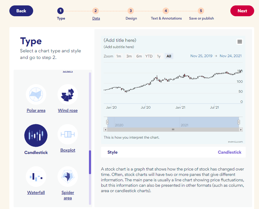
Select ‘Next’ to proceed to step 2.
2. Data: First ensure it is laid out in the correct rows and columns as described above.
You can either copy and paste it directly from your spreadsheet into the chart wizard or you can upload it as a csv file.

You can check the preview to ensure your data appears as expected and make any necessary changes by editing the data directly in the chart wizard.
When you are happy, select ‘Next’ to continue.
3. Design: You can select from one of the available design templates. Don’t worry if you don’t see one that meets your requirements, you will be able to adjust the design later.

Select ‘Next’ to continue
4. Add text: You can add your chart and axis titles here or you can wait and add them later if you prefer.

In our example, we added a title and a link to the data source. Leave any settings blank if they are not required or if you prefer to add them later. Select ‘Next’ to continue.
5. Save or Publish: At this point, you can save, publish or download your chart if you are happy with how it looks. Alternatively, select ‘Continue in Editor’ to make further changes.

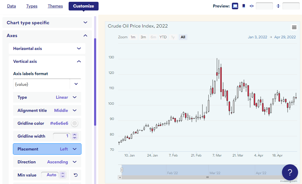
Customizing your candlestick chart
By selecting ‘Continue in Editor’ you have access to lots of different options that allow you to customize your candlestick chart to appear exactly as you want it.
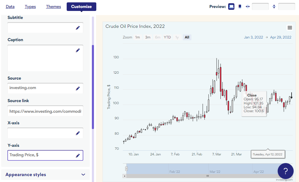
We decided to display the vertical axis (y-axis) on the left-hand side of the chart.
We also added a label to the y-axis:
everviz is packed with features that you can use to customize your chart so feel free to get stuck in and explore!
Frequently Asked Questions
How do I add a tooltip to my candlestick chart?
In the everviz Chart Editor, you have access to customize all aspects of your candlestick chart.
Tooltips are automatically generated for candlestick charts but you can adjust these to suit your needs in the everviz chart editor.
Firstly, ensure your tooltips are displayed by setting the “Enable tooltip” checkbox.
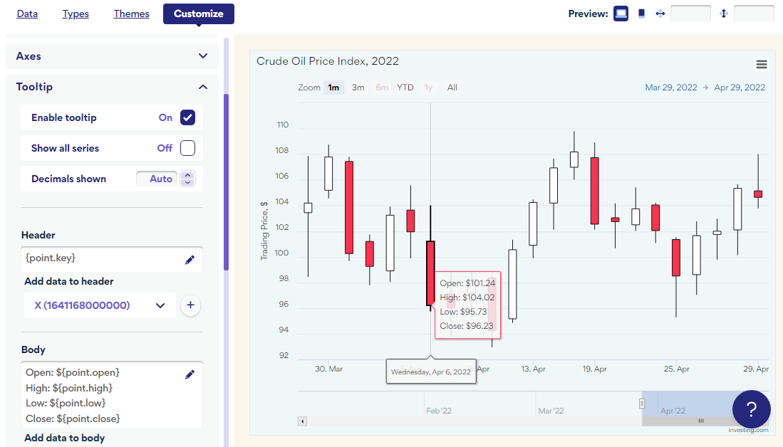
You can control the information that is displayed in the tooltip by adding the data points you require. The four standard candlestick chart data points (open, close, high and low) are automatically included, but you can change these to suit your requirements. In our example, we added a dollar sign so that the currency is displayed each time.
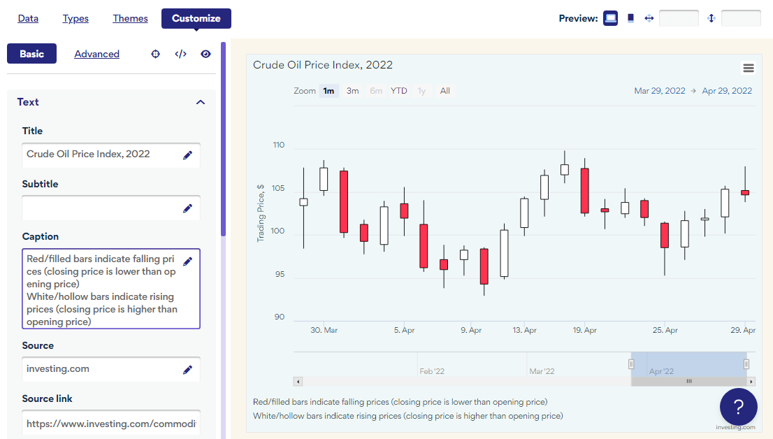
How can I ensure my candlestick chart is interpreted correctly?
Not everyone will be familiar with candlestick charts, and many people may not appreciate the meaning of the color or fill you have used to distinguish between rising and falling prices. Therefore, it is a good idea to include a key or explanation to help your readers to interpret the chart.
We used the ‘Caption’ setting under ‘Text’ to include an explanation neatly below the chart.
How can I keep my candlestick chart up to date with live data?
Since everviz candlestick charts automatically scale to display data across different time periods, this makes them ideal for displaying live data. For example, you might want to populate your chart daily with the latest trading prices, ensuring it always remains up to date.
It is very easy to link your everviz interactive candlestick chart to your own live data source. Firstly, you should set up your data source as a Google Sheet or JSON.
You can link the data when you set up a new chart (from the everviz chart wizard) or you can link your data to an existing chart from the chart editor.
In the Chart Editor, select the ‘Data’ tab and choose ‘Link data’.
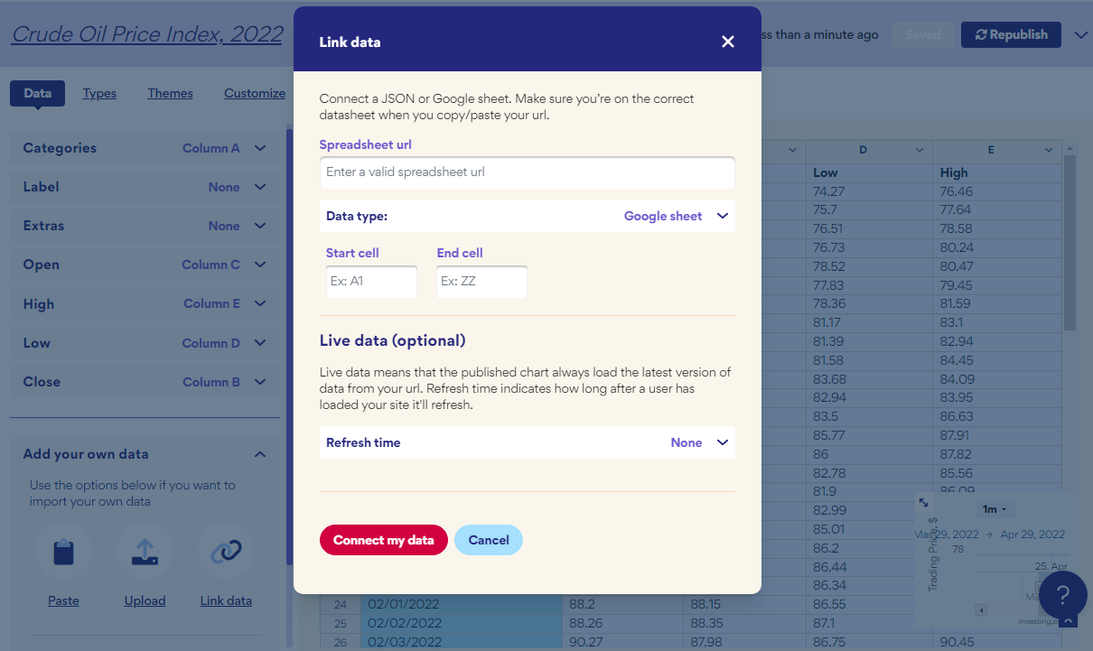
Now you just need to add the link to your live data source and your graph will be kept up to date.