Another strange year is soon coming to an end. Also this year has hit various businesses, communities and individuals hard. On top of that, the mounting urgency of climate change.
It’s not always easy to stay upbeat when there are still so many obstacles to overcome. But, in this second year of unparalleled upheaval, we’re also hopeful. Having witnessed the strength of individuals to aid one another, and overcoming adversity together.
We’re also super grateful for all the great work and feedback from our clients, inspiring us to come to work every day and do what it takes, as we get through these tough times.
Here at everviz we have, after all, been rather fortunate. We’ve been able to continue working on new features and improvements, although mostly from home.
Here’s a look back at what we’ve been up to this year and the progress we’ve been able to make for our users all over the world.
Annotations, series labels and dumbbell charts
We kicked the year off by improving annotations in everviz, making them more reliable in regards to tackling different screen sizes.
At the same time, we made it possible to use data series labels, and introduced a new template; the dumbbell chart. Read all about it in this blog post.
Improved export server
Every time you download your project to use in print, slide deck, share by email or social media the export server is in action.
In January we also launched our next generation export server. This article explains what the export server is, why we redesigned it and how you can use it.
Highlight your data
You asked for it, and in March we made Highlights a part of the annotation section in everviz.
everviz WordPress plugin
One of the more exciting news in 2021 for our customers using the WordPress platform.
After installing the plugin, WordPress users will be able to embed visualizations from everviz directly into blog posts and pages, without having to leave the WP interface.
The everviz WordPress plugin helps them manage everviz projects on their website quickly, easily, and more efficiently. Read all about it here.
Not a WordPress user? We are planning to integrate the plugin in other CMSes as well. Please let us know your favorite CMS here.
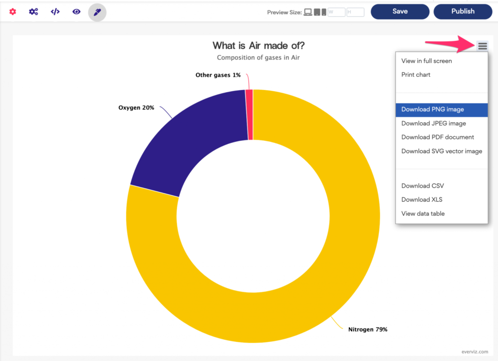
Meet the Inspector
At everviz, we aim to keep things simple, yet powerful. These are two orthogonal (independent) adjectives, and almost like describing something that is red, yet short. Still, we are continuously trying to find the perfect balance between a simple user experience and a powerful tool.
Our approach for balancing simple, yet powerful, is separating the most used features into a simple basic editor, and offering more comprehensive features in an advanced editor.
The feedback we get from our customers is that this separation is very useful and enables them to work productively. If the option is not available in the basic editor, it’s almost guaranteed that it is possible to get the desired results by tweaking the advanced settings.
Hence, another feedback we got was that it was is hard to navigate in the advanced settings until we launched the Inspector;
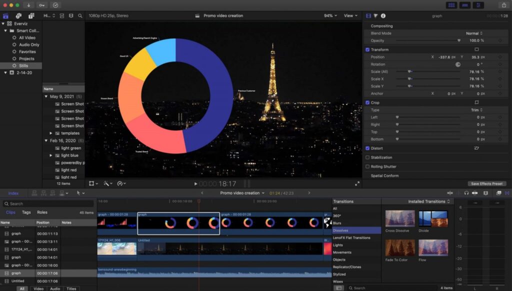
Animated charts in video
Right before the summer, we launched a new feature in beta: Download project as video.
With the new video download feature you can now repurpose your charts in videos as well. Bring your data to life with animated graphs and retire your Adobe After Effects or Apple Motion graphics templates.
More efficient text editing
In October we made adding texts to your visualizations simpler than ever. Because of that update, you now have access to editing all texts in your chart in one single page.
Another nice feature worth mentioning is that all fields support rich text editing if you click on the little pen icon next to the field. This opens a small WYSIWIG editor where you can customize textual content and design options without any coding
On top of that we have some exciting news in the baking which will be announced in January.
Phew, no wonder the coffee pot is always empty!
Here is a small bonus, namely the most popular and interesting blog posts for the year:
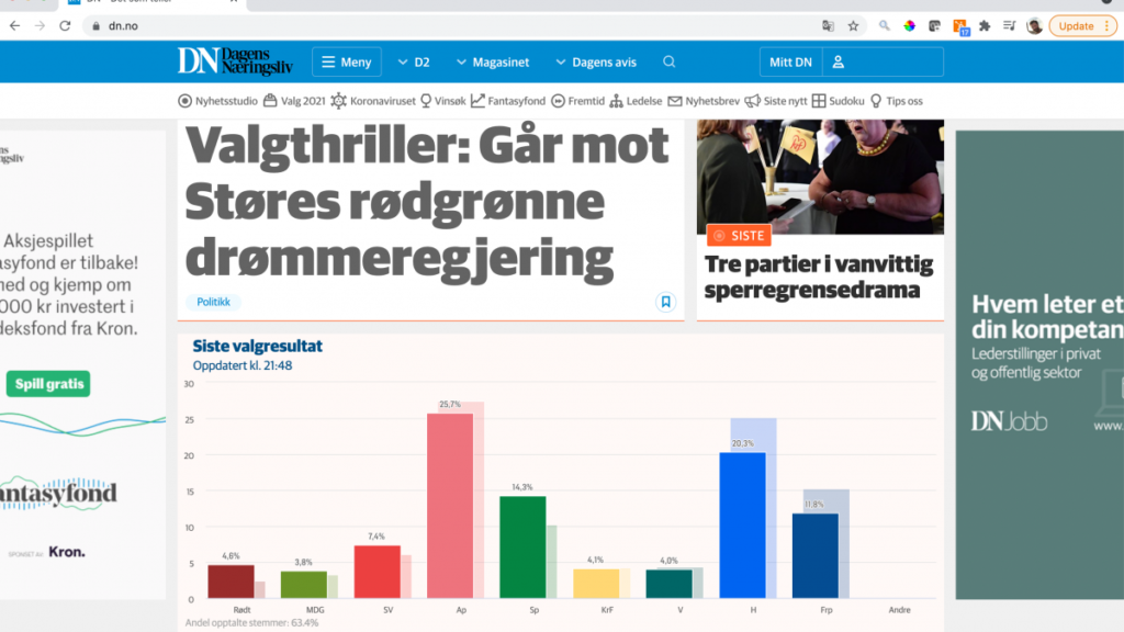
How Dagens Næringsliv used everviz for live election data visualizations
The national parliamentary election in Norway was held in October. Dagens Næringsliv (DN), The Norwegian Business Daily, a leading business newspaper in Norway used everviz to convert live election data into beautiful visualizations to engage their readers.
We talked to Frode Buanes, Head of Digital Publishing at DN, to learn more about the project.
Choosing the right visualization for your data
There is a wide range of different types of data visualizations, and different charts are good for different purposes. Simple visualizations (such as pie charts, bar charts, and line charts) are widely used and will be easily interpreted by most audiences. However, there are many other options and opportunities to get creative with how you display your data and maximize its impact.
Whatever your data type, your main priority should be to ensure your key message is delivered clearly and can be understood by your target audience. Read this post to learn more!
Visualize climate data – a few simple yet effective ways to get started
October was all about the Glasgow Climate Change Conference.
Lies, damned lies, and visualizations
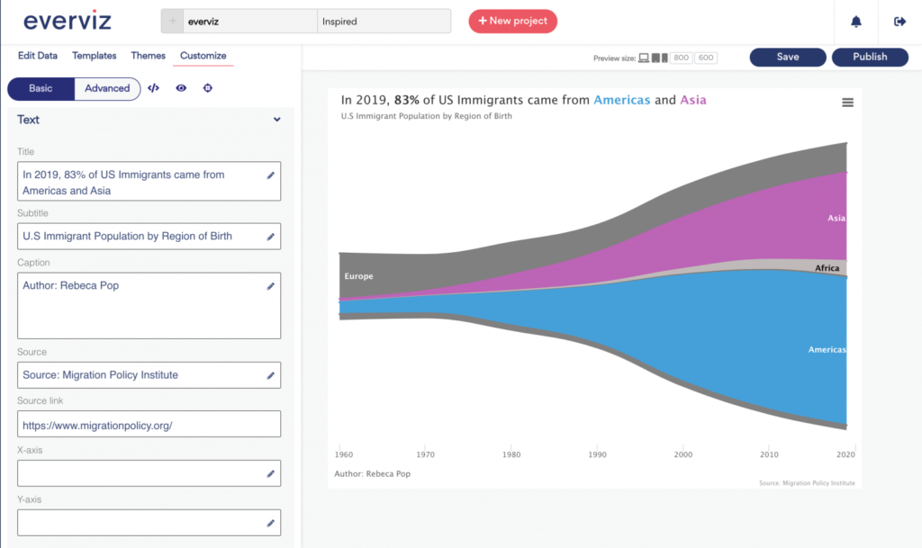
Graphs can be a wonderful tool to make data clear, engaging, and accessible to your audience. However, picking the right data visualization to communicate your story can be hard. To begin with, there are dozens of graph types to choose from. Choose the wrong chart type, and you end up not just not communicating clearly with data, but also misleading your audience. Learn more in this guest blog post by Rebeca Pop, founder of Vizlogue.