This is a guest blog post by Rebeca Pop, founder of Vizlogue, a Data Visualization and Storytelling Lab that offers workshops and consulting services. You can find Rebeca on YouTube, where she posts data visualization videos. Rebeca has been providing insights and creating data visualizations for almost 10 years. She has worked as a digital analytics leader for top media and analytics companies, and is teaching Data Visualization and Storytelling at the University of Chicago and at Northwestern University. Read more about Rebeca in her bio below.
Header Image Source: Craftwork Design
When William Playfair, a Scottish engineer, and political economist, invented the pie chart, line chart, and bar chart in the late 1700s, he probably couldn’t have guessed that we would still be using them over 200 years later. Or, Baron Pierre Charles Dupin, a French mathematician, engineer, economist, and politician, would probably be stunned to hear that we are still using the choropleth map that he invented in 1826! You get my point. Some of the most commonly used graph types were invented hundreds of years ago, before computers, mobile phones, and the internet. Yet, for some reason, we still use them.
In this article, I’ll walk you through a few reasons why you should expand your chart toolbox, as well as examples of how to do so. Let’s get started!
A case for using more advanced chart types
While I am not arguing that you should forget altogether about pie charts, bar charts, and line charts, there are situations in which a more innovative chart type could work better. After all, picking the right graph is a tremendous opportunity to tell a story and make a convincing argument by visualizing data. Why limit this opportunity to only what’s commonly used?
Here are three reasons why you should consider using more advanced chart types next time you visualize data:
1. Standard charts don’t work
Maybe the bar chart that you thought would work looks too cluttered. Or, perhaps the trend line doesn’t quite convey the story that you were planning to tell. Or, maybe your pie chart has eight different slices, and you’re worried that no one would be able to read it. If you can’t convey the message you have in mind using a common chart type, then it’s time to innovate.
2. Attract attention
About ten years ago, when I first started working with data, I had a manager who always used to say: “If I can’t get the message in 3 seconds, your chart is not good enough.” And so, for a while, I was convinced that I had to stick to only showing a few data points and using standard chart types. Fast forward to 2021, I’d respectfully disagree with my manager from back then. There are situations in which we might want our audience to be intrigued, curious to spend some time exploring our graph. There are situations in which it could be helpful to let a chart tell a more intricate story. And, to do so, we need to use a more unique chart type.
3. Increase data literacy
If you open The New York Times, The Guardian, or The Economist, you notice right away that their teams are constantly innovating in terms of chart choices. However, these publications address a vast and diverse audience. So then why do they choose to innovate? At least partially because The New York Times, The Guardian, and The Economist want to increase their audience’s data literacy level by exposing them to more unique chart types. That’s something that you might want to do as well if you are in a position where you think your audience is open to learning.
While I think these are three compelling reasons to start using more advanced chart types, I’m not arguing that you should stop using bar charts, pie charts, line charts, or choropleth maps. Not at all. These graph types have the advantage of being easy to read and accurately understood. I would never encourage innovation for the sake of innovation. But, if you think that a common chart type won’t work in a specific scenario, that you want to attract attention or increase your audience’s data literacy level, then I encourage you to explore more advanced chart types.
If not bar charts, pie charts, line charts, and choropleth maps, then what?
Now that I (hopefully!) convinced you to explore more advanced chart types, I’ll show you a few examples of how such graphs can overcome some common flaws that standard charts have. Let’s explore a few different data types, the most common way of visualizing them, and alternatives.
1. Paired bar chart versus dumbbell chart
While a line graph is the most commonly used graph type to encode time, it won’t work if you only have two points in time to compare, such as two years. In this case, a paired bar chart might be your typical chart choice.
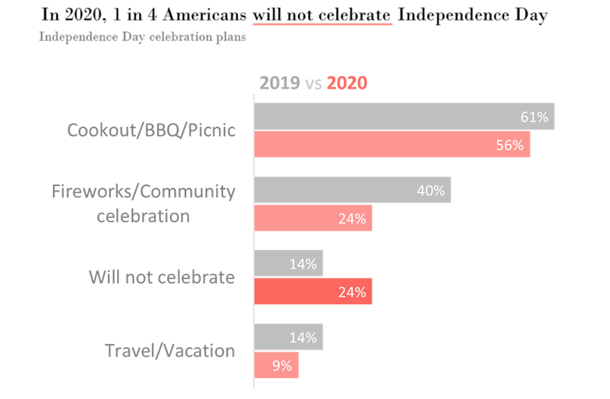
Author: Rebeca Pop | Data source: National Retail Federation (NRF)
I created the paired bar chart above using data from the National Retail Federation (NRF) about how Americans planned to spend Independence Day in 2020 versus 2019. The main insight is that much fewer people were planning to celebrate in 2020 compared to the prior year.
How do we read a paired bar chart? Similar to how we read a regular bar chart. We start from the baseline and then follow each bar till the end. We then compare the endpoints, looking to spot any differences. One of the main advantages of a bar chart is that almost everyone is familiar with it and knows how to read it accurately. A flaw in this specific example is that there isn’t sufficient emphasis on the main story point – an increase in the number of people planning not to celebrate Independence Day in 2020.
An alternative to this paired bar chart? A dumbbell chart!
The dumbbell chart, like many other graph types, has many aliases: DNA chart, barbell chart, and connected dot plot. Using the same data, I created the dumbbell chart below and used enclosure to highlight the “will not celebrate” segment.
Author: Rebeca Pop | Data source: National Retail Federation (NRF)
Dumbbells are a great option if your goal is to compare two points in time or display before and after results. To read a dumbbell chart, I recommend starting off with the legend. This will provide the information necessary to identify the meaning of each color. As a second step, read the first category, “Cookout/BBQ/Picnic” and then each circle’s position. After that, continue down the graph, reading each category.
Overall, dumbbell charts are innovative and, while they might require a slightly higher level of data literacy than a paired bar chart, they are not much of a stretch for the brain. One other advantage of using a dumbbell chart is that they effectively show the gap between two categories.
What to be cautious about when using dumbbell charts to visualize your data? Avoid having too many segments, as your graph can easily end up looking cluttered. Also, the end circle can overstate the values, so I suggest not creating very large circles.
2. Stacked bar chart versus streamgraph
Stacked bar charts are the staple of data visualization. While the paired bar chart shows two data values per category, the stacked bar chart can include many more values. Each bar represents the total (such as 100%) and is subdivided into segments. Stacked bar charts are commonly used when we have many categories and, instead of placing them next to each other, we stack them. Stacking bars can help show and compare ratios across years, like in the example below from The Migration Policy Institute.
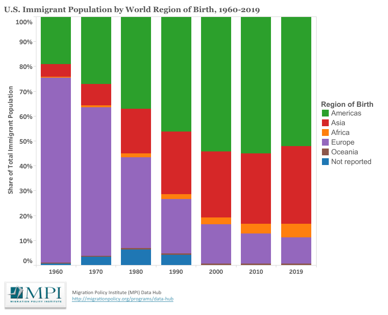
Source: Migration Policy Institute
Stacked bar charts encode a lot of information and have the advantage of being easy to read. The challenge? The further a segment is from the baseline or from the top, the harder it is to compare it across years. You can easily compare the segment “Not reported” and “Americas,” but “Asia” is quite hard to compare across years. Also, this graph highlights segments within each year more than the trend across segments over time. In my view, the main story in this data set is that the share of U.S. immigration from Asia and Americas has increased tremendously over the last years. A different chart type could do a better job highlighting this story.
So, what’s the alternative? A streamgraph!
A streamgraph is a version of the stacked area chart. It is excellent at showing the evolution of a set of values over time and highlighting patterns. Unlike the stacked area chart or the stacked bar chart, a streamgraph doesn’t have any corners. The edges are rounded, which gives the impression of a flow.
Author: Rebeca Pop | Data source: Migration Policy Institute
While I do not recommend using a streamgraph when you want to show the evolution of every single segment, this chart type is excellent at painting the big picture and enables us to make relative comparisons. In my makeover above, Americas and Asia stand out much more, and there’s an emphasis on how fast these two segments increased over time.
Streamgraphs might be hard to decode for the average audience, so I recommend spending a few seconds explaining how the data is encoded when you are giving a presentation. On the other hand, streamgraphs will likely intrigue your audience.
Everviz is getting ready to announce support for streamgraphs, so stay tuned!
3. Choropleth map versus honeycomb map
A choropleth map is the most common type of map, and encodes both latitude and longitude. Just like bar charts, pie charts, and line charts, the choropleth map is widely used, and your audience won’t have problems knowing how to read it. In the example below, I included three different data layers:
(1) each state’s geographical position on the map
(2) each state’s size
(3) the STD rate by state
That’s a lot of data layers in one map!
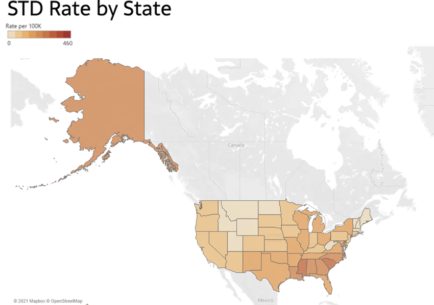
Author: Rebeca Pop | Data source: CDC
While this choropleth map encodes a lot of information, it is not without flaws. Let’s take a closer look at it. The first problem is that Alaska looks too prominent compared to the US mainland, and there is a lot of blank space between the US mainland and Alaska. If I add Hawaii as well, the US mainland becomes very small. One fix is to bring Alaska and Hawaii closer to US mainland, so partially removing the latitude and longitude encoding of these two states. While this solves the first problem, there is a second one – the data story that we are trying to tell might have nothing to do with each state’s geographical size. By keeping each state proportionate to its actual size, the tiny US states on the East Coast (e.g., Maine, Vermont, Rhode Island) become too small to read on a choropleth map.
The alternative? A honeycomb map!
I used the same data to create a hexagon for each US state. Do you see how DC stands out now? Unlike a choropleth map, a honeycomb map allows us to quickly see every state, including the tiny ones on the East Coast. Note that the position of each state is not exact nor encoded using latitude and longitude. Also, we are losing any information related to the size of each state.
But, if the size of each state and each state’s exact location are less critical for your data story than the ability to have every state visible, then a honeycomb map might be your best option.
Author: Rebeca Pop | Data source: CDC
What’s next
Now that we explored a few advantages of using more advanced graph types, as well as examples, I encourage you to continue familiarizing yourself with such graphs. They will enable you to visualize data more effectively, tell a more compelling data story, and increase your audience’s data literacy level.
If you’re wondering what other advanced graph types you should be exploring next, here are a few: Sankey diagrams to visualize flow, word clouds to visualize qualitative data, unit charts to emphasize on individuals or objects, and wind rose chart to display part-to-whole relationships. All around the world, data visualization experts are constantly inventing new chart types, so I encourage you to never stop exploring.
About the author

Years ago, Rebeca fell in love with data visualization and storytelling. And there was no way back.
That was the point when she realized how underrepresented these skills are, despite being core to most business professionals.
Rebeca, Vizlogue’s founder, has been providing insights and creating data visualizations for almost 10 years. She has worked as a digital analytics leader for top media and analytics companies, across a diverse set of industries, such as Fast Food Restaurants, Consumer Packaged Goods (CPG) and Automotive.
For nearly 3 years, she has been teaching Data Visualization and Storytelling at the University of Chicago and at DePaul University in Chicago.
Rebeca holds a MA from the University of Oklahoma and a BA from the University of Bucharest, Romania. When she’s not reading, practicing or talking about data visualization and storytelling, Rebeca enjoys hiking and cycling.


